


BRAND DESIGN: CHIAREZZA PADEL
CHIAREZZA PADEL
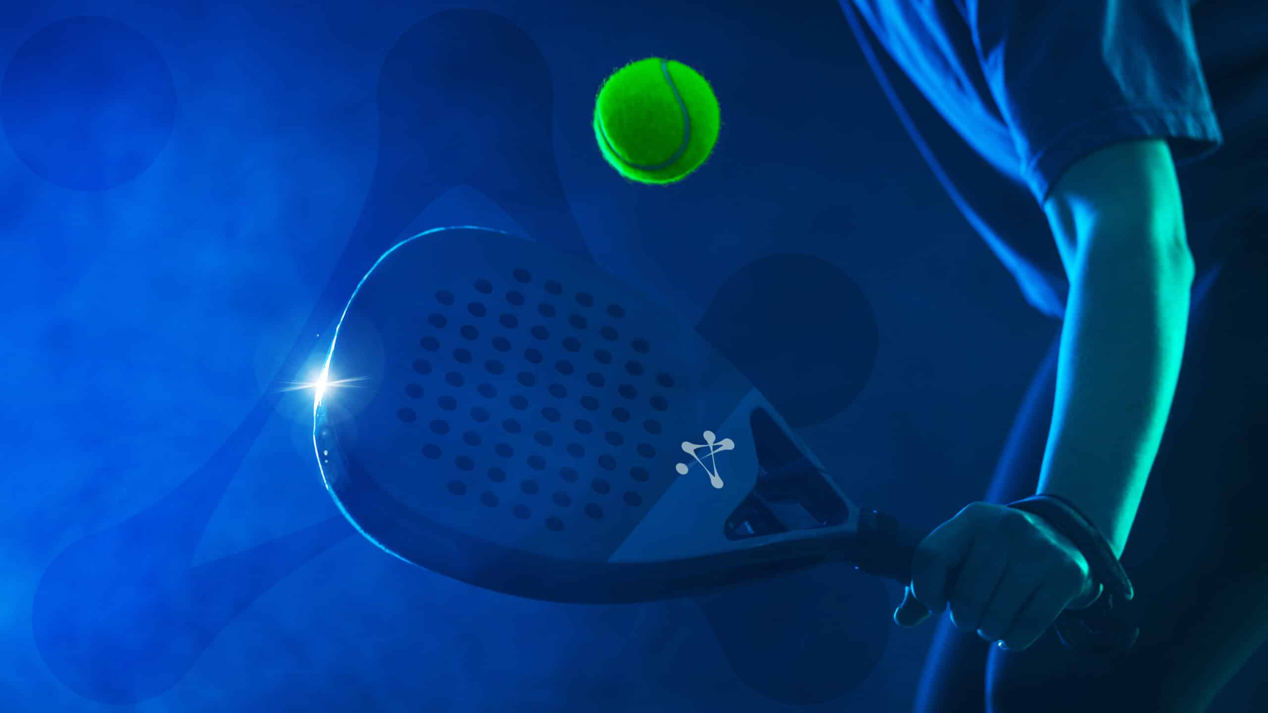
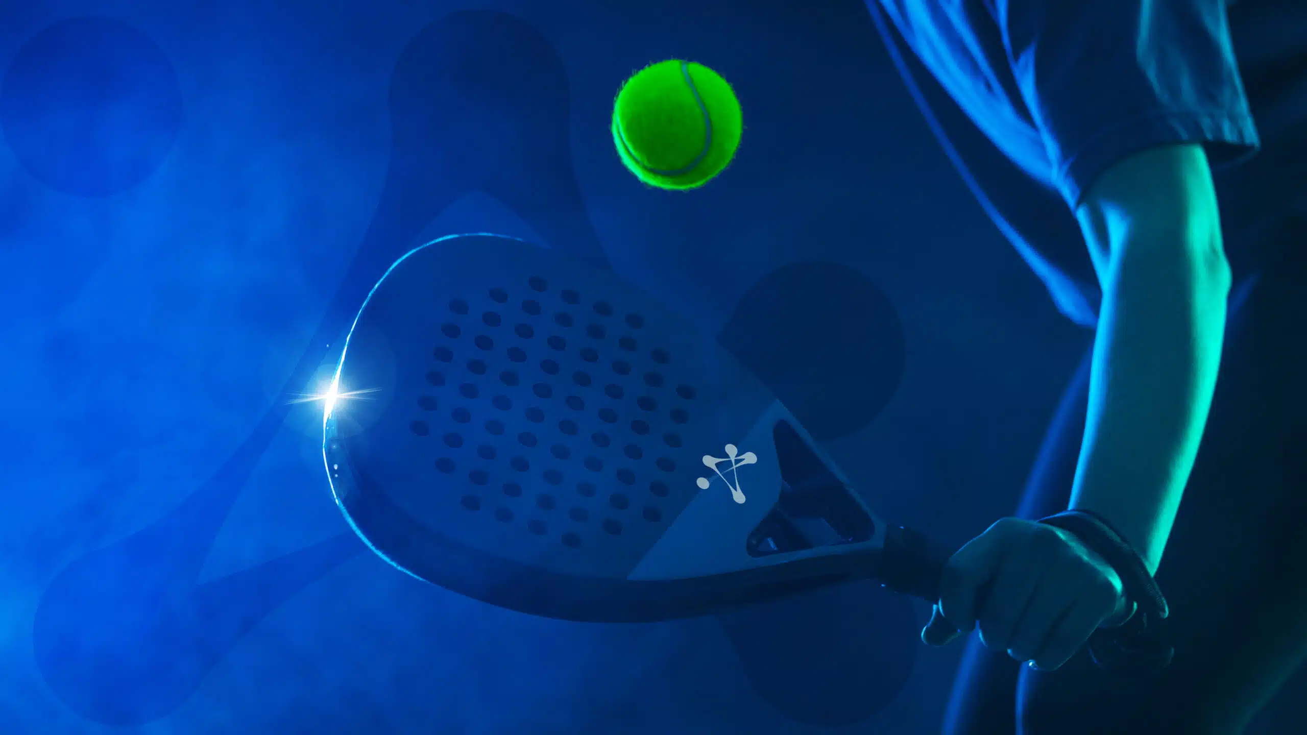
For the new padel brand Chiarezza, we developed an authentic brand design—one that radiates sophistication, clarity, and performance power.
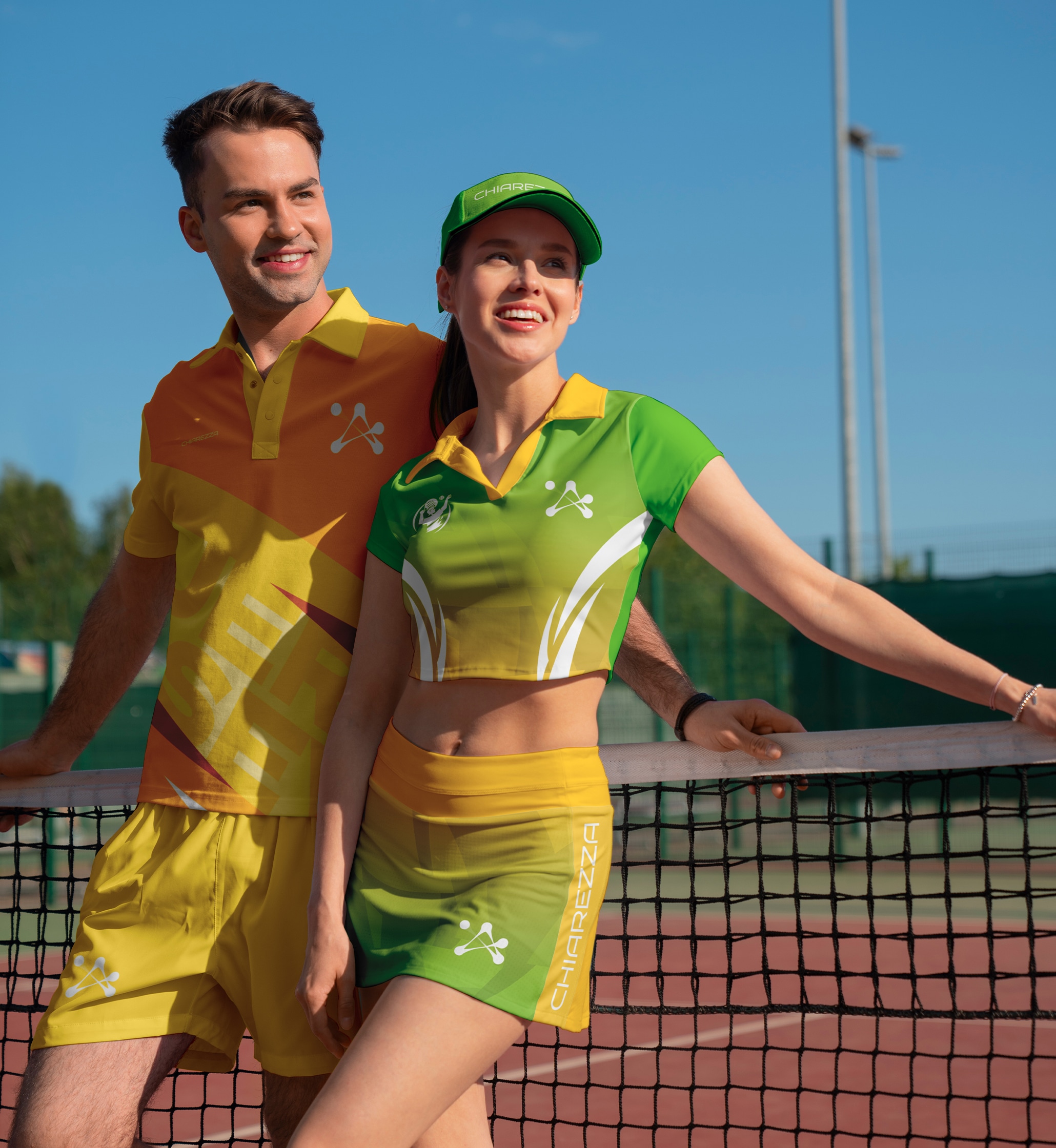
Chiarezza is an upcoming padel equipment brand that merges performance clarity with contemporary style. The name, meaning “clarity” in Italian, symbolizes precision, elegance, and the mental focus required on the court. The brand is centered around premium products—rackets, bags, apparel, and accessories—that combine functionality with modern design.
Chiarezza aims to communicate confidence, control, and essential simplicity, both through its visual identity and its tone of voice.
Services:
Art Direction
Brand & Strategy
Industries:
Sports

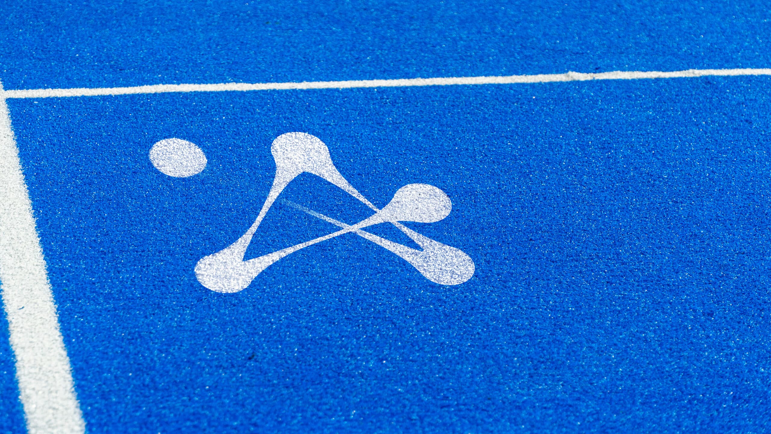
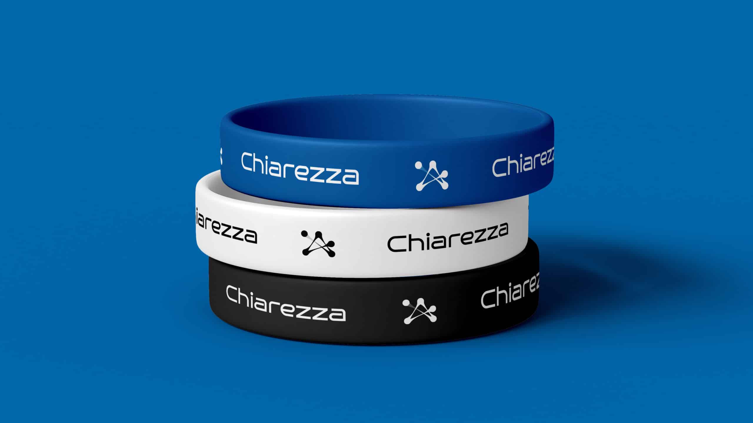
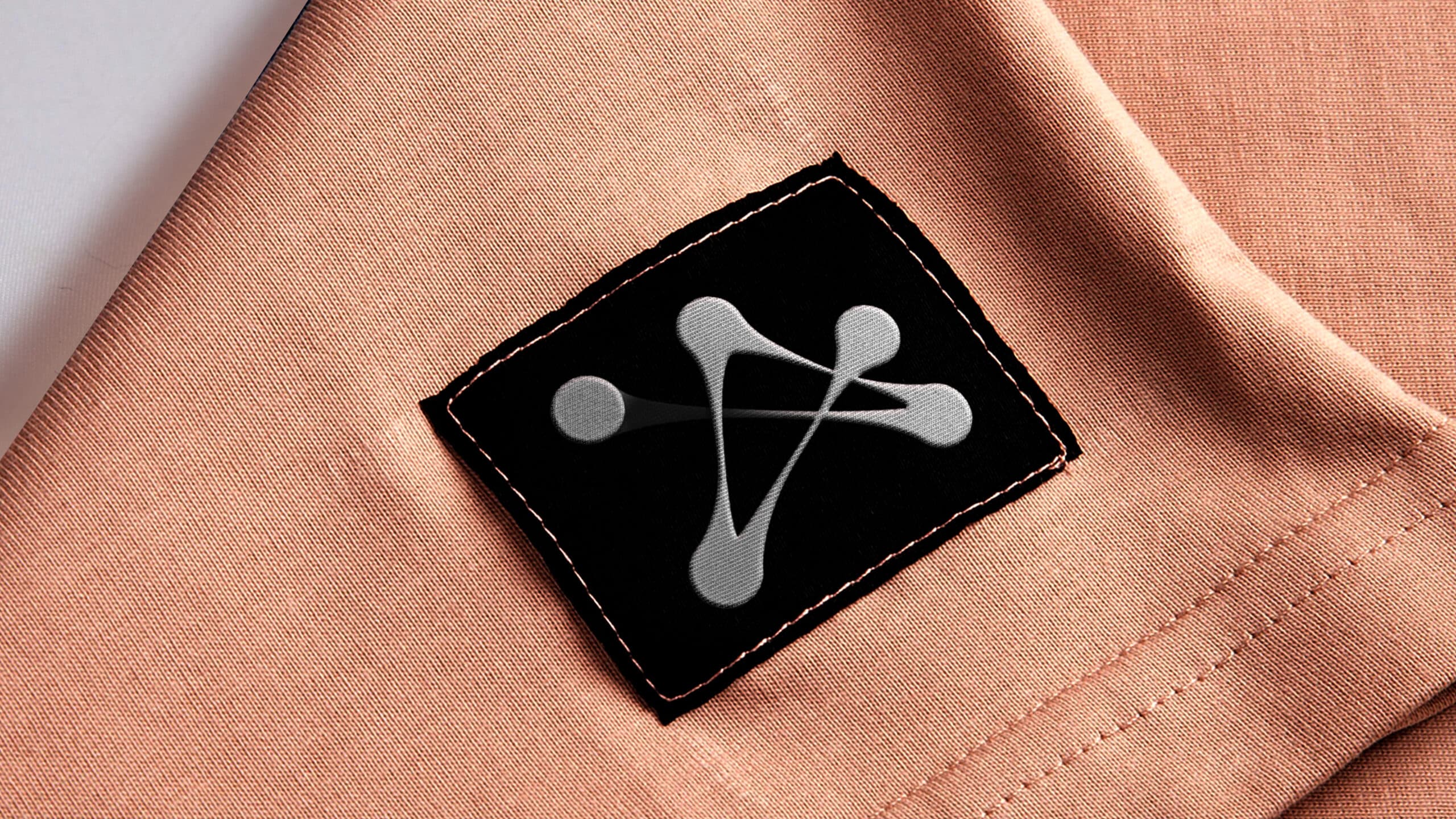
Logo as a Symbol of Connection
The logo is designed as a symbol of the sport that connects generations, just as padel brings together young and older players. This sport, which is growing in popularity worldwide, has become a bridge between different age groups – from young enthusiasts who enjoy the dynamic game, to experienced players who bring wisdom and tradition. Padel is not only a physical activity but also a social phenomenon that creates a community and energy that inspires everyone, regardless of age. The logo reflects this synergy, energy, and mutual connection, creating a symbol of a sport that knows no boundaries.
Design and Structure of the Logo
This logo for Chiarezza Padel visually represents the dynamics of the ball’s movement in various directions through an abstract, modern, and minimalist design. The trajectories of the balls are interconnected, symbolizing not only the path and energy of the game but also the mutual connection and unity within the padel community.
Speed and Energy of the Game
The dynamic lines in the logo reflect the fast pace and excitement of the game, while the simplicity and abstraction ensure universal brand recognition. Through this logo, the sport is presented as a bridge between generations, as padel becomes increasingly popular among all age groups – from young enthusiasts to older players – with more and more people recognizing its appeal and energy.
Inclusivity and Community
The logo symbolizes the inclusiveness and openness of the growing padel community, which connects people through sport, encouraging teamwork, physical activity, and social interaction. With its simplicity, abstraction, and dynamism, the logo not only conveys the movement and excitement of the game itself but also the strength of the bond that padel creates among players, building a community based on shared values – health, friendship, and sportsmanship.
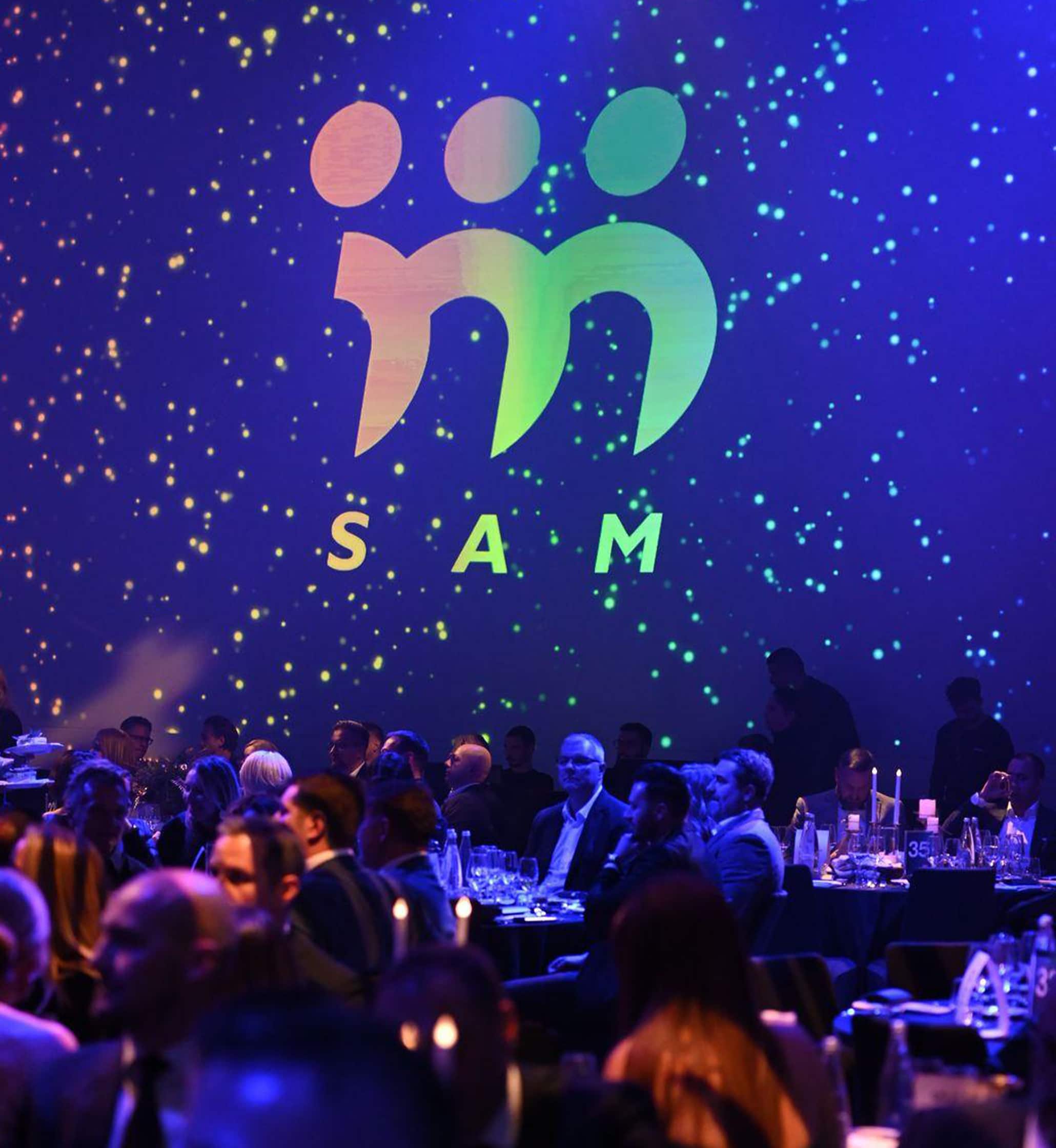
SAM GALA: CREATING UNBREAKABLE CONNECTIONS
SERBIAN ASSOCIATION OF MANAGERS
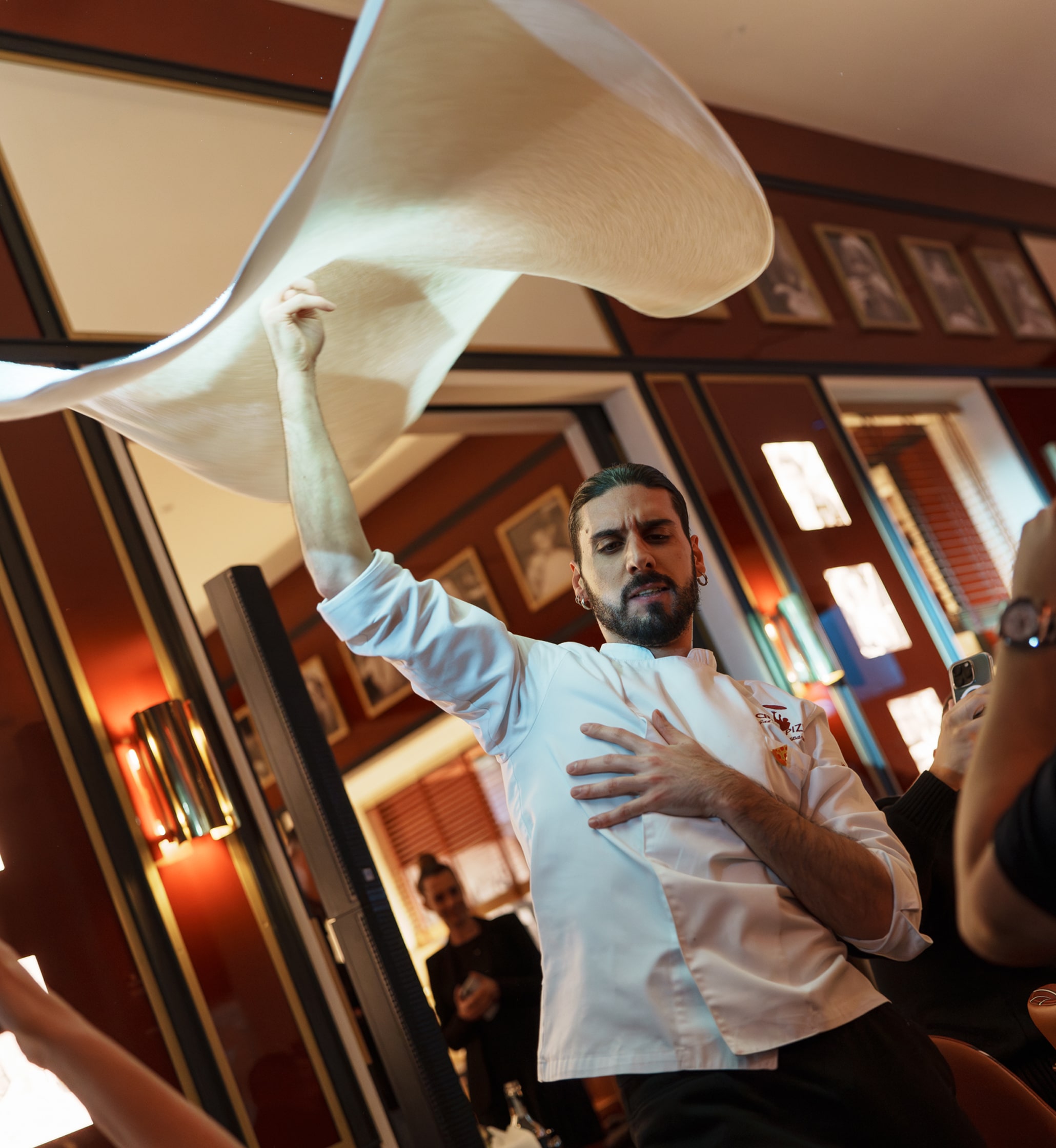
FOR CRAZY PIZZA, WE OPENED THE DOORS TO BELGRADE
CRAZY PIZZA
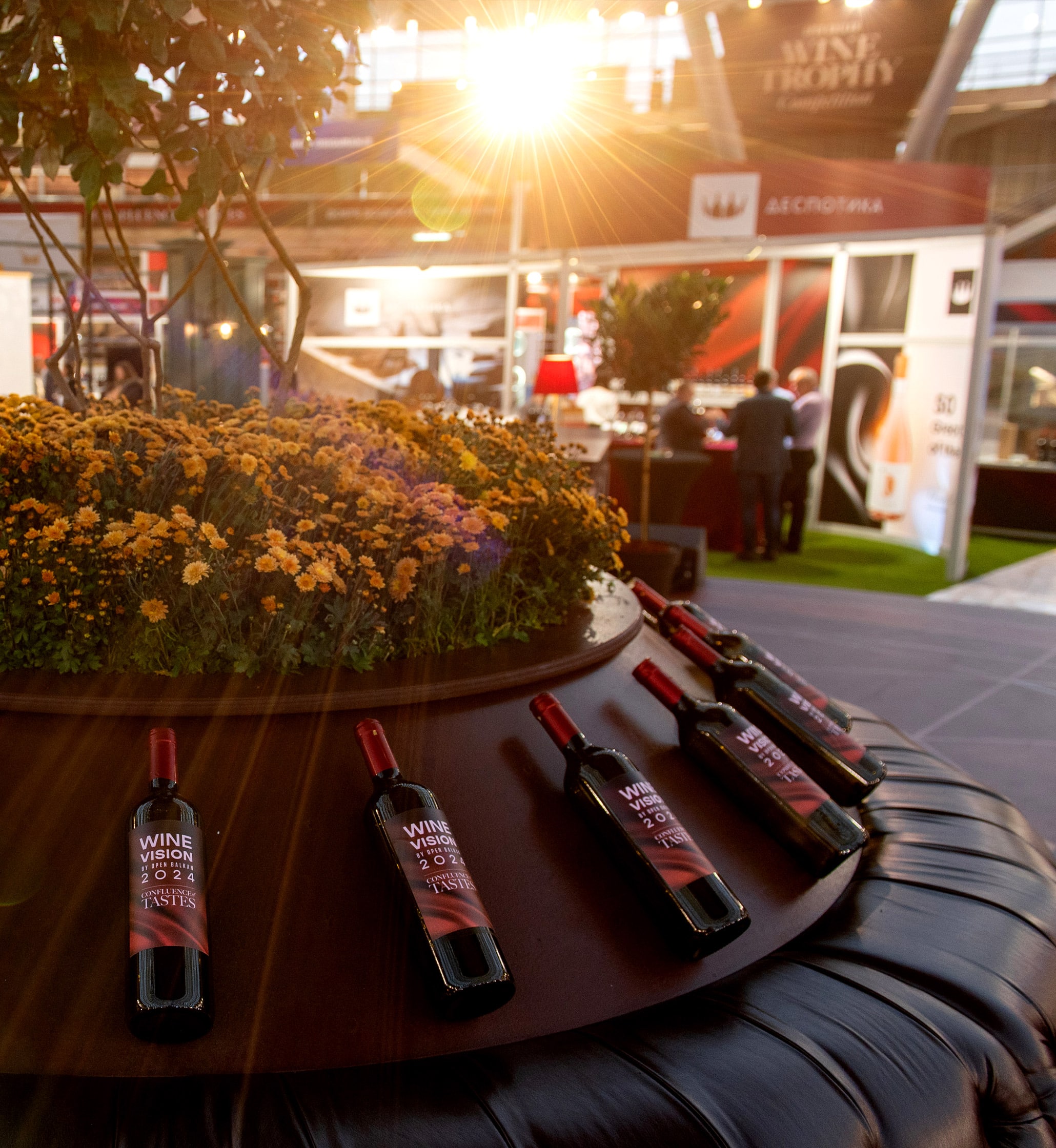
WINE VISION BY OPEN BALKAN 2024: FUSION OF COLOURS
THE GOVERNMENT OF THE REPUBLIC OF SERBIA