


PADEL BELGRADE OPEN BRAND DESIGN
PADEL BELGRADE OPEN
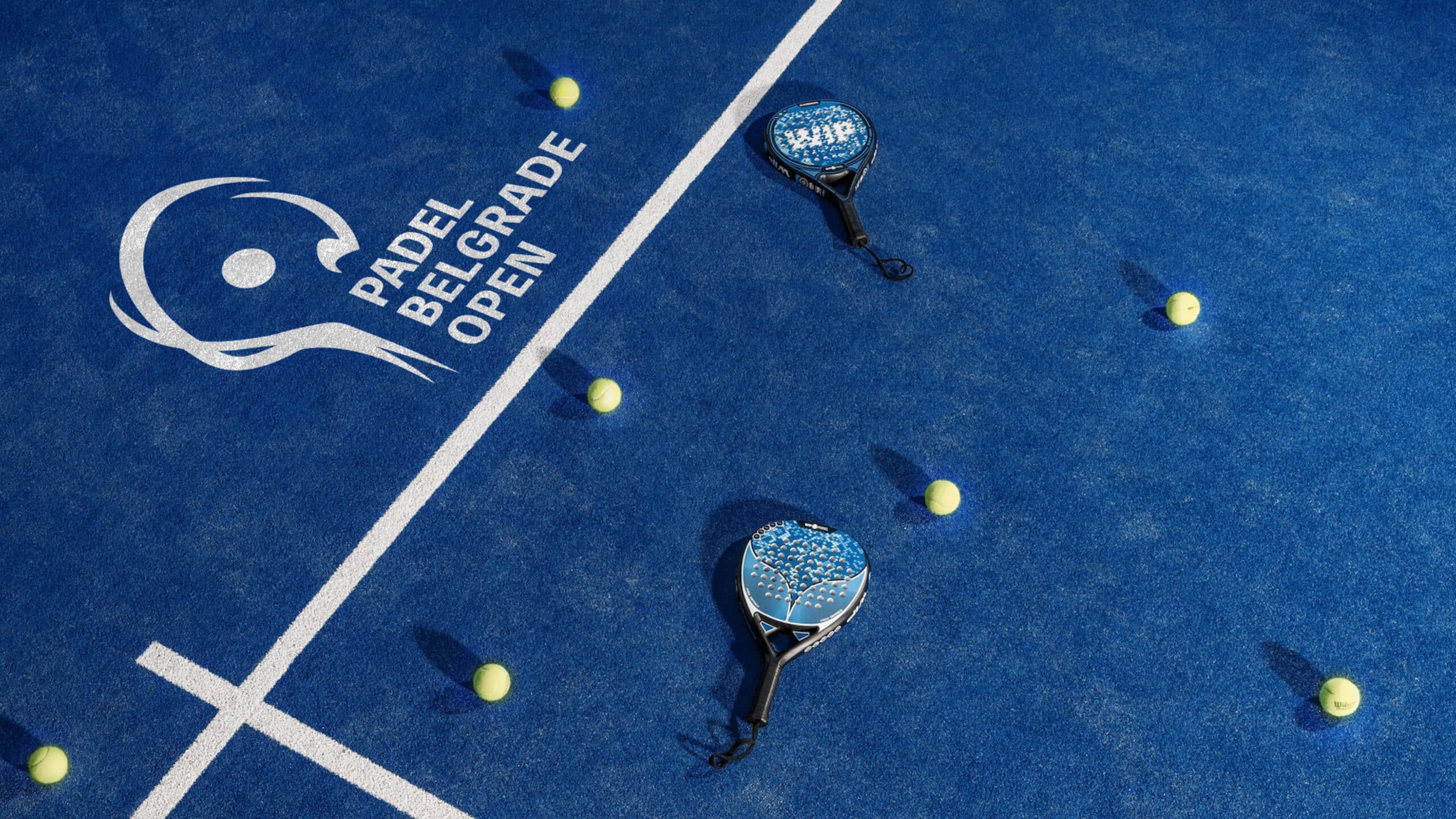
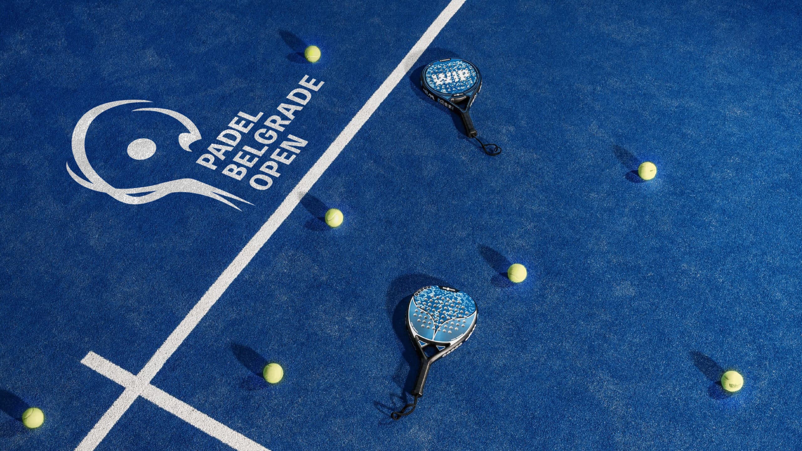
We are thrilled to present the new, dynamic logo for the Padel Belgrade Open! The logo is designed to capture the energy and passion of the growing and increasingly popular padel sport, a racket sport that combines elements of tennis and squash.
The creative concept behind the logo is based on several premises: By associating it with the Olympic ring, the logo embraces the spirit of free will, symbolizing the sporting unity that padel promotes. Equally important is the symbolism of the racket swing, as the logo’s abstract shapes are fluid and dynamic, reminiscent of the graceful swing of a padel racket.
Services:
Art Direction
Brand & Strategy
Industries:
Art, Entertainment & Lifestyle
Sports
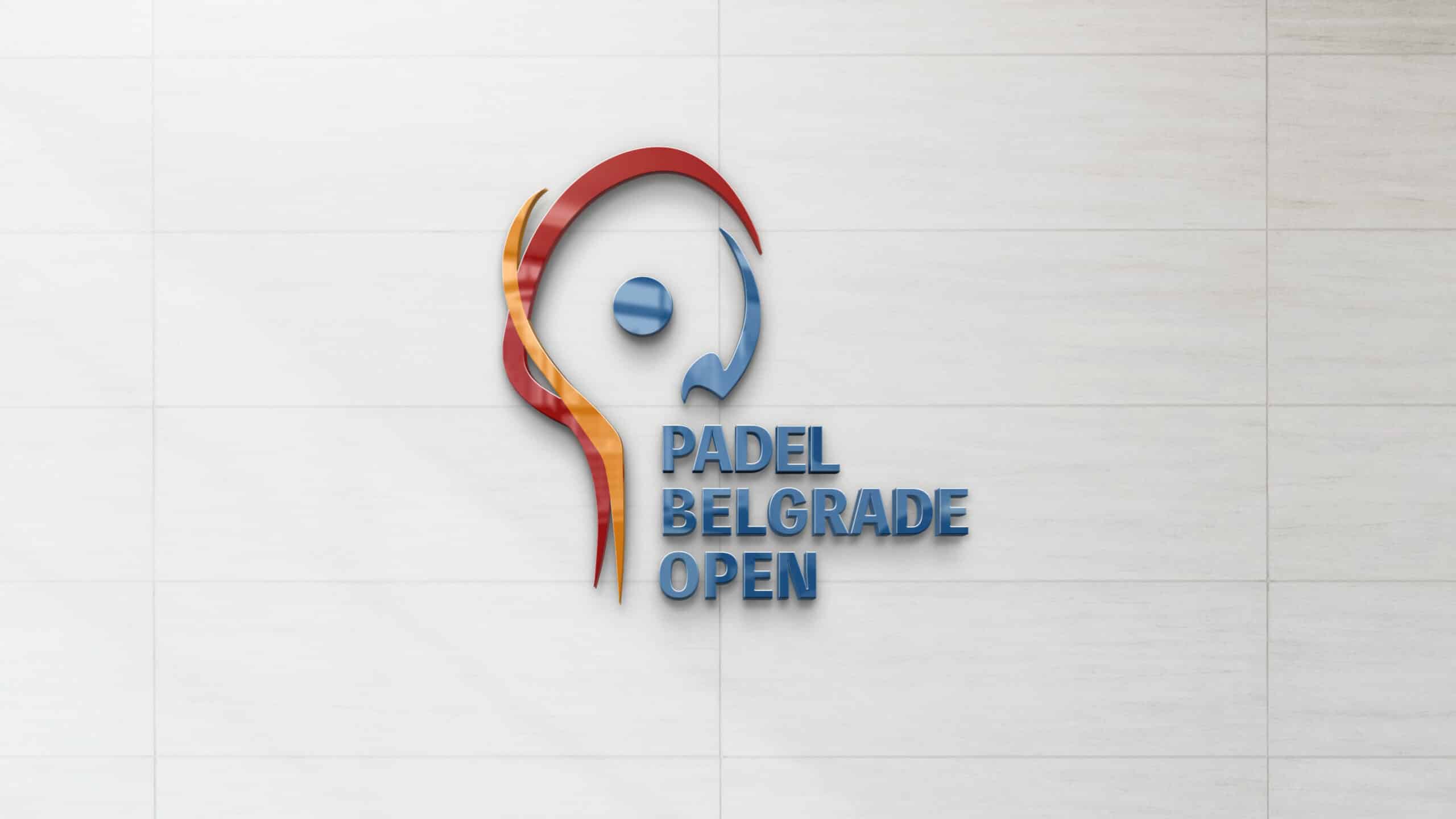
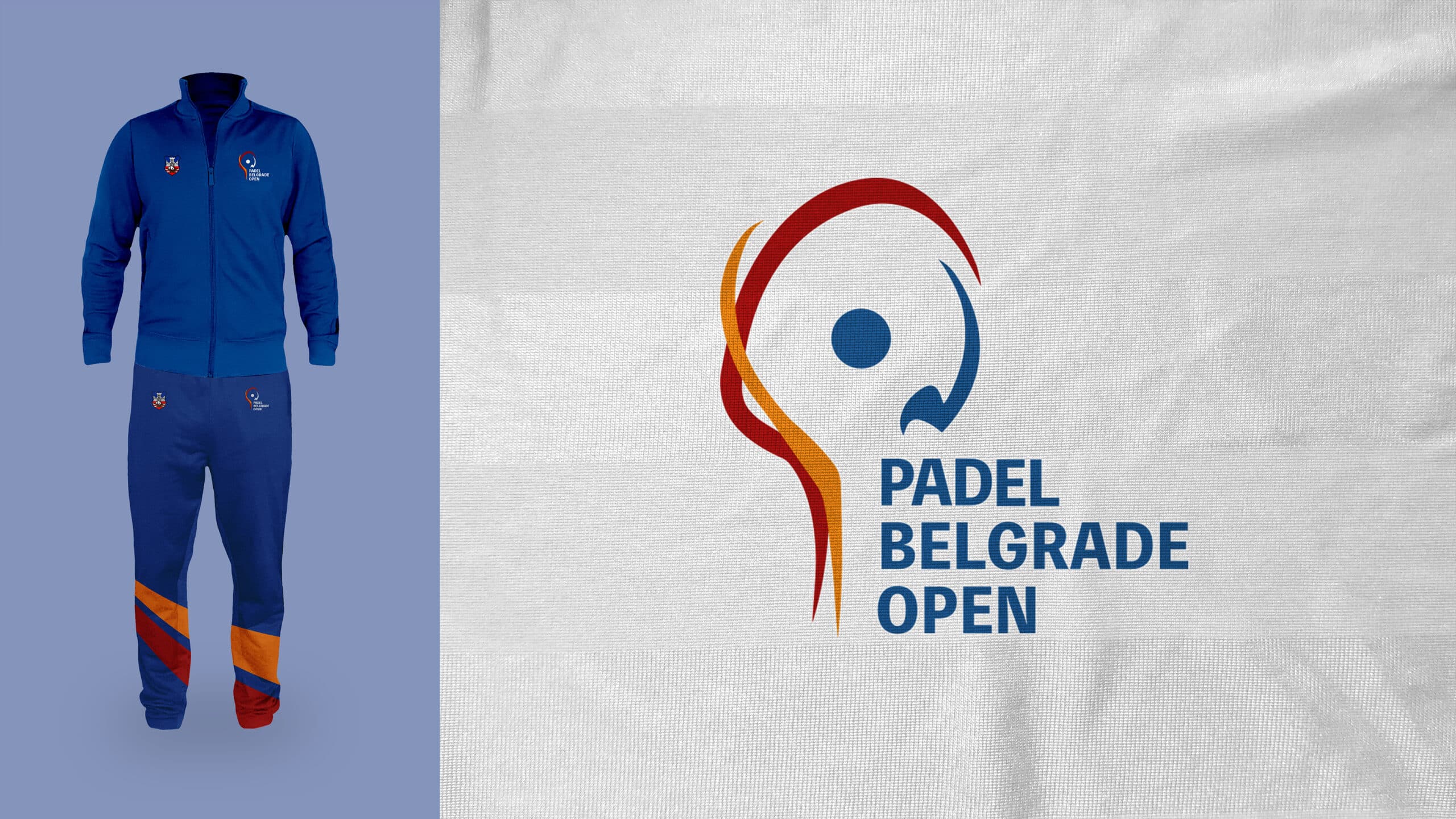
Upon closer inspection, the abstract shapes of the logo come together to form recognizable forms of a racket and a ball. The new logo of the Padel Belgrade Open also incorporates the colours of the Belgrade coat of arms, creating a strong connection between the tournament and the host city.
This logo is not static, but rather represents the movement and energy of the padel sport. It also symbolizes the spirit of Belgrade – a city that is vibrant, open, and ready for victory!
We believe this logo perfectly represents the Padel Belgrade Open tournament and Belgrade as a metropolis of sport and culture. We believe the new logo will inspire many to be part of the exciting padel tournament adventure!


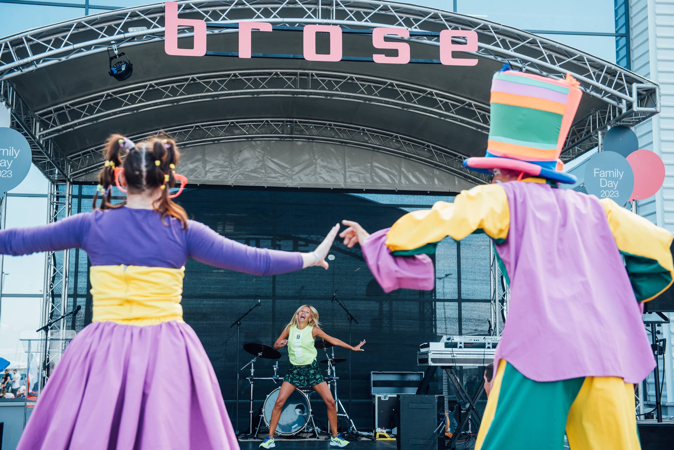
BROSE DAY: A CELEBRATION OF VALUES, TEAM SPIRIT AND TOGETHERNESS
BROSE
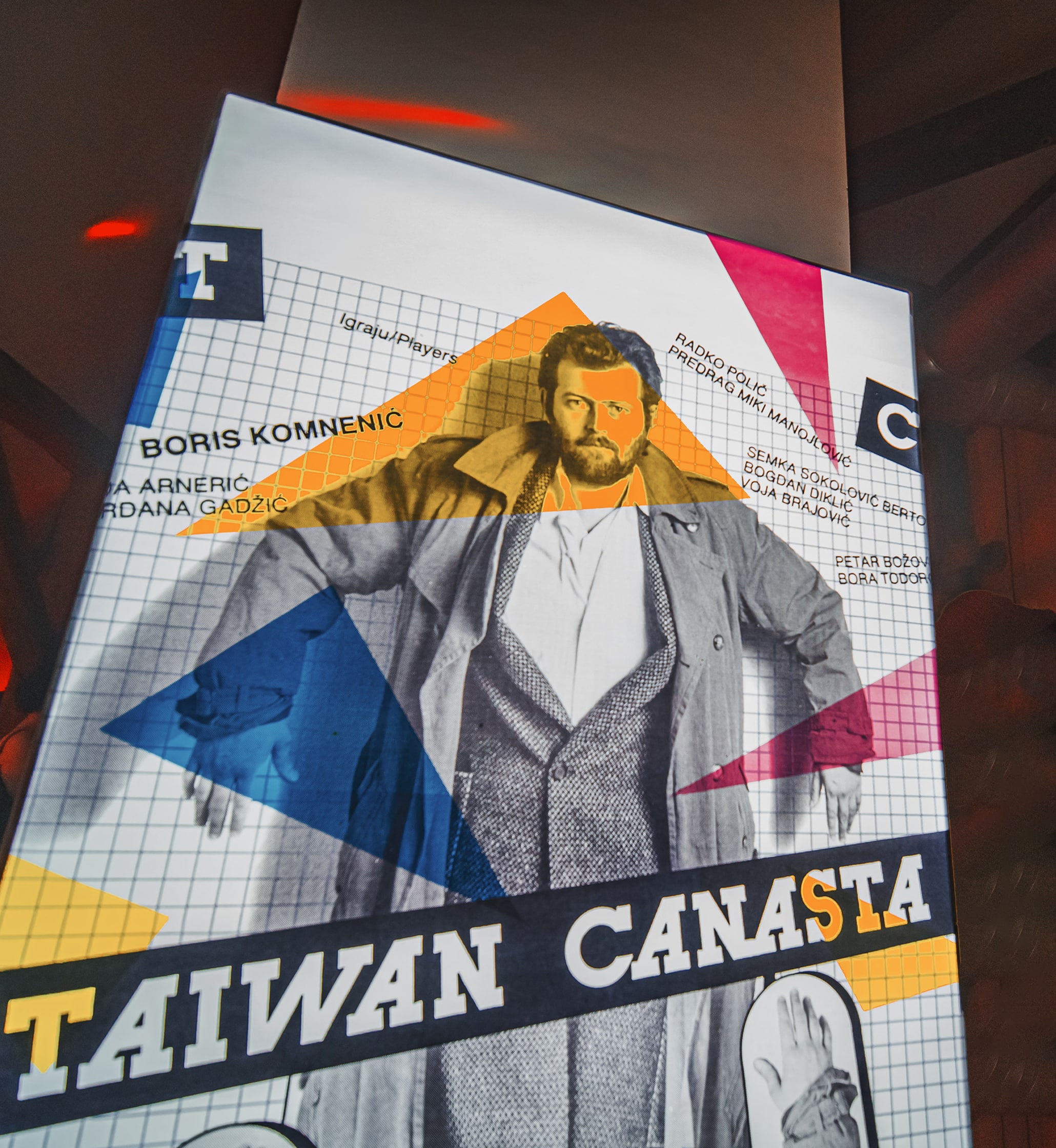
A1 KINOTEKA “TAIWAN CANASTA”
A1 SERBIA
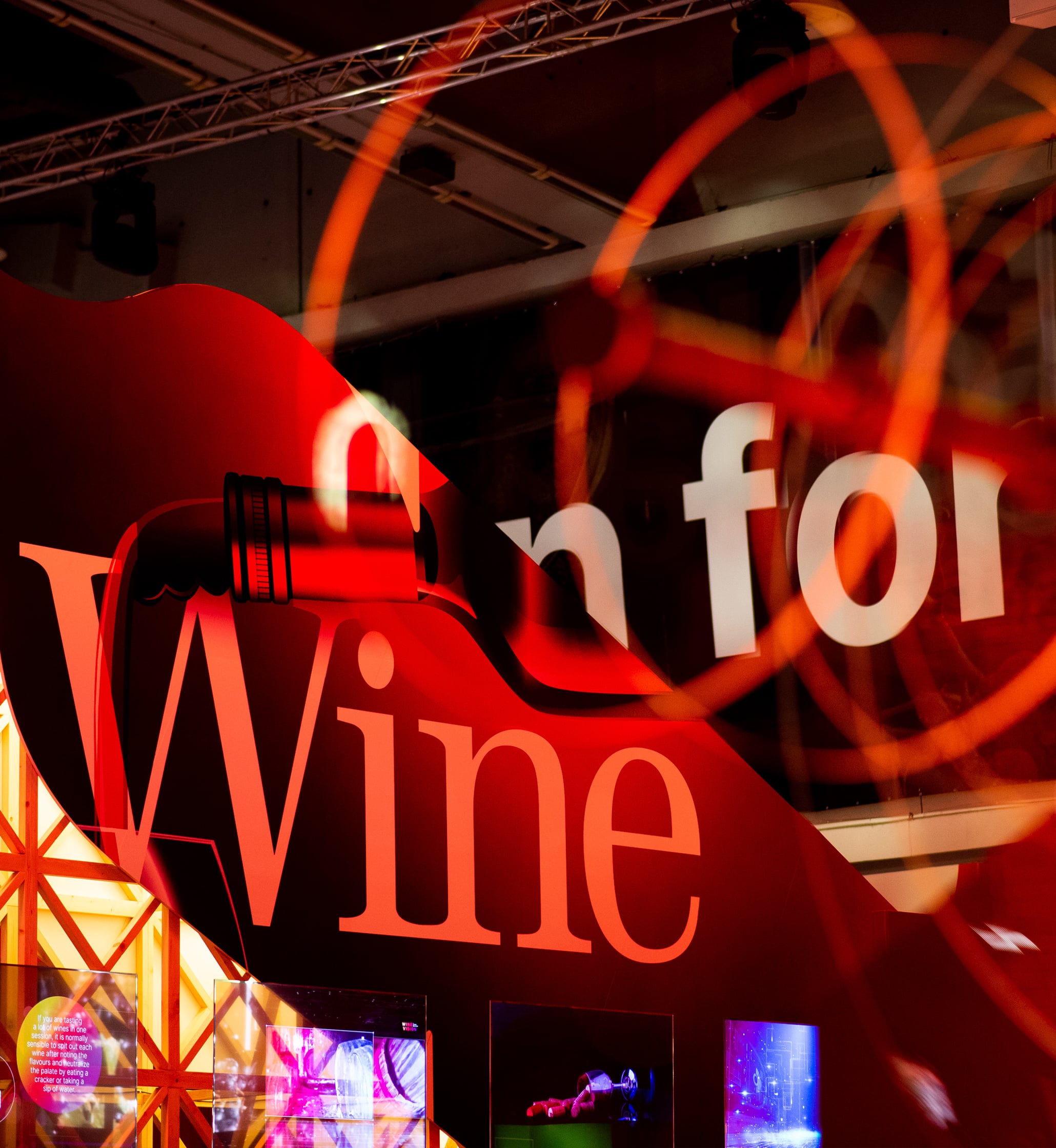
WINE VISION BY OPEN BALKAN
THE GOVERNMENT OF THE REPUBLIC OF SERBIA