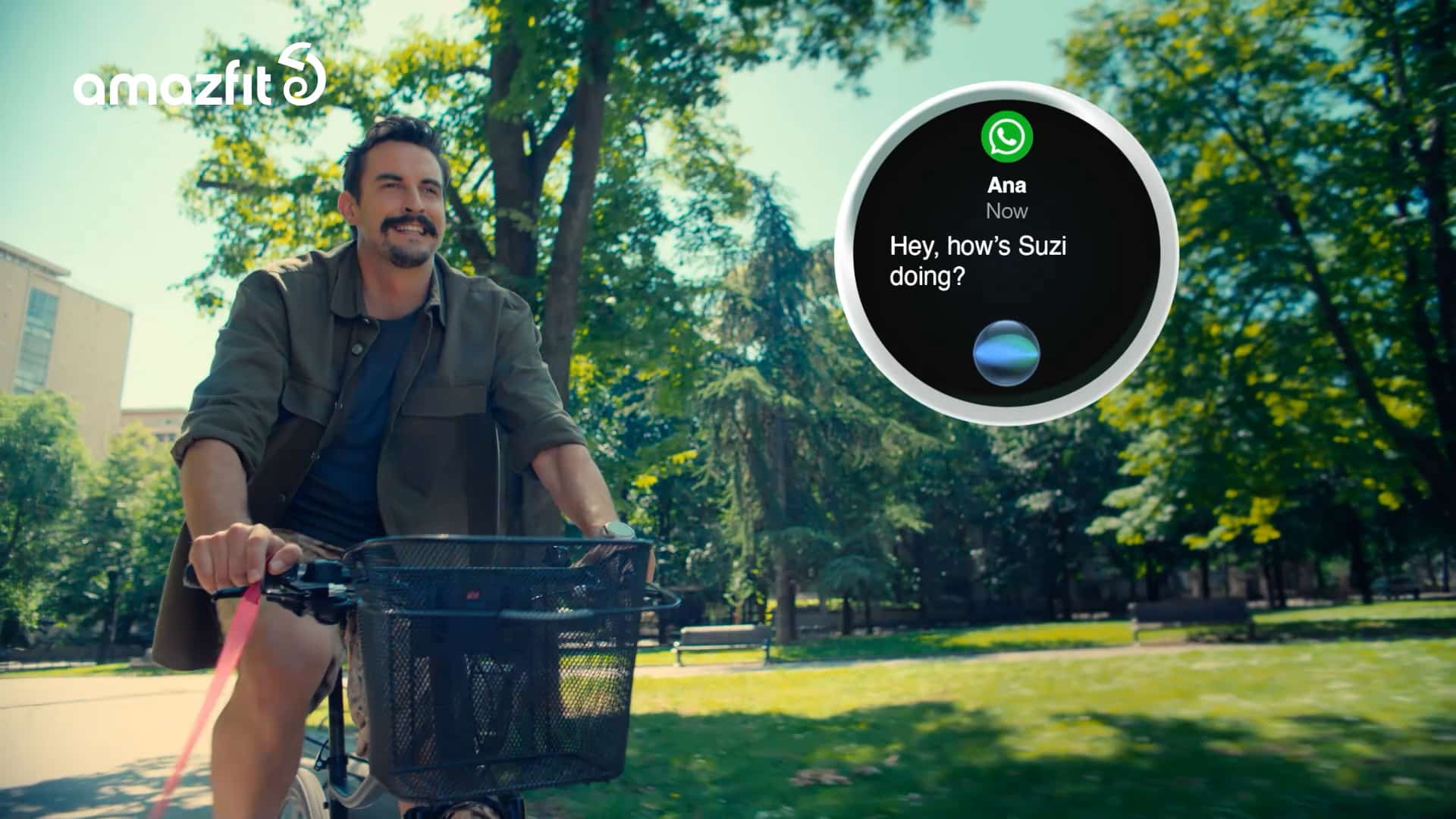
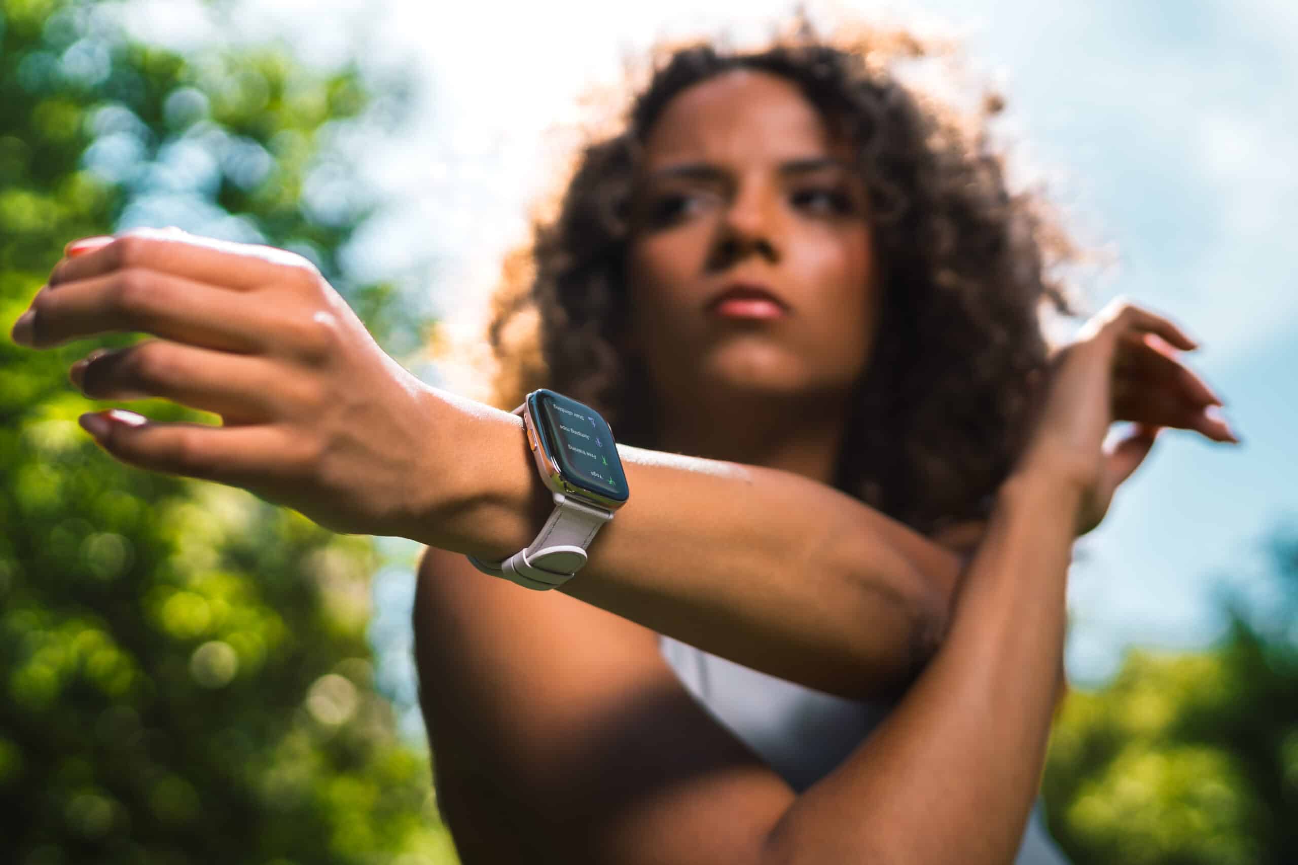
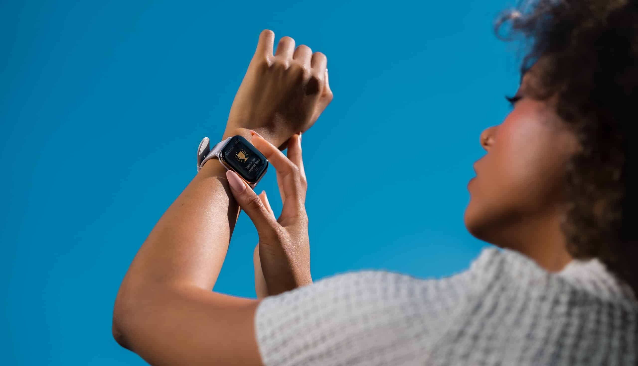
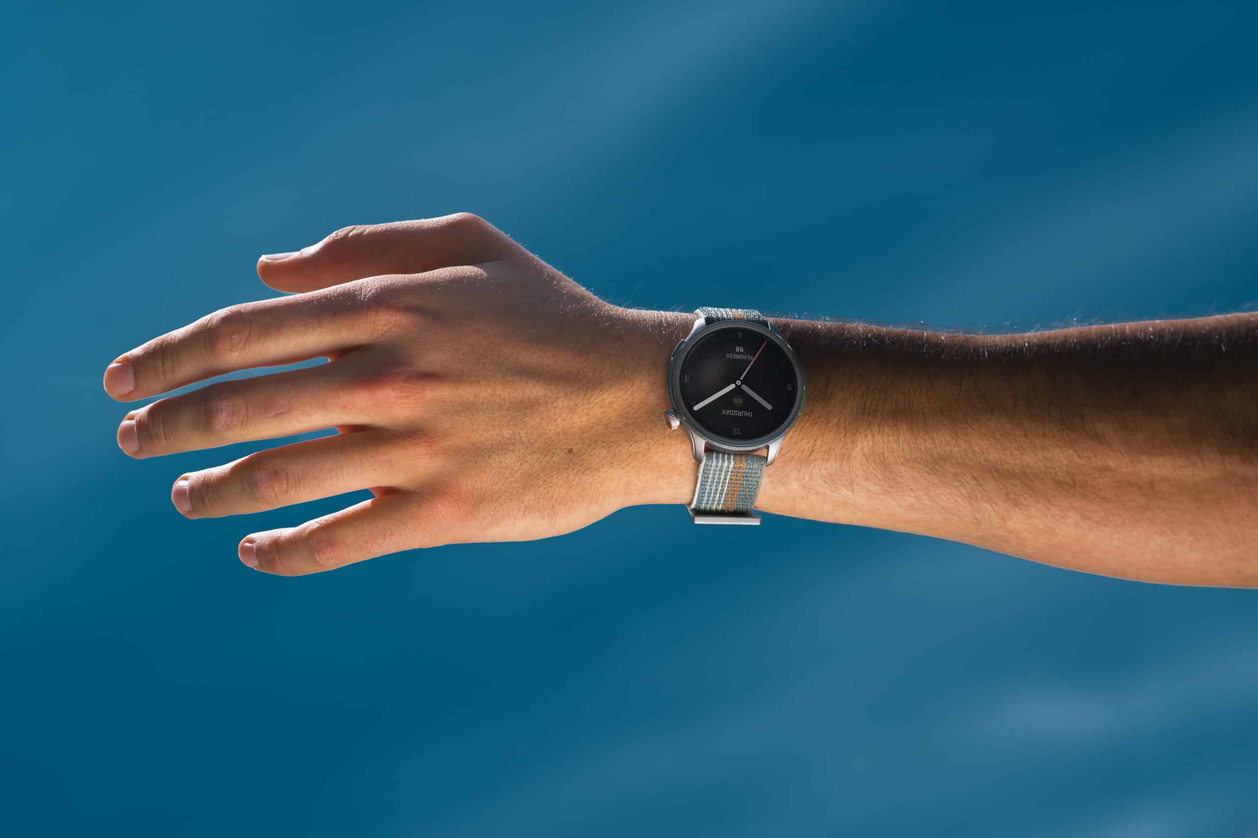
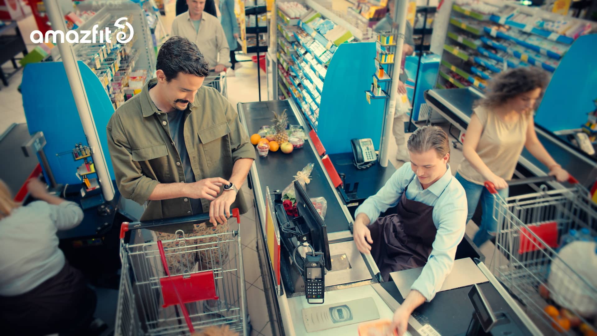
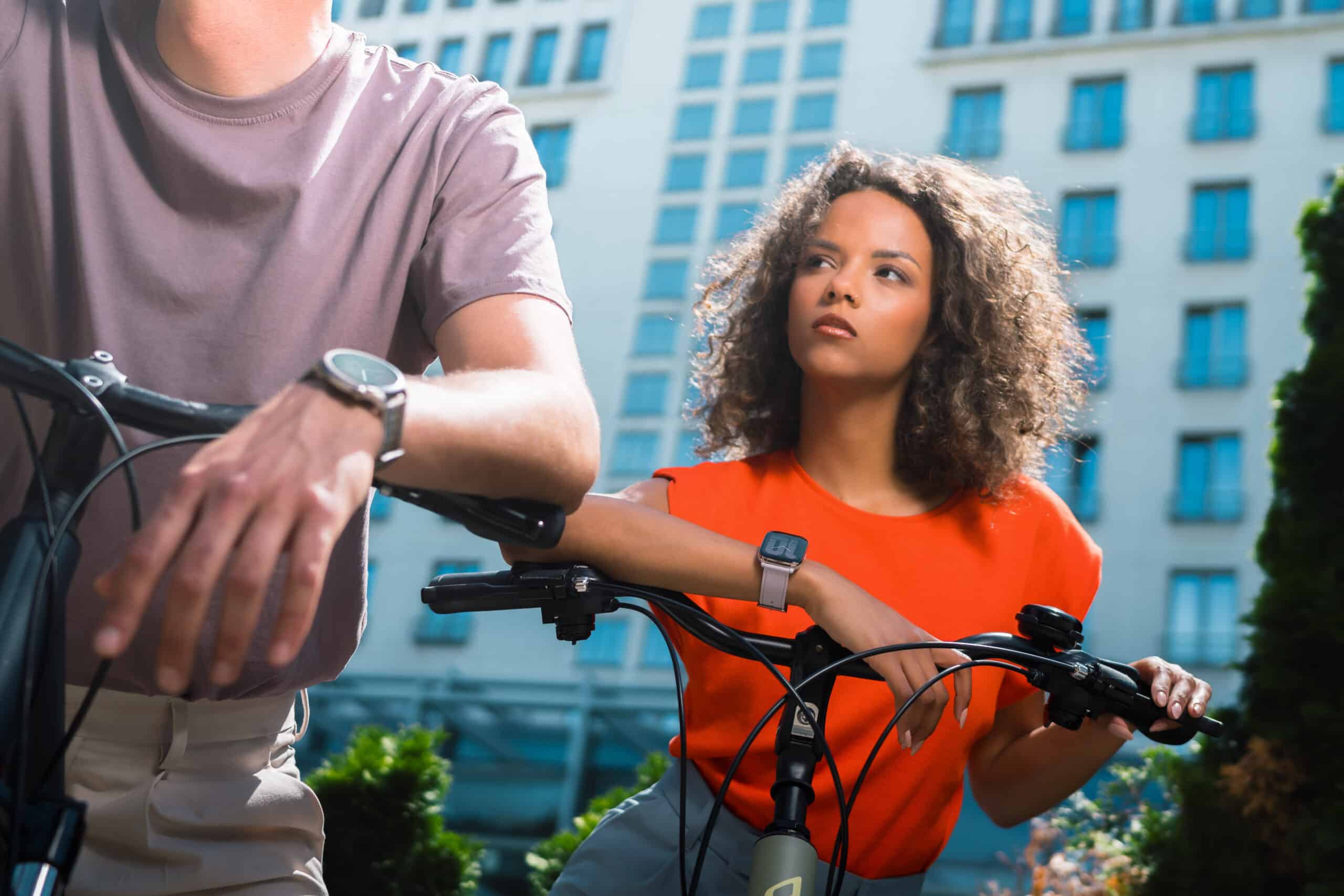
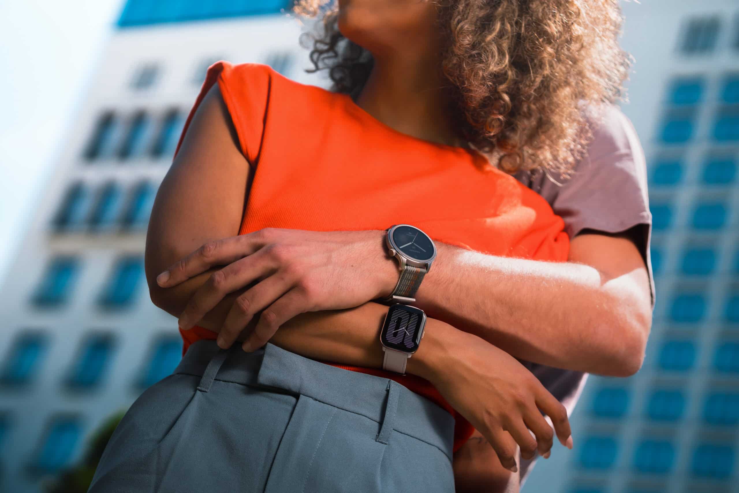
Creating a global campaign for Amazfit was a thrilling and demanding project, primarily due to the tight timeline. The task was to present the Amazfit Balance smartwatch and its revolutionary technology in a fun and accessible way, highlighting its role in making people more active, healthier, and mobile.
Services:
Design & Art Direction
Digital & Content Creation
Top 10
Video & Photo Production
Industries:
ICT
Sports

The journey began with an inspiring, international pitch. We designed a campaign that would resonate across multiple markets and languages, which won us the pitch.
From brainstorming to the final approved script, we developed at least eight different commercials. Once the client selected the final script, we meticulously refined each scene to ensure clear and accurate communication across cultures, as the ad would have a global audience.
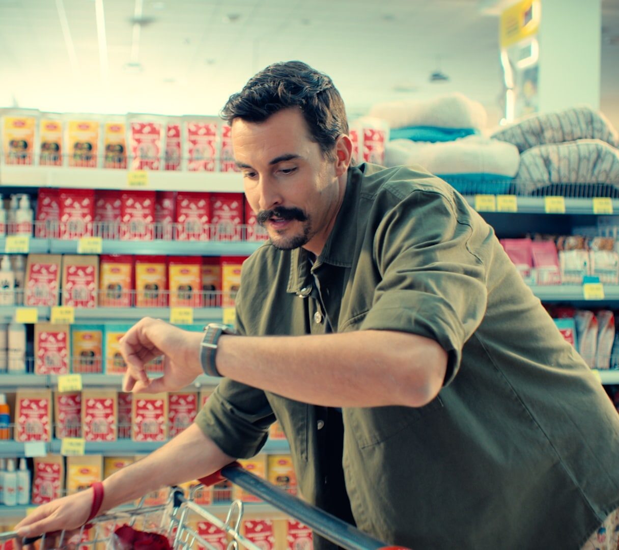
The creative concept of the campaign centered around showcasing the practical, everyday use of Amazfit’s revolutionary AI-integrated smartwatch. The narrative followed a young, energetic individual who, with the help of the device’s intuitive suggestions and practical functions, navigated daily challenges with ease.
This transformed Amazfit from a simple smartwatch into an indispensable ally for the urban lifestyle.
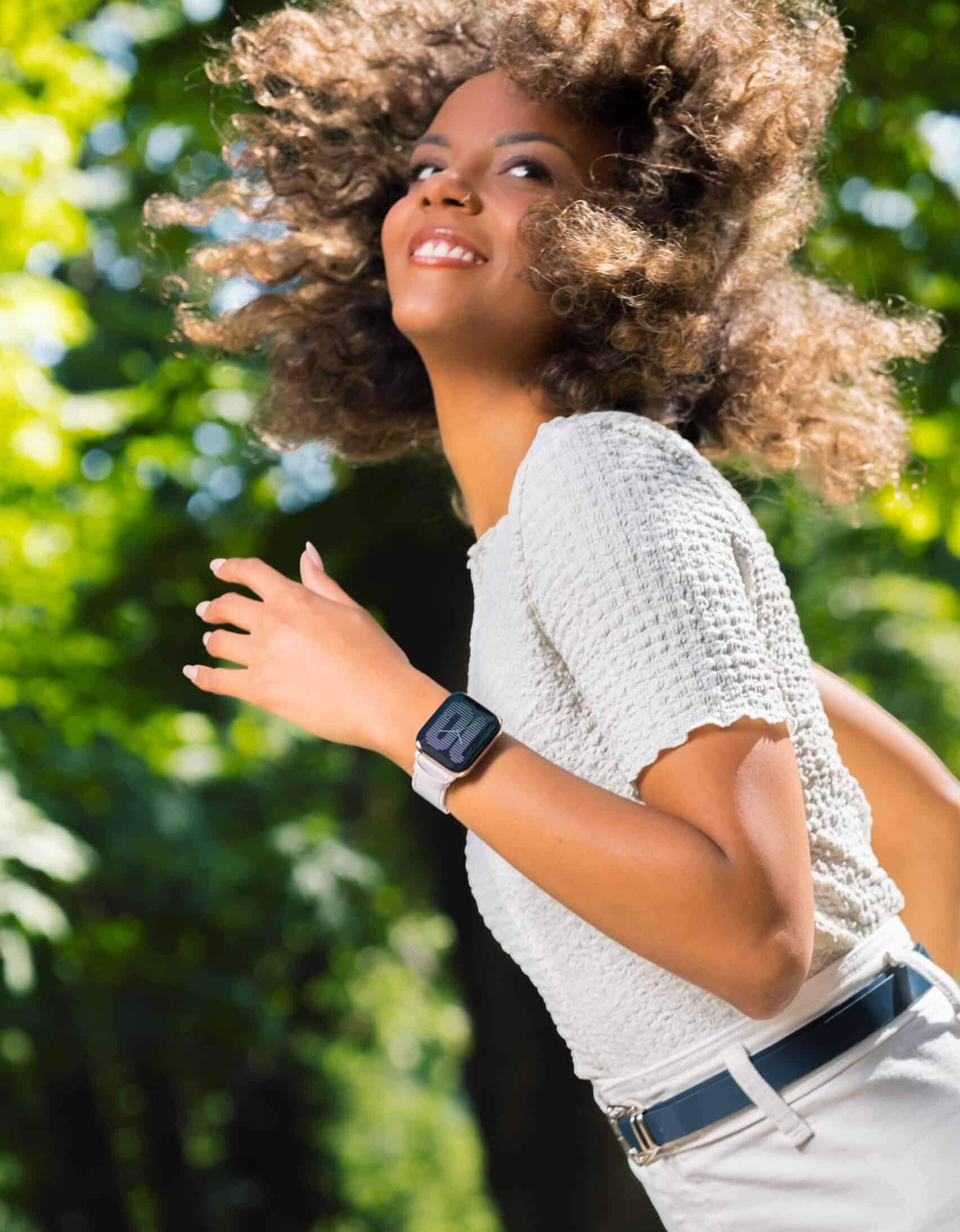
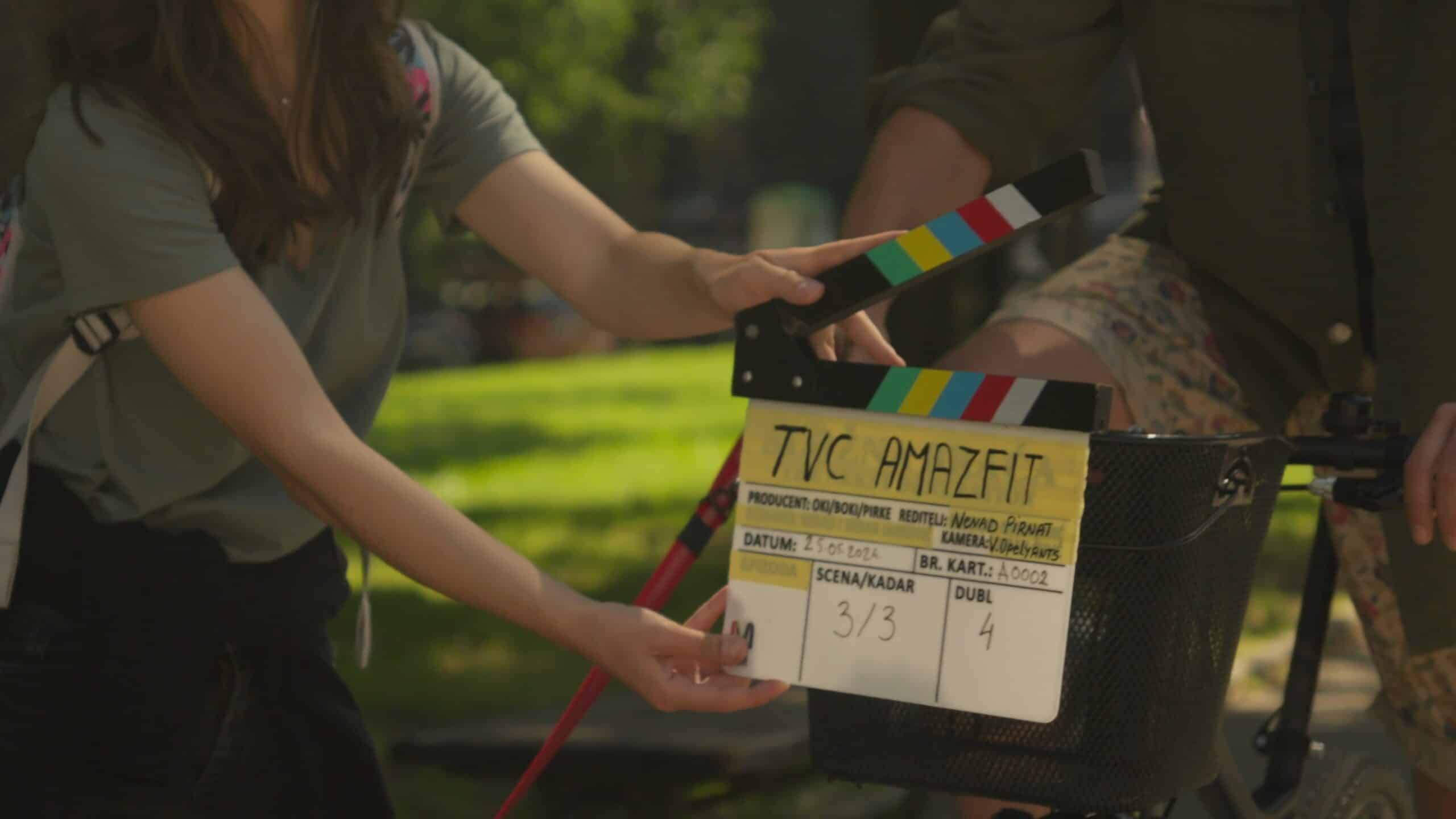
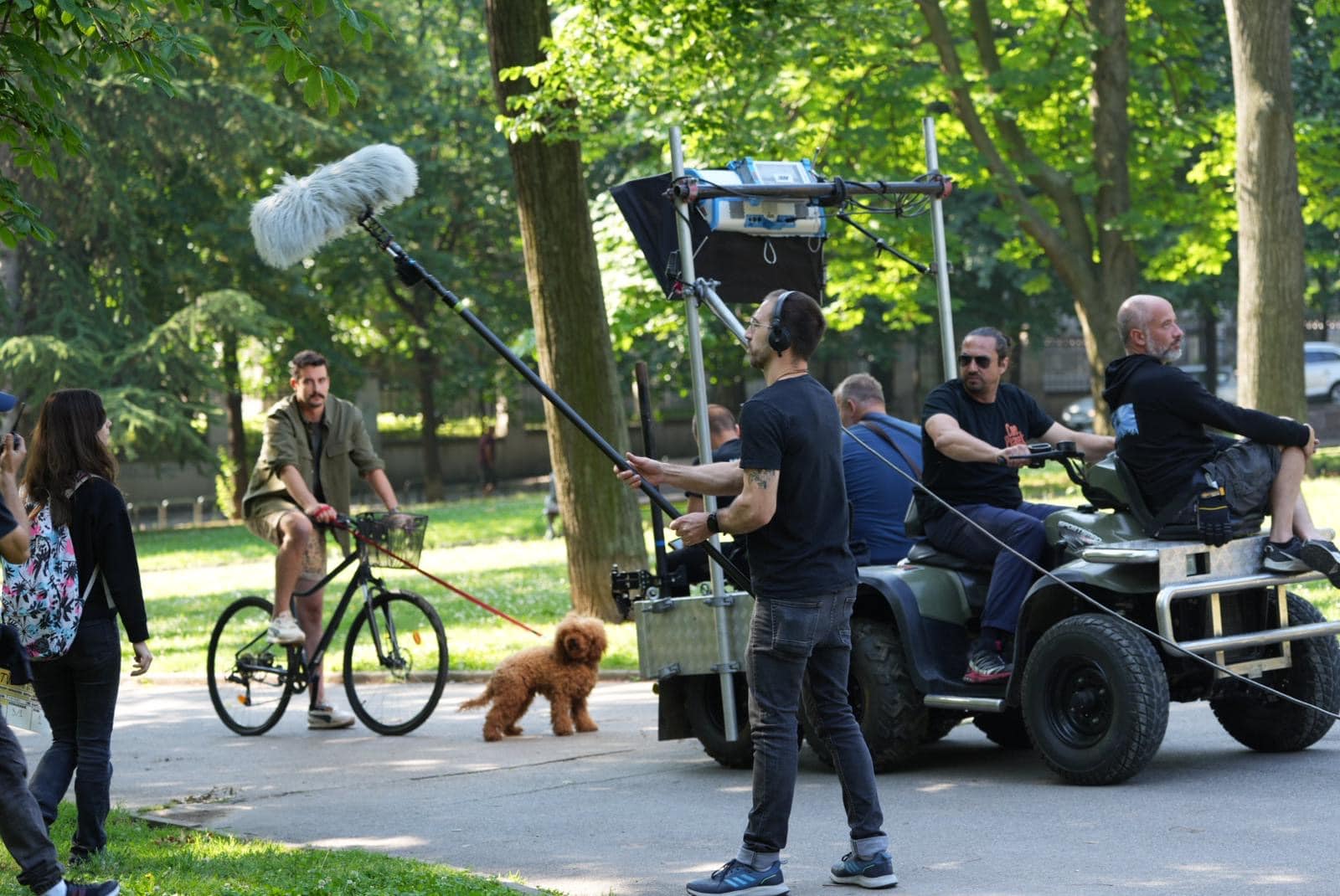
Art direction was at the heart of our creative process. To achieve the highest quality, we brought in a Cannes Lion-winning director of photography. Alongside our talented actors, directors, and production team, we used state-of-the-art equipment and technology to shoot the commercial in stunning 8K resolution.
The TV commercial was only part of our comprehensive strategy. We produced several shorter versions of the video to maintain a cohesive online identity and bolster Amazfit’s social media presence. To ensure the campaign’s consistency across various media channels, we also shot a series of lifestyle photos.
The timing was crucial. We aligned the campaign with major summer sporting events like the European Football Championship and the Olympic Games to maximize visibility.
Despite the ten-week timeline, we delivered a polished TV commercial, several short social media videos, and a series of lifestyle photos. The campaign, initially produced in English and dubbed into four other languages, is currently airing on sports channels in Germany, France, Spain, and Italy, with plans for further expansion during the Paris Olympics. Digitally, the campaign is active in numerous additional countries.
The Amazfit international team expressed great satisfaction with our collaboration, the speed of our creative work, and the overall project organization. Our team thrived in the international environment, appreciating the diverse perspectives on humor, film, and language.
The campaign successfully presented the smartwatch, Amazfit Balance, as a necessary companion for urban life, meeting the client’s expectations and showcasing the product’s innovative capabilities. It is also the fastest advertising campaign in our portfolio. It testifies that we are open to different types of cooperation and that we successfully respond to really big challenges.


The teaser campaign for Buro.Desert Rose was launched three days before the event.
Services:
Digital & Content Creation
Video & Photo Production
Industries:
Art, Entertainment & Lifestyle
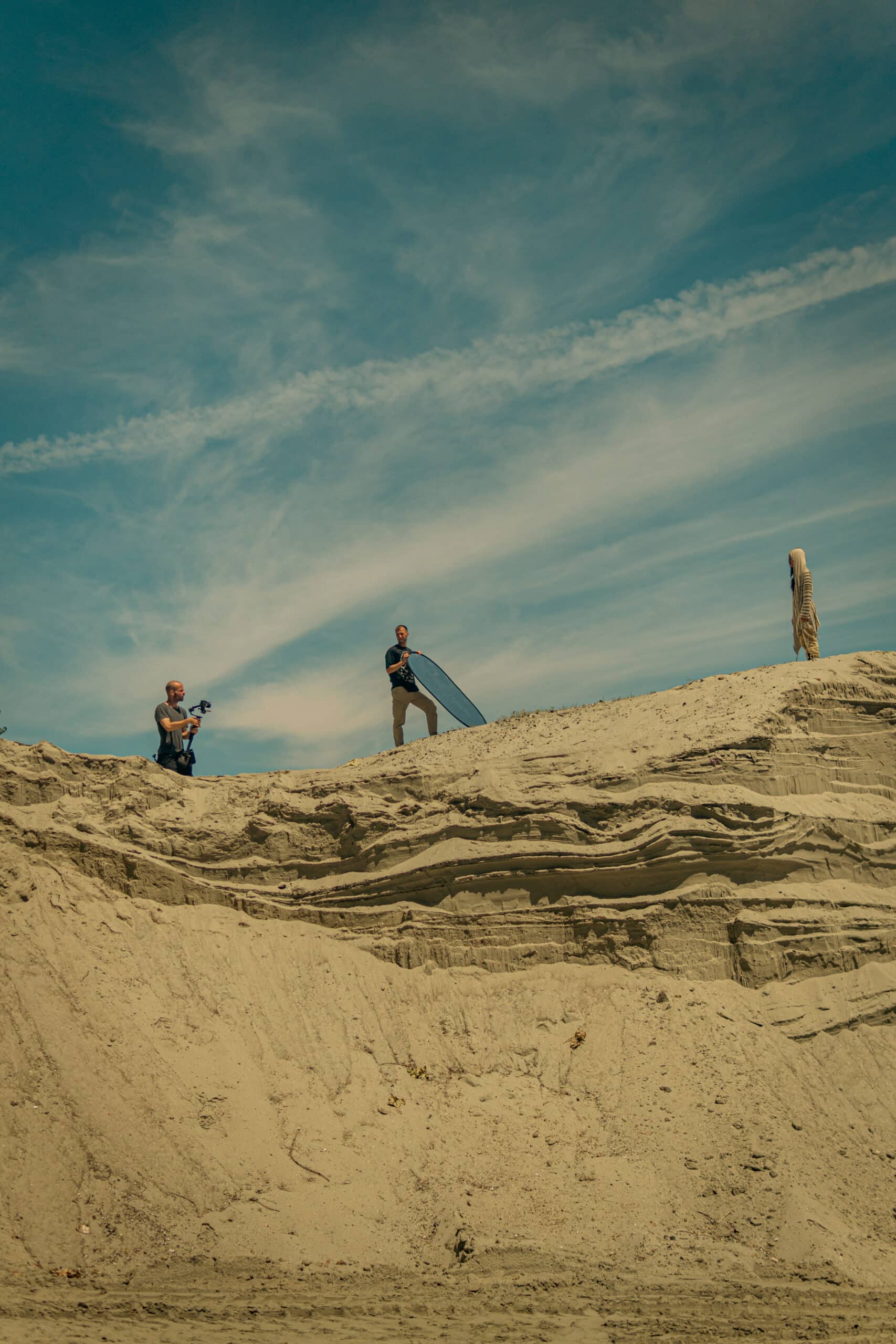
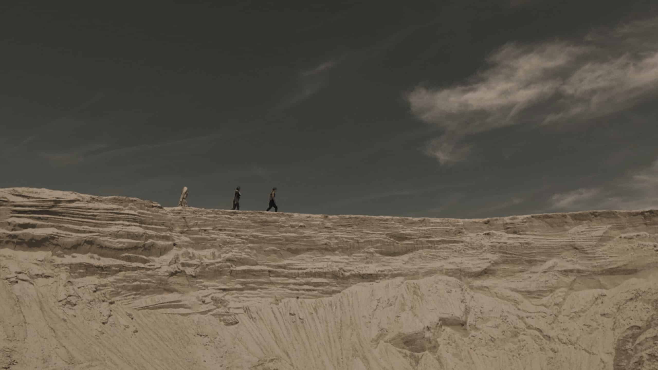
Intensive preparations for the Buro. Desert Rose event at Tašmajdan Stadium had their exciting ‘filmic’ prelude, adding a touch of mystery and adventure to the entire project.
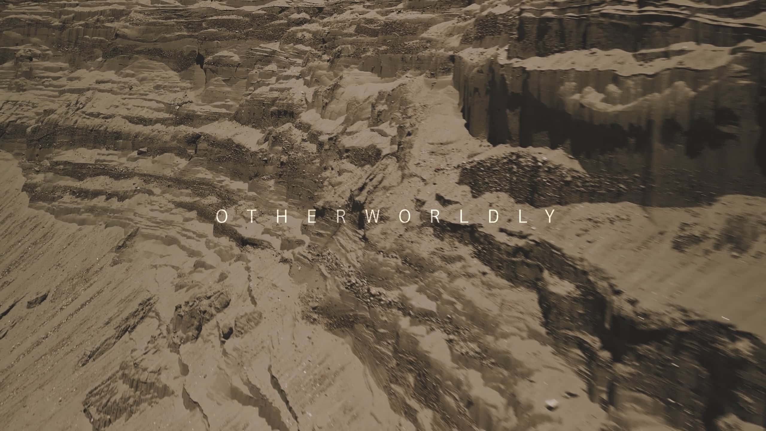
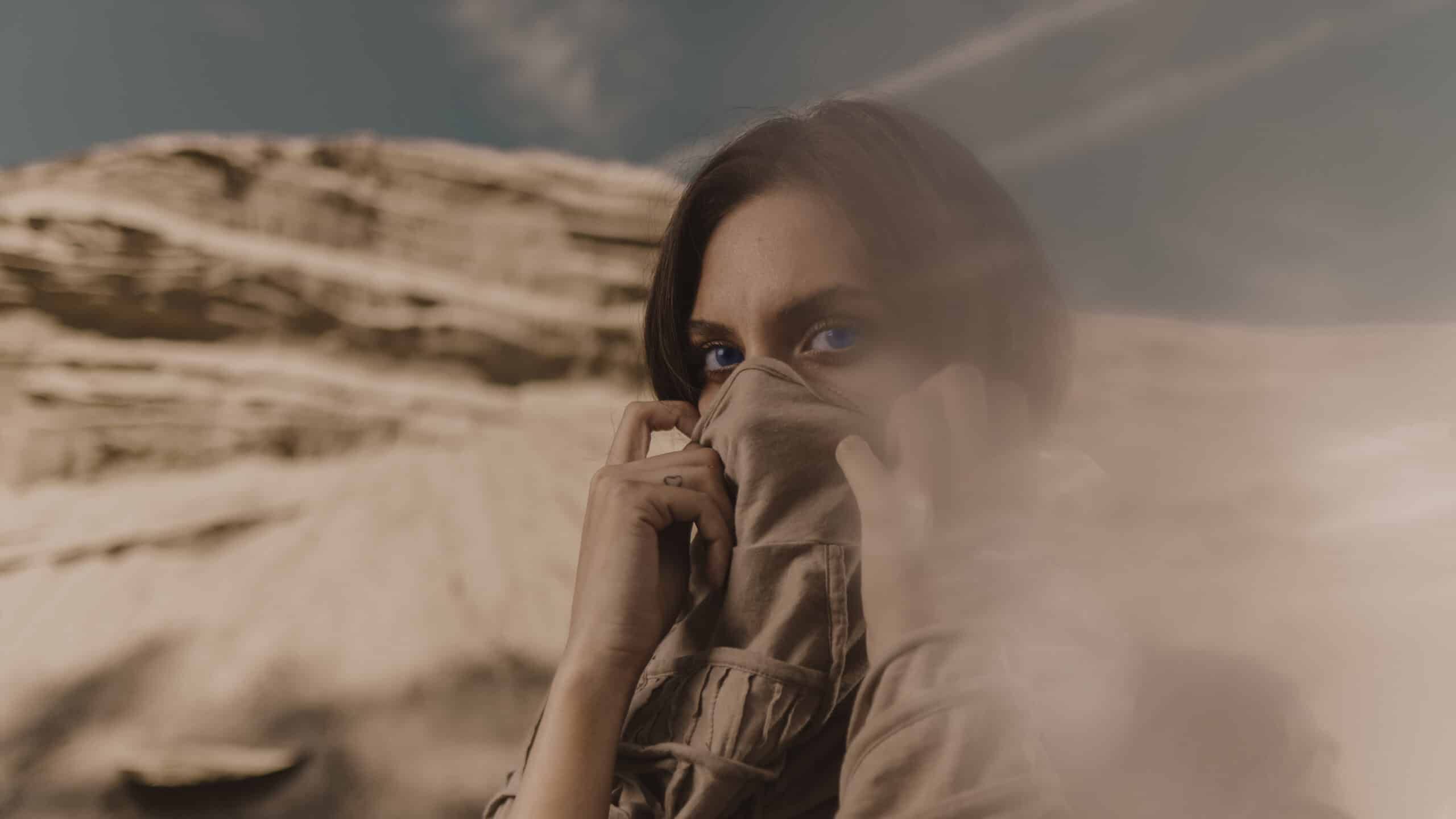
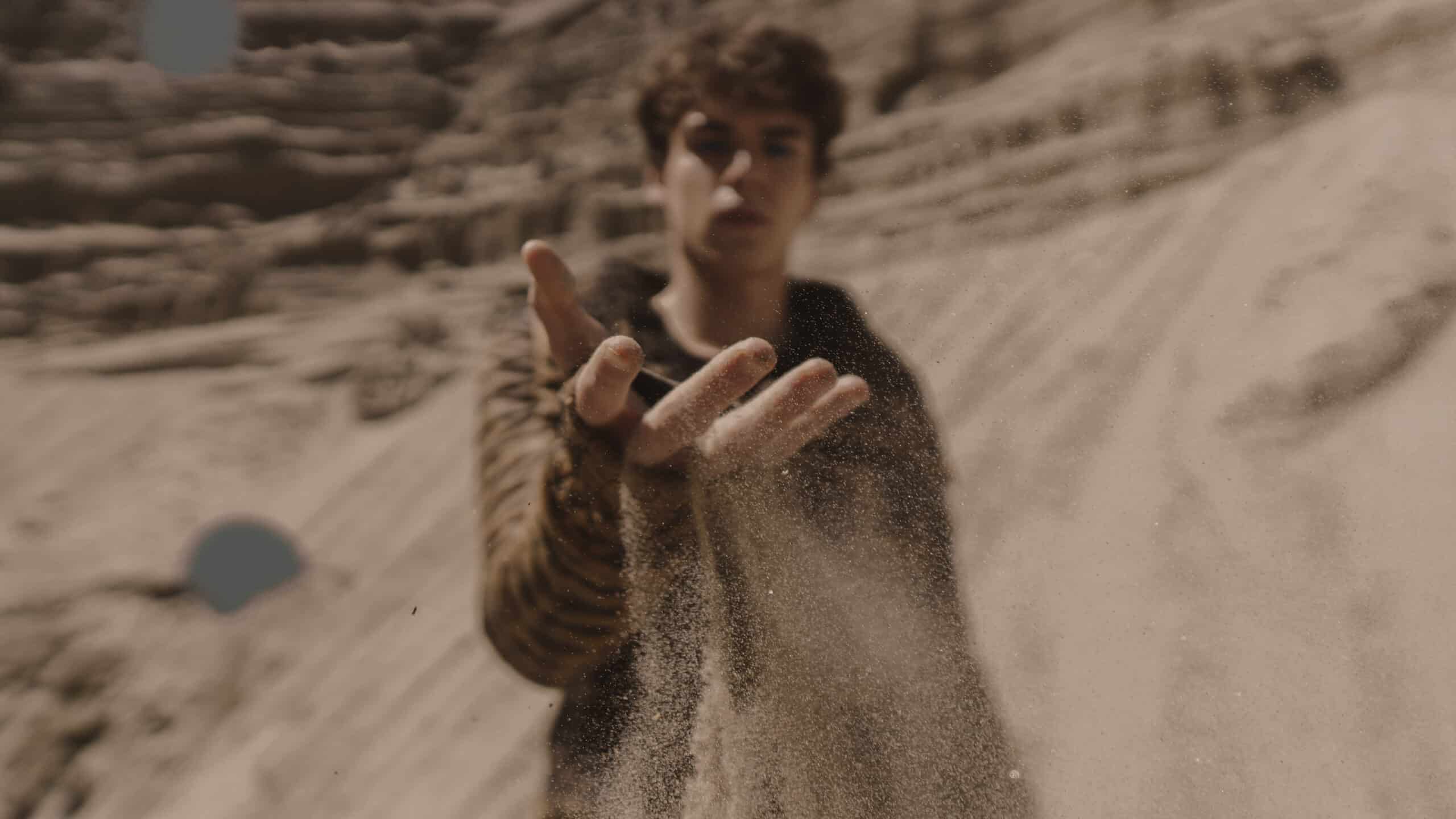
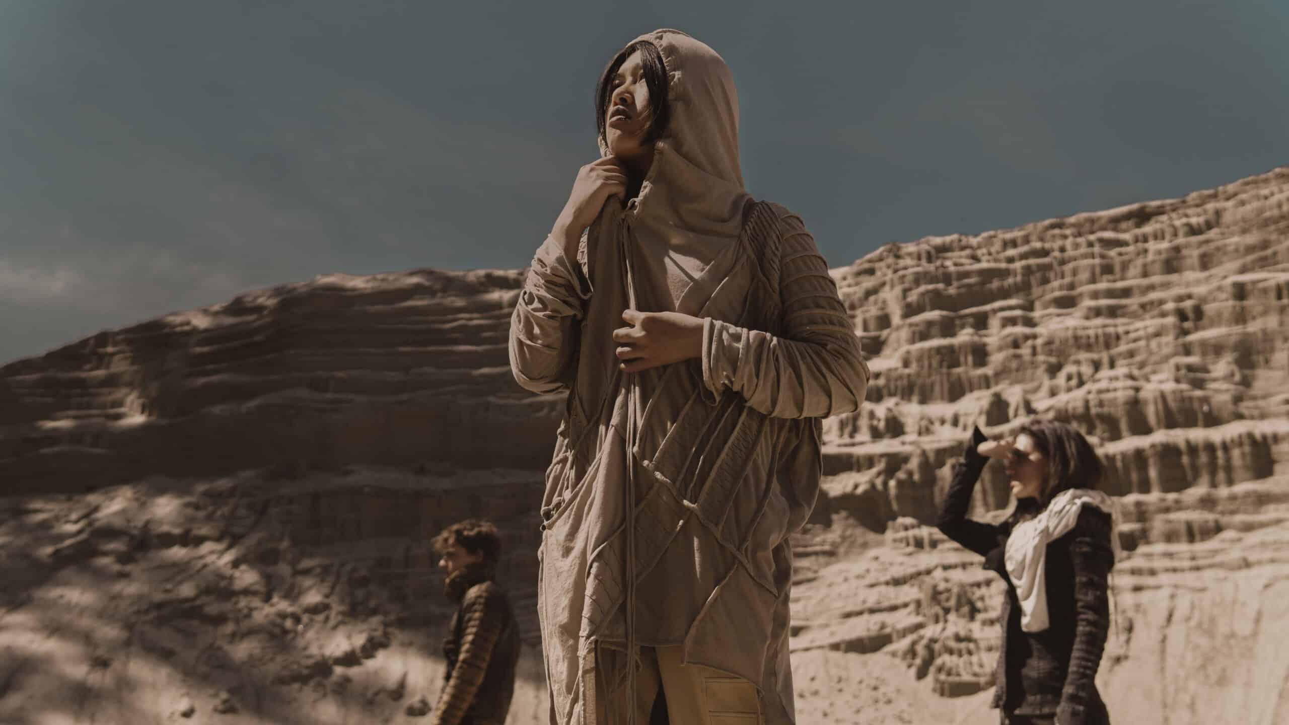
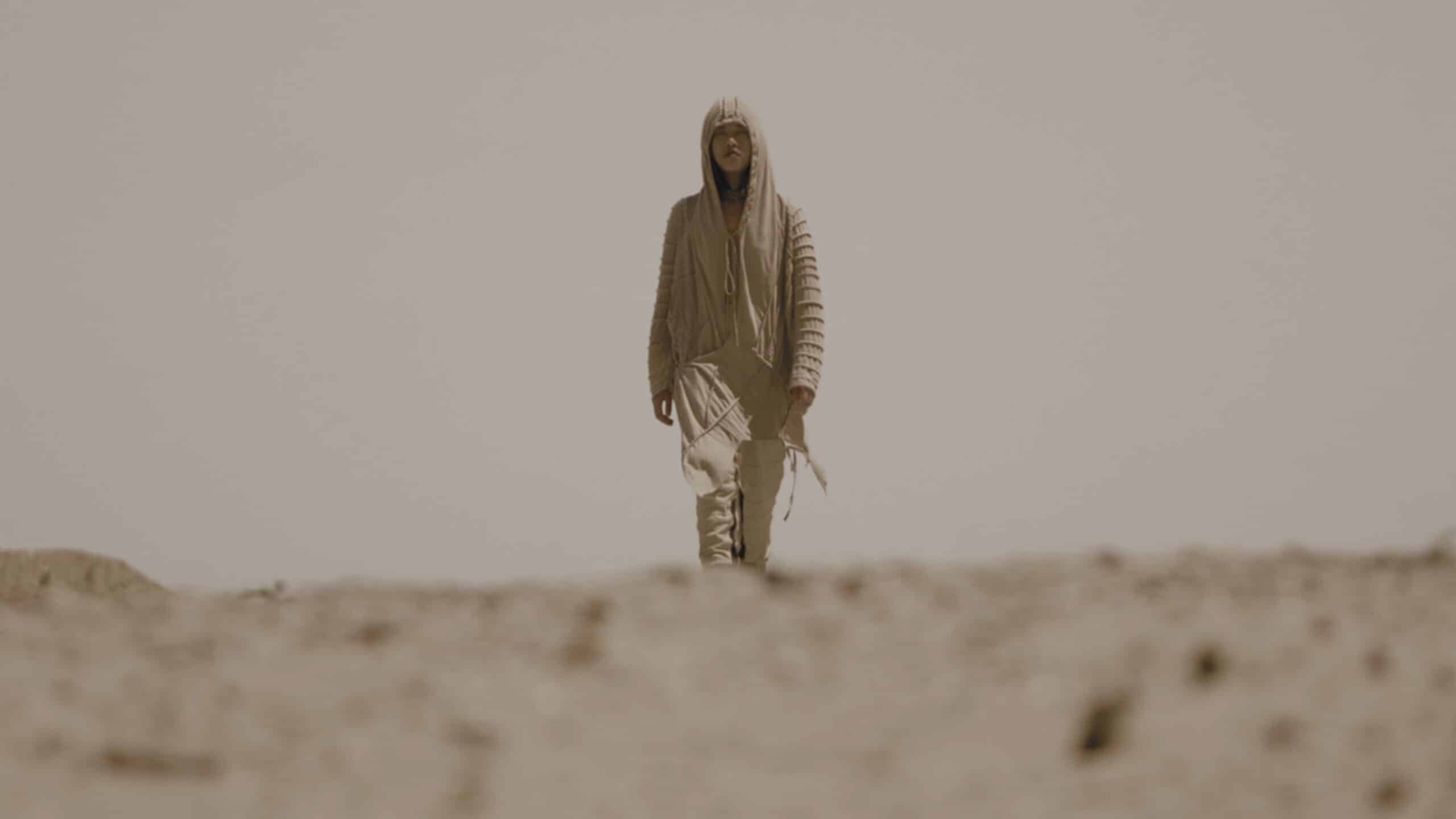
The idea for the teaser video was inspired by the movie ‘Dune’, with desert aesthetics, colors mimicking heat and sand, and ethereal feelings and scenes characteristic of this cult science fiction novel and film.
The inspiration for the teaser video comes from the famous SF franchise ‘Dune’: desert aesthetics, warm sandy colors, and ethereal scenes evoke the atmosphere of this iconic science fiction work.
In the spectacular sandy environment, we filmed a series of impressive promotional teaser spots. Finding the right cast for this shoot was challenging because we wanted to select protagonists whose appearance and acting abilities perfectly matched the film aesthetics that formed the basis of the creative concept.
It consisted of two short teaser videos that didn’t reveal the essence of the event but highlighted key words, atmosphere, and inspiration for the event. The final, longest reveal video unveiled event details on the day of its occurrence.
The goal of this mini-campaign was to generate additional hype around the “Desert Rose” event and intrigue the public.
The campaign was conducted through Instagram as the primary communication channel, and segments of the video content were also used at the event itself and displayed on LED screens. Altogether, the video content achieved over 30,000 views on Instagram.

The actors shone in specially tailored costumes from Demobaza, the brand originally responsible for the costumes in ‘Dune’. Their presence not only contributed to the event’s atmosphere but also emphasized the mystical beauty and splendor of this unique setting.
These video recordings set the tone for what followed at Tašmajdan Stadium in Belgrade, where guests of the Buro. Desert Rose event embarked on a journey through a desert oasis of creativity and elegance. The color palette in the film aligned with that of ‘Dune’, while the shots were framed to support the event’s concept and provide an overall experience of mystique and gentle unreality. This was achieved using modified sun filters with transparent polymer, and the spot was filmed at a high frame rate ranging from 50 to 200 fps to achieve a specific ‘otherworldly’ effect.
This cinematic prelude added depth and emotional connection to the event theme, creating anticipation and excitement among guests who embarked on a journey through the imaginary world of desert elegance.


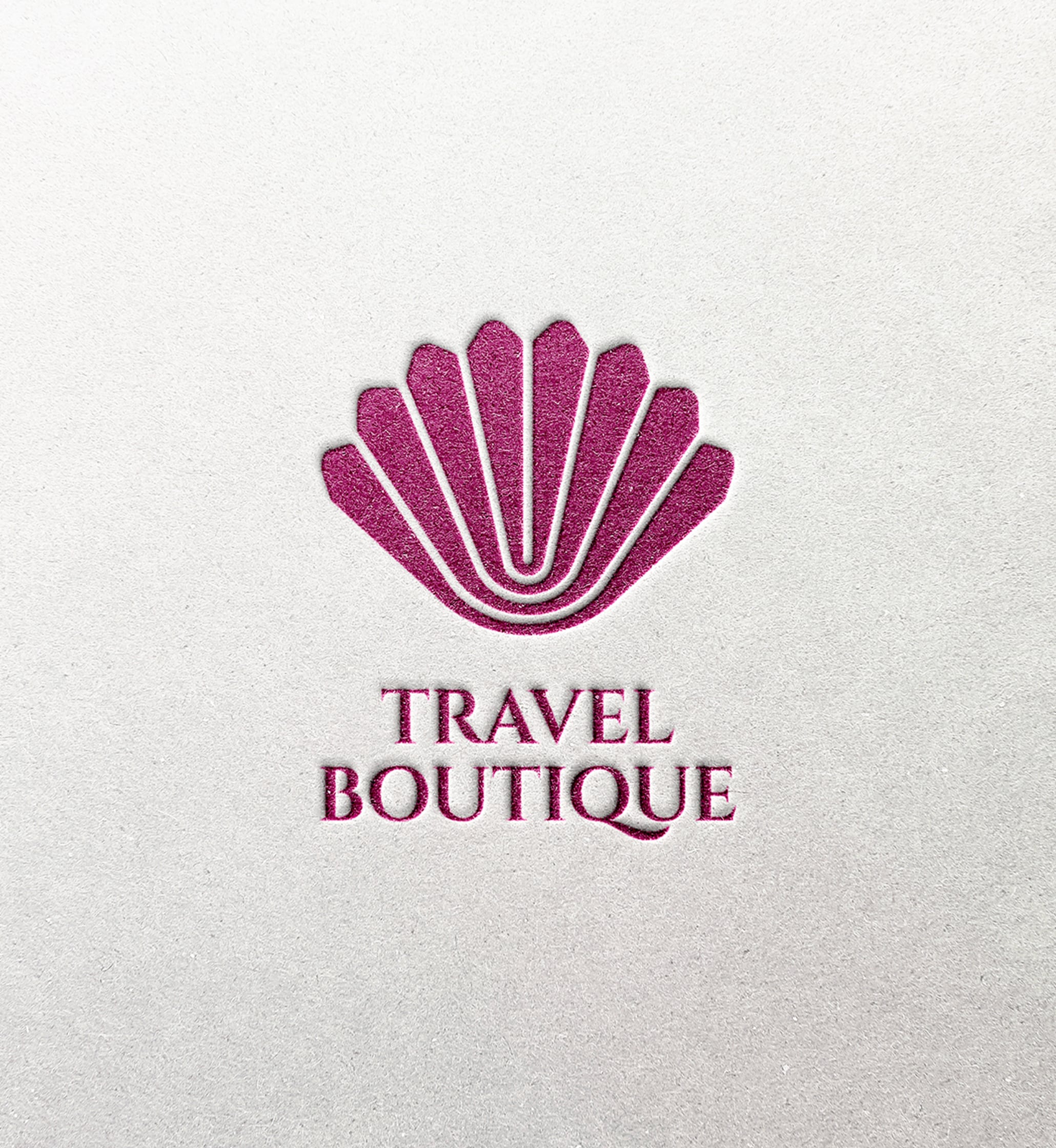
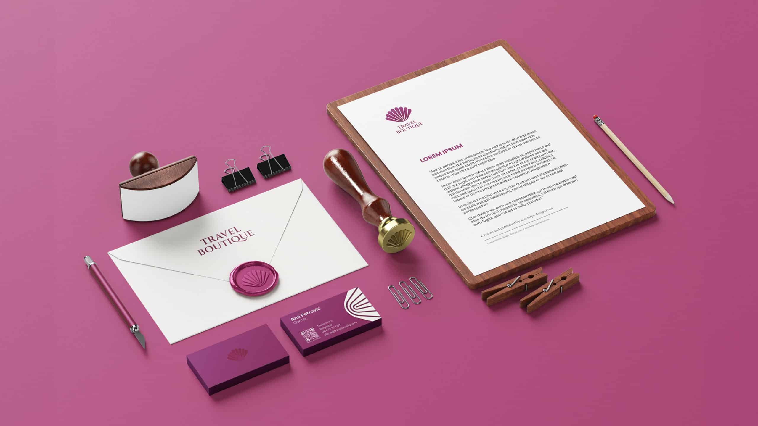
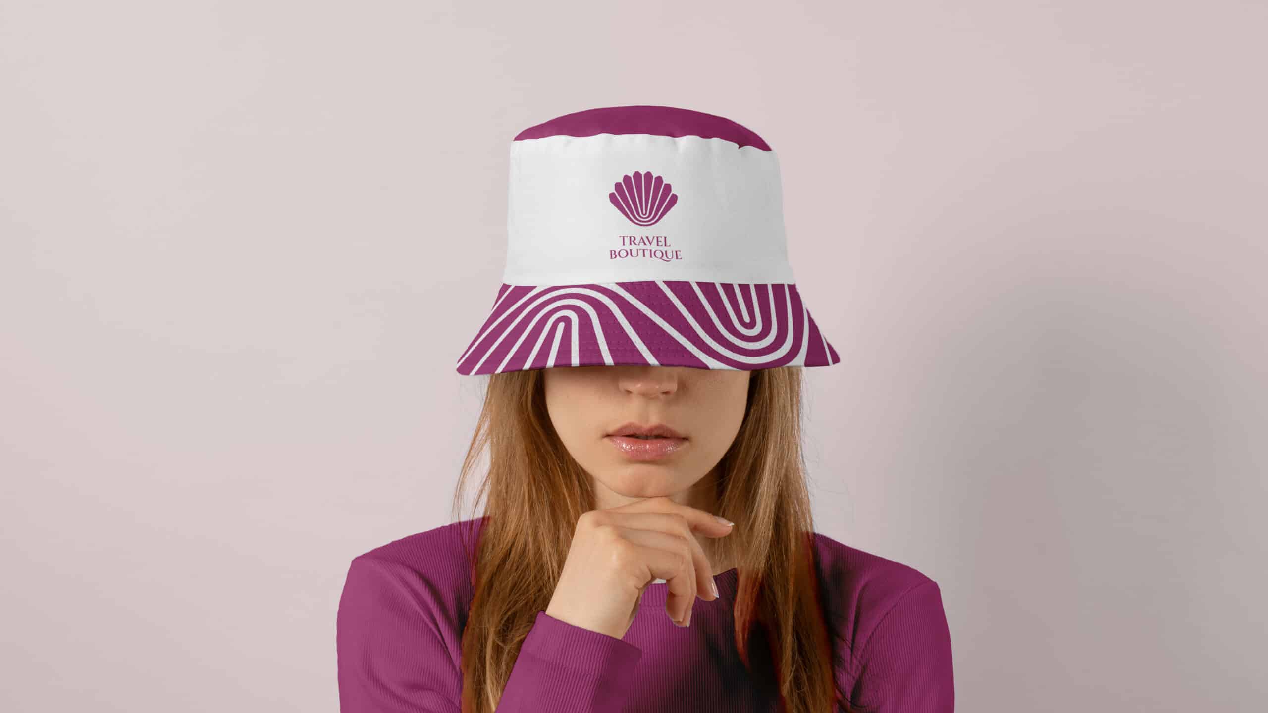
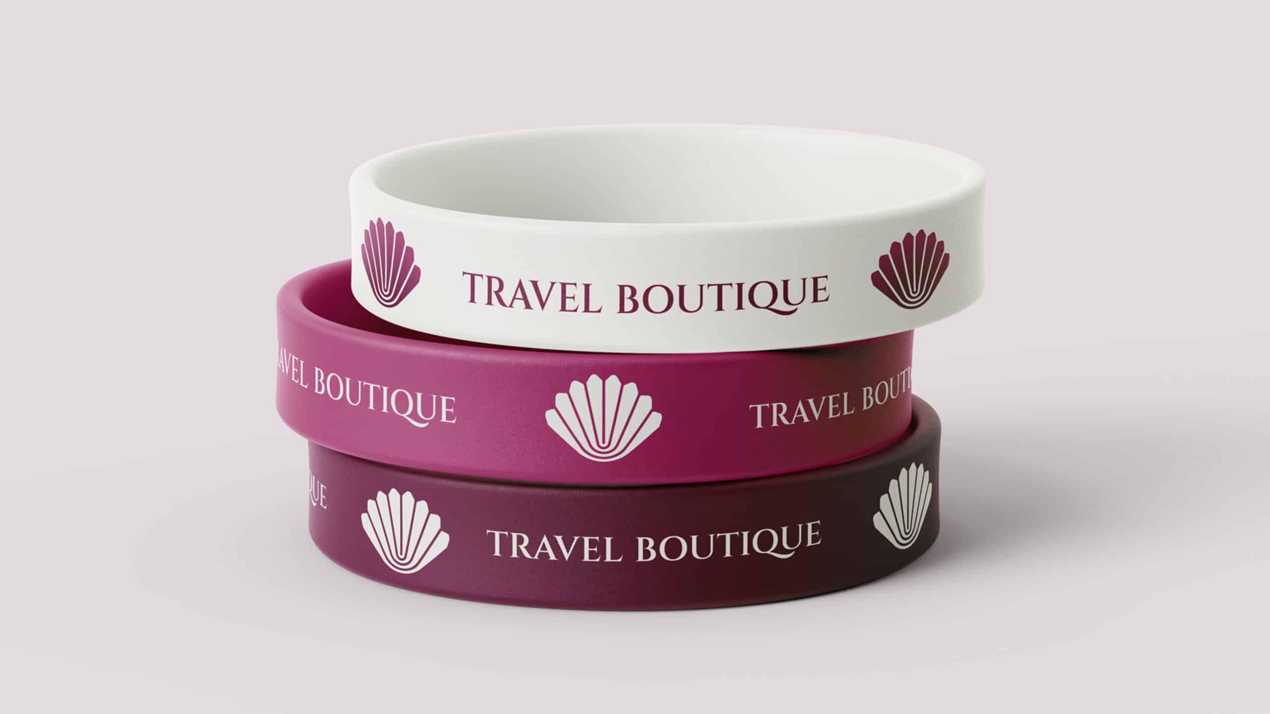
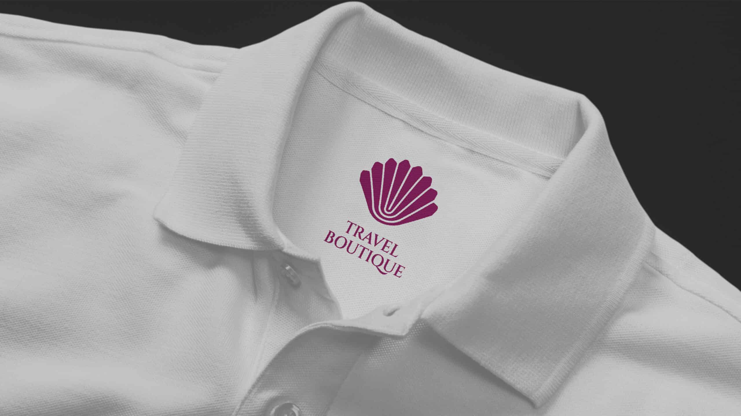
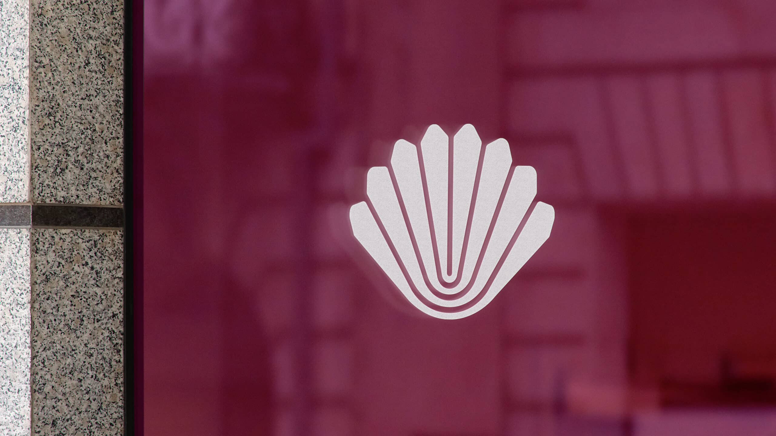
This is how a travel agency changes its look. But not just any agency— it’s Travel Boutique, a Belgrade-based agency known for organizing luxury travel.
Services:
Brand Development
Digital & Content Creation
Industries:
Hospitality & Travel
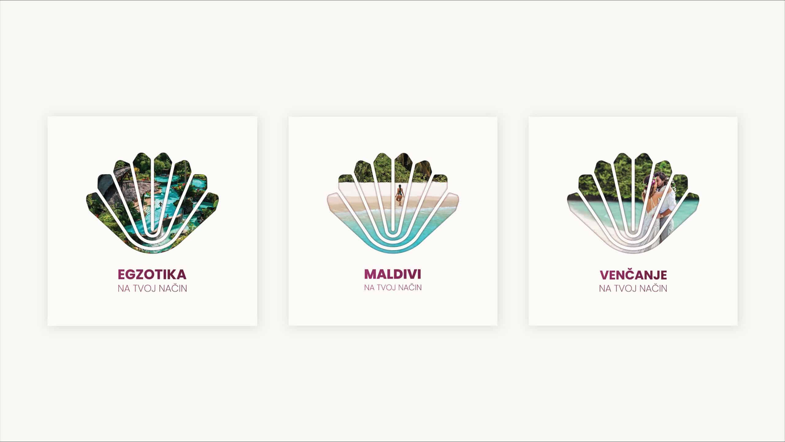
Our job was to showcase the most amazing, faraway, and hidden spots around the world. At the same time, we wanted to show how travelers can customize their trips with Travel Boutique. This means each traveler and destination is special, just like a precious pearl.
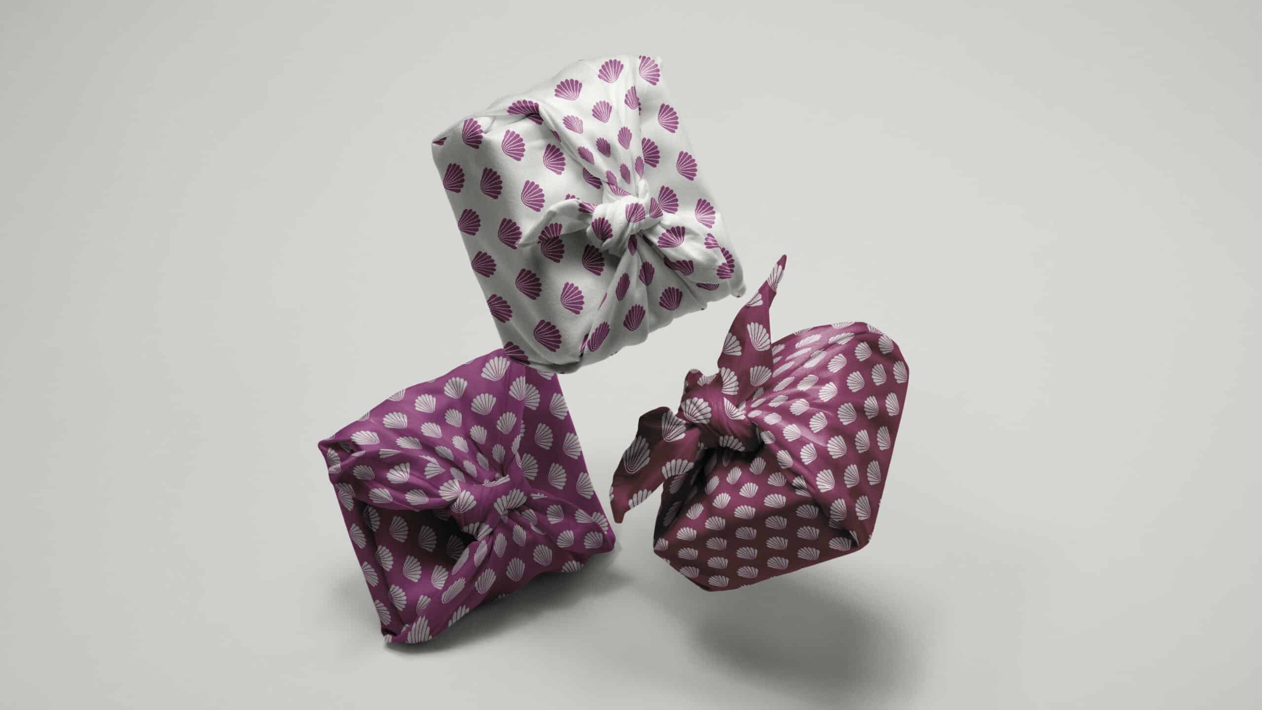
We thought about all of this and decided the shell symbol made perfect sense. We came up with this idea by thinking about everything the brand stands for. We looked for the right words, colors, and shapes to represent what the agency wanted to offer when they started.
The slogan we chose sums up what Travel Boutique is all about. We keep our communication simple and honest, without using big words or hiding anything. We want people to know exactly what to expect when they travel with the company, just like how Travel Boutique shows destinations on social media – just real pictures.
We updated the website, social media, and other materials to match the new look. We also made a series of social media posts, including a video about the logo change and what we’ve achieved in our 14 years in business.
Projects like this are exciting because we get to make an already great brand even better, both in how we talk about it and how it looks.
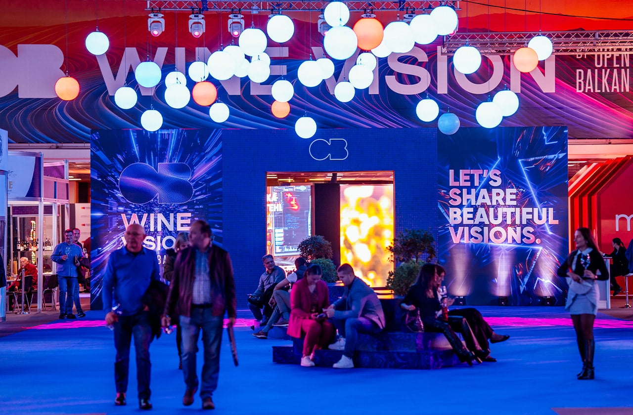
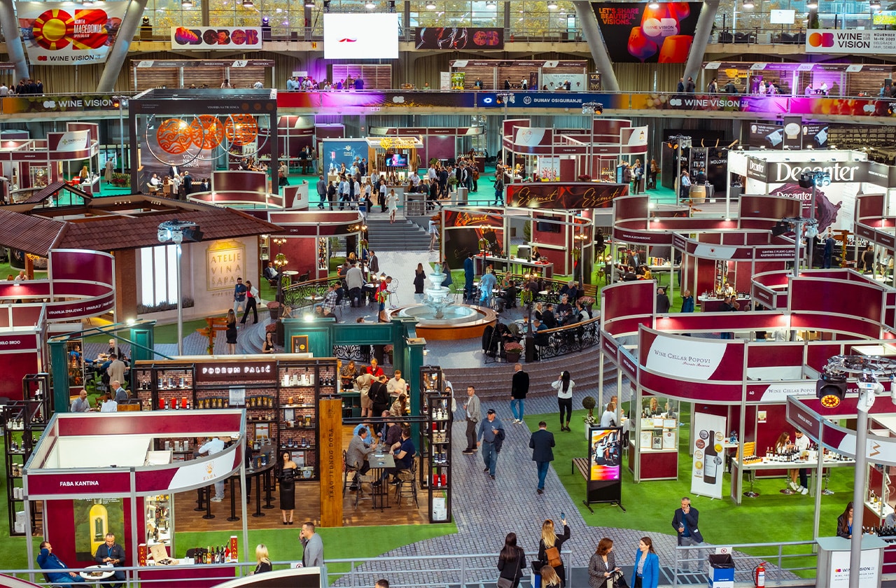
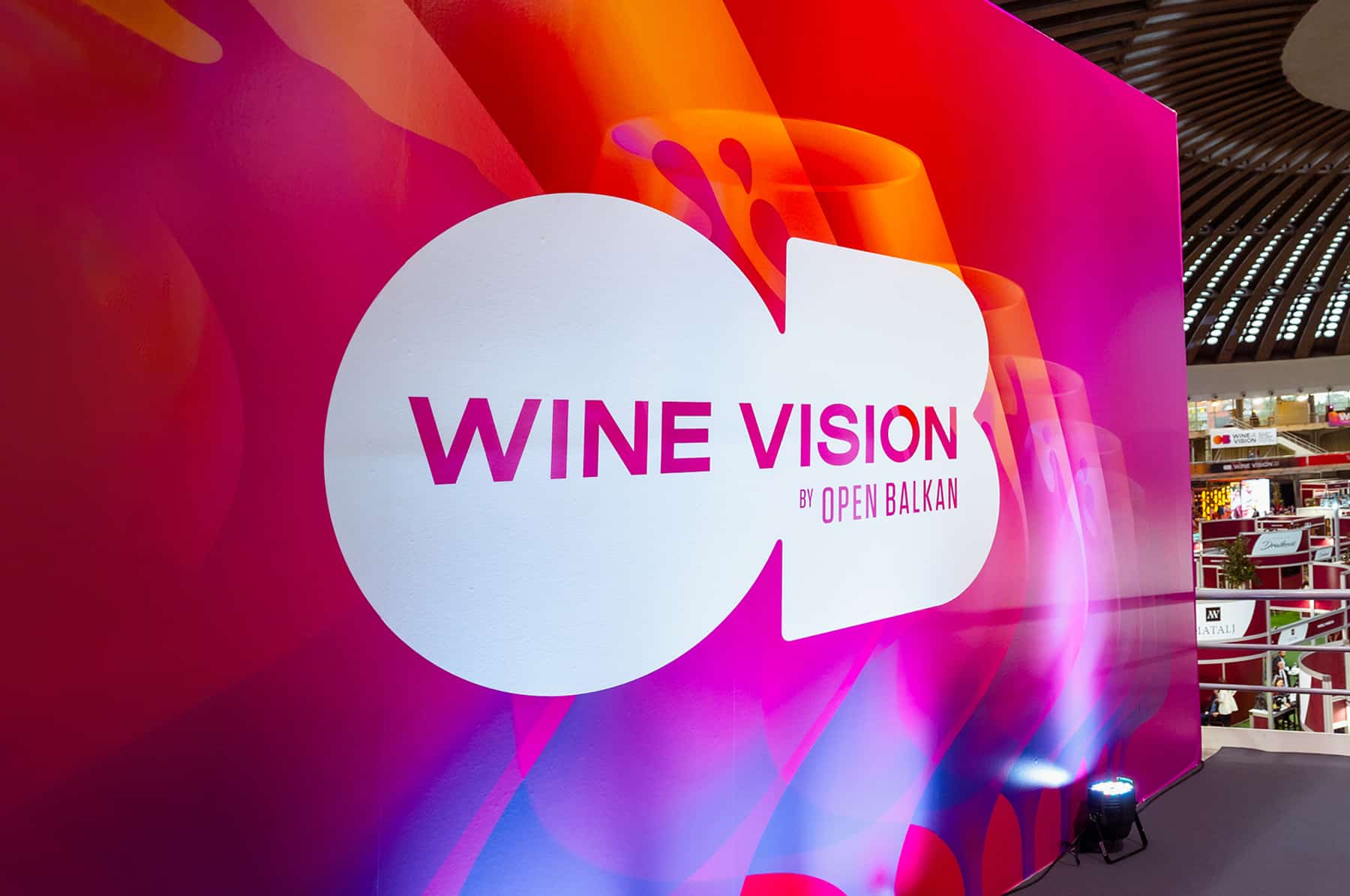
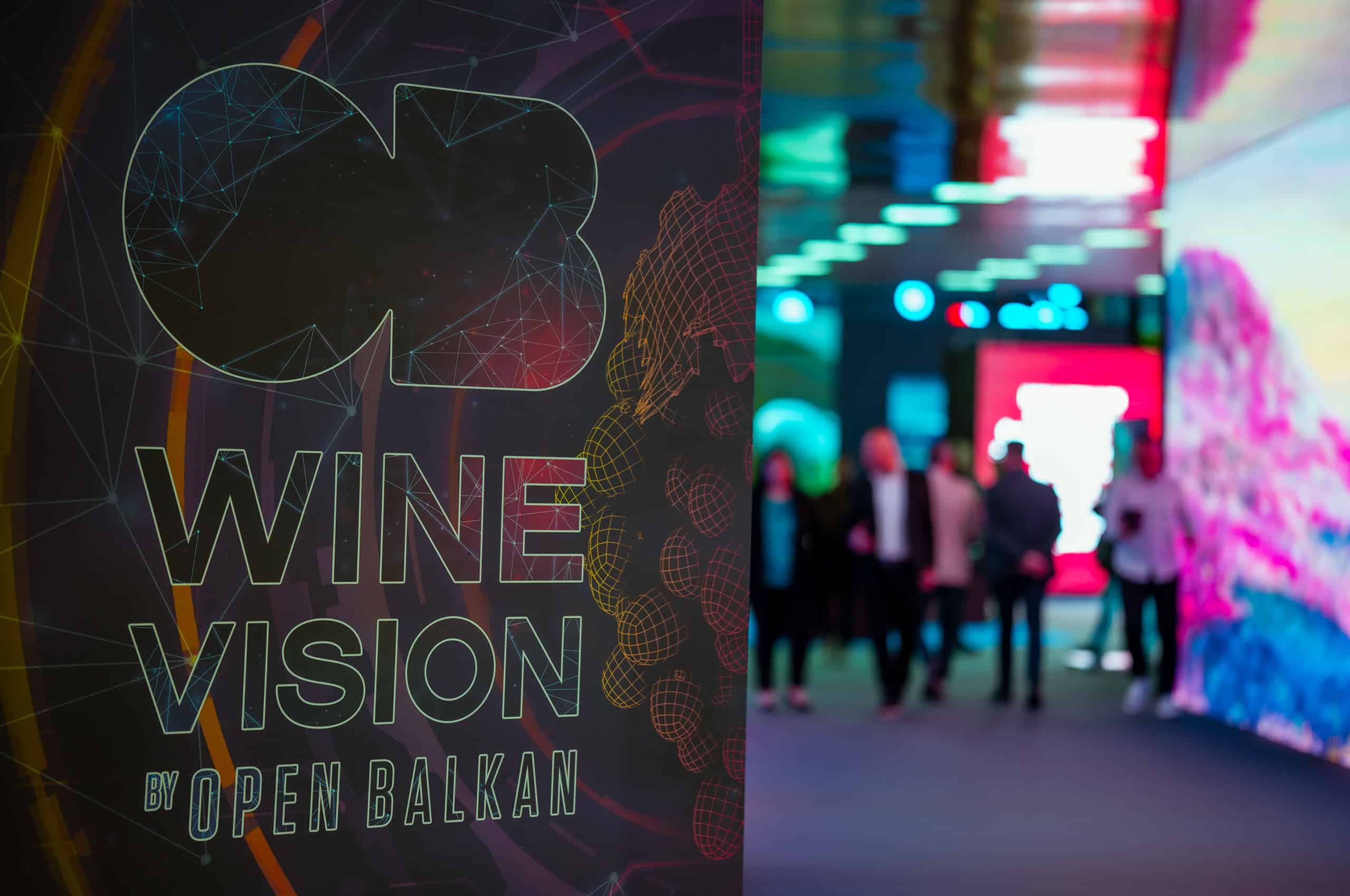
Another wine vision has been successfully completed! The second international wine fair “Wine Vision by Open Balkan”, held from November 16 to 19, proved once again that it is the largest and most recognizable wine festival in this part of Europe.
Services:
Brand Development
Digital & Content Creation
Experience Design & Event Production
Industries:
Government, Business Associations and NGO
Wine & Spirits
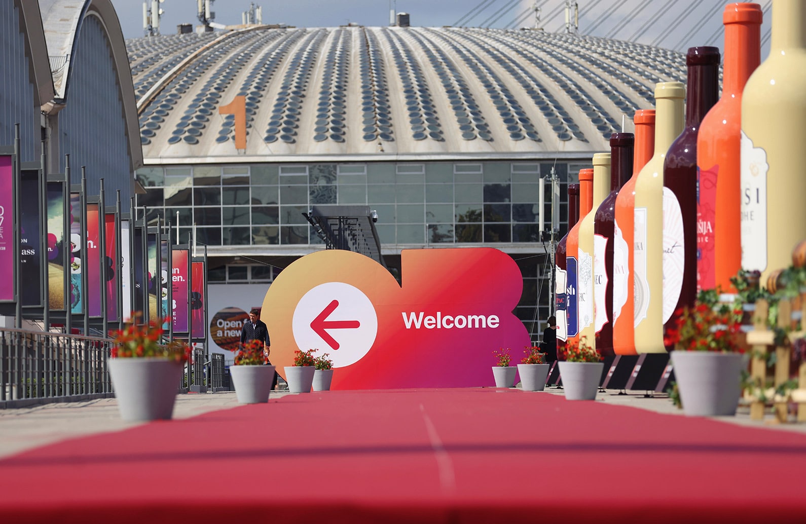
Another international festival of wine, food and tourism “Wine Vision by Open Balkan” was held under the auspices of the governments of Serbia, North Macedonia and Albania, and as part of the Open Balkans initiative.
Again, the executive production of this unique event was entrusted to the creative and production team of M2Communications, and the fair brought together the best wine producers from the region and the world in one place. More than 600 exhibitors from almost 30 countries participated in this unique event, which was visited by several tens of thousands of wine lovers over the course of four days.
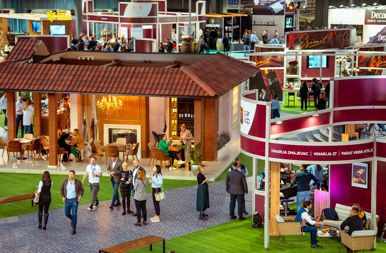
The creative concept called “Wine as a constant of civilization” was based on the idea that the cultivation of vines and the production of wine are inextricably linked with the history and progress of people (and all of humanity) in different time periods. Visitors and oenophiles had such a unique opportunity to travel through space and time while enjoying the quality wines of the region and the world.
The organization of an event of this magnitude was a complex and multidimensional project, which included numerous aspects of production and the realization of a series of accompanying programs and exhibitions, and visitors had the opportunity to visit thematically differently designed halls. The entire display of the Wine Vision by Open Balkan was realized in six halls of the Belgrade Fair and was divided into three units: The Roots of Wine Culture, The Wonderful World of Wine, and A View of the Future, which talked about the past, present, and perspectives of winemaking and the wine industry in our country and in the world.


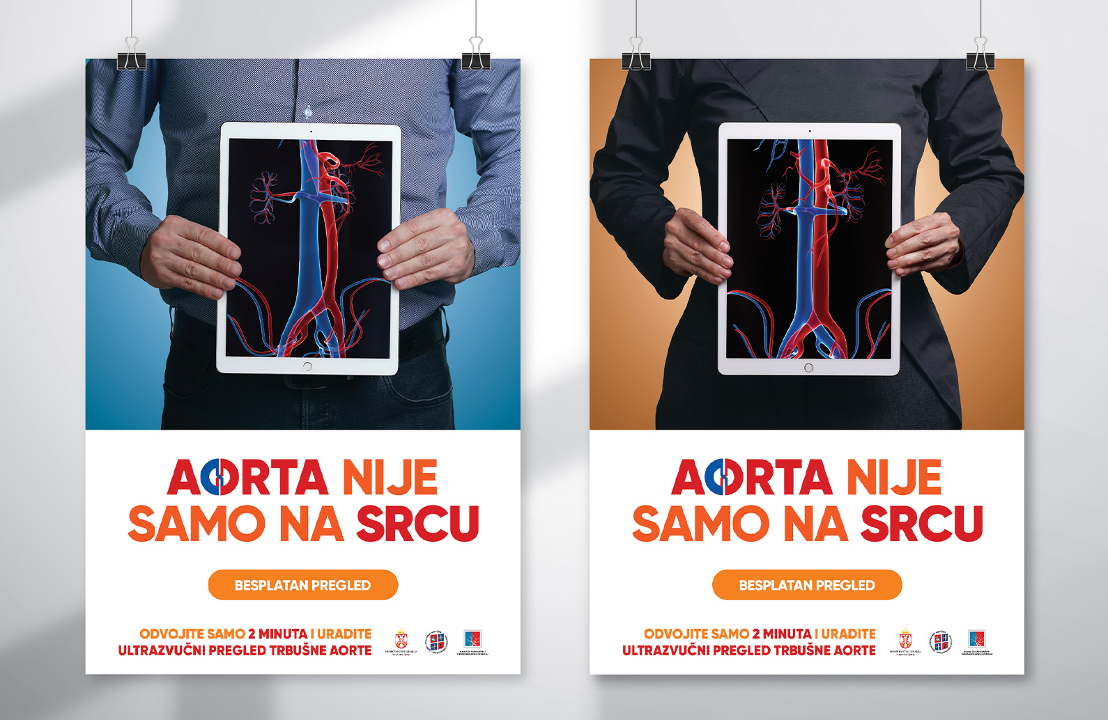
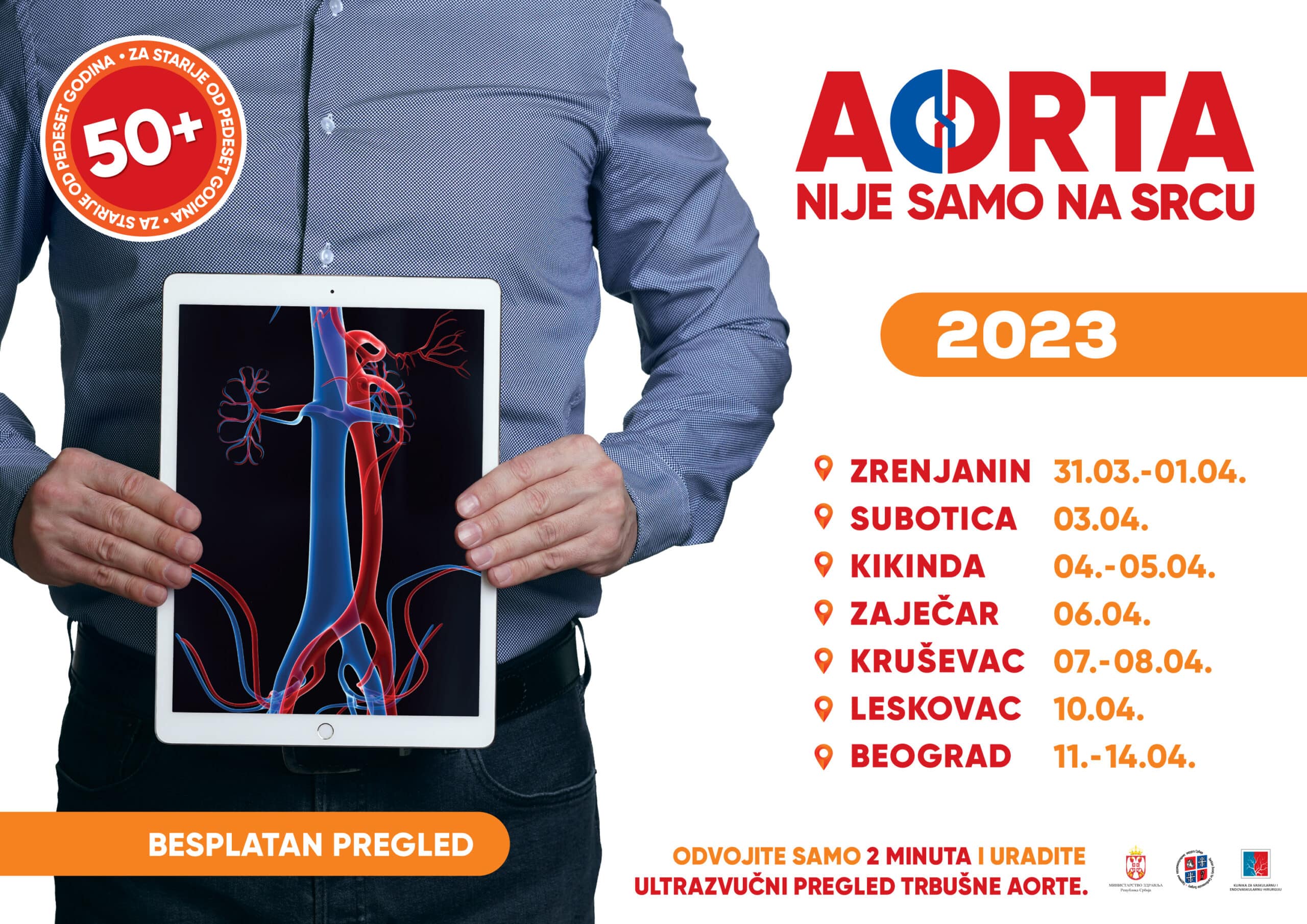
Another project of wider social importance, whose goal is to improve the health of individuals and prevent and control serious diseases, was successfully implemented.
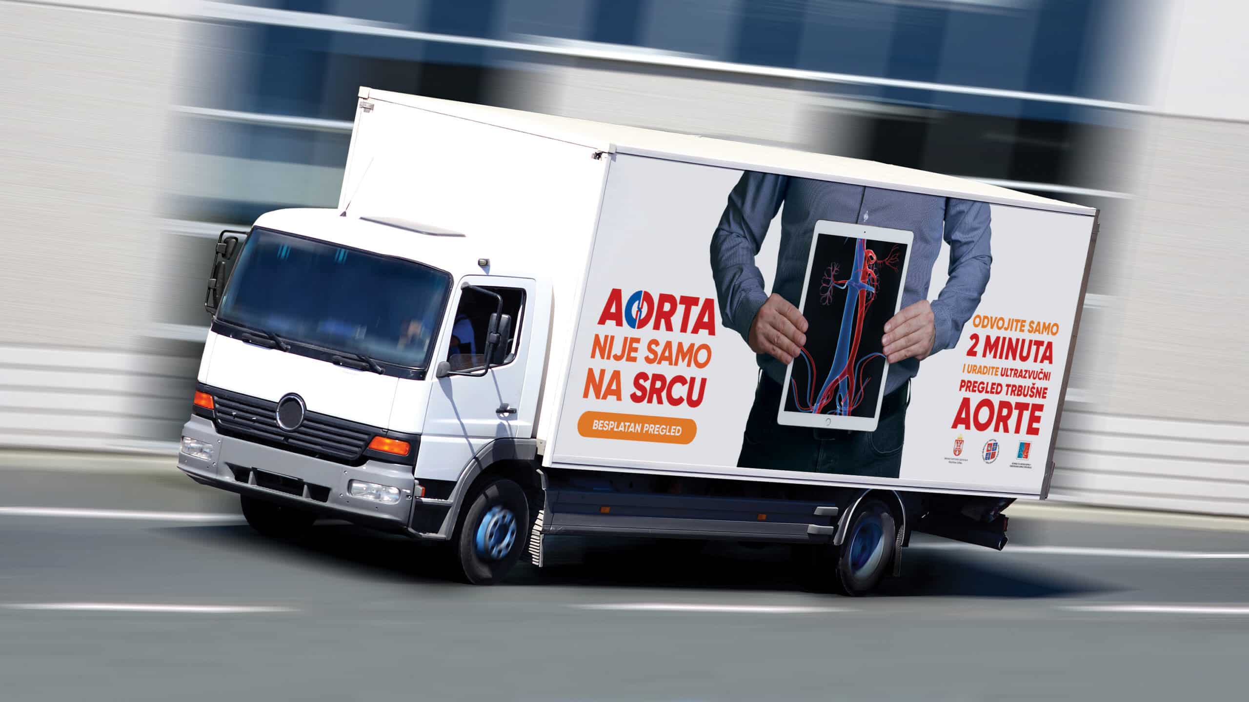
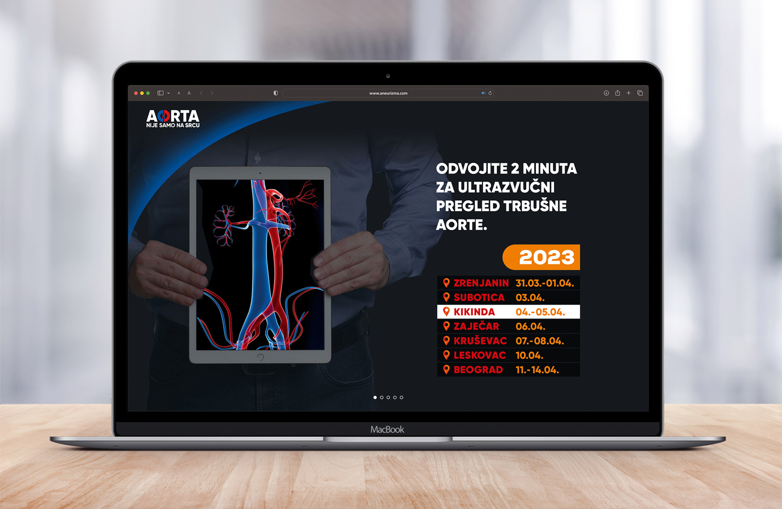
Namely, the pilot campaign “Aorta is not only in the heart”, which provided all interested citizens over the age of 50 with a free, quick and painless ultrasound examination of the abdomen, recorded an exceptional response from the target public.
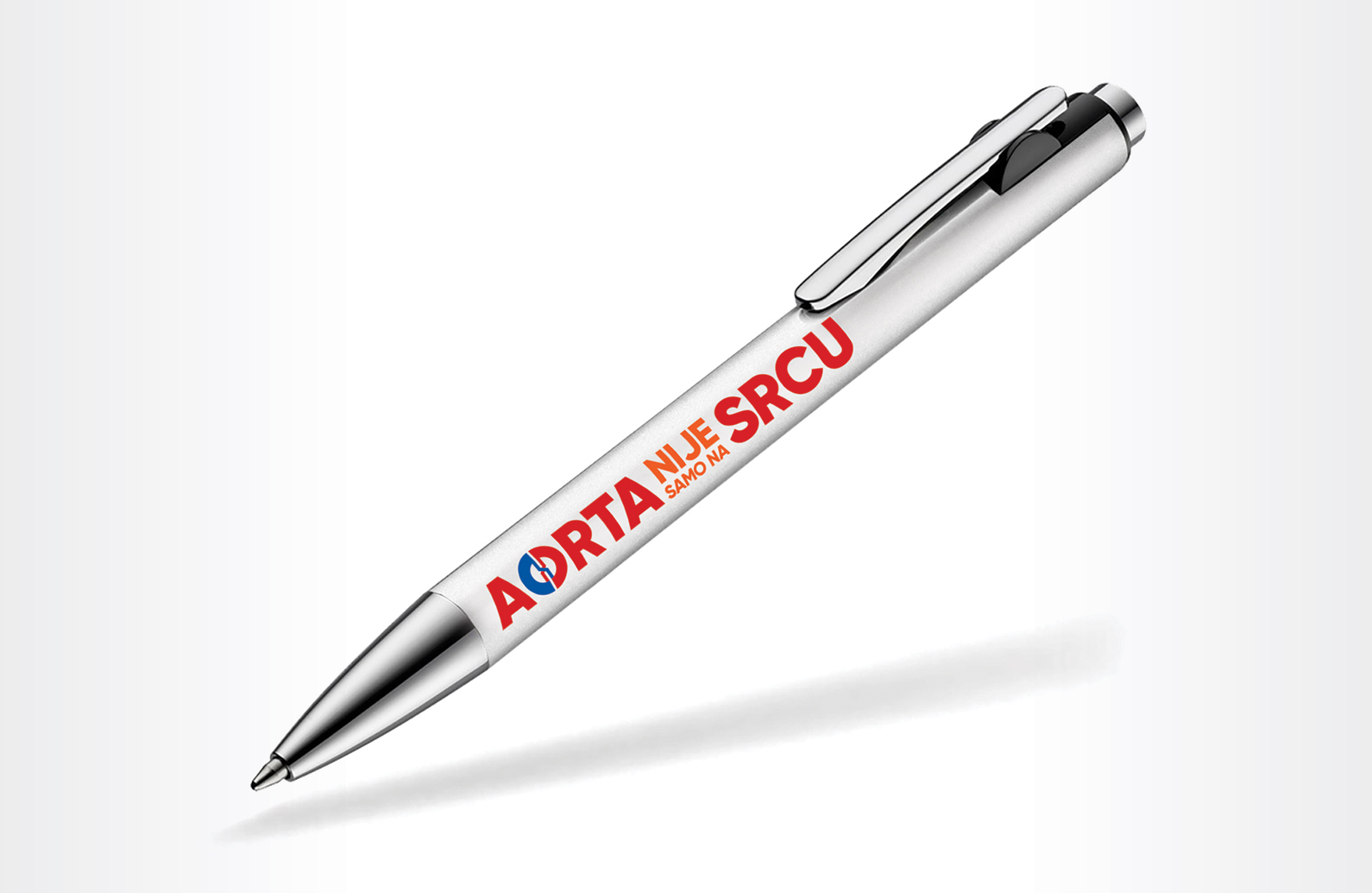
Our creative team designed the slogan and elements of the promotional campaign, which included striking visuals, a website, informative flyers, as well as a branded mobile clinic – a truck with an ultrasound machine and equipment for diagnostic examination – which “cruised” throughout Serbia.
Services:
Design & Art Direction
Digital & Content Creation
Industries:
Government, Business Associations and NGO
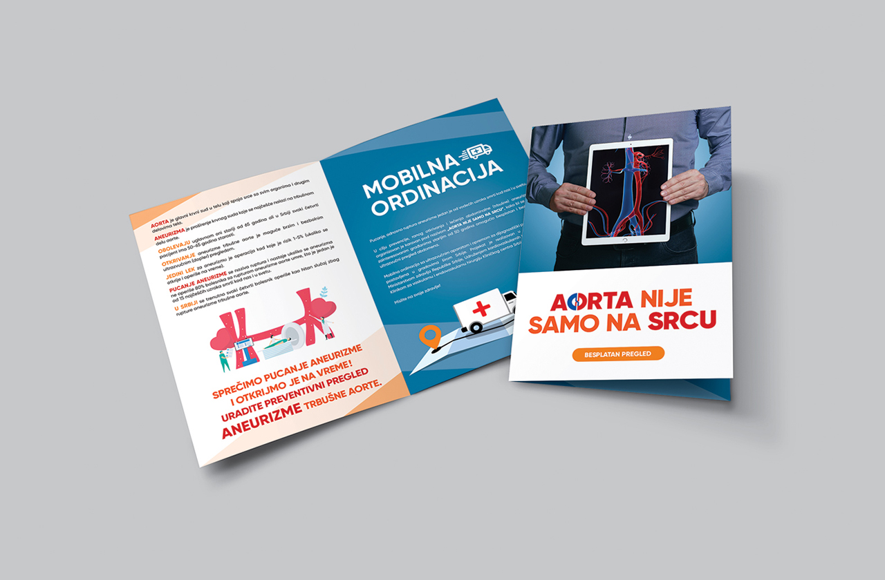
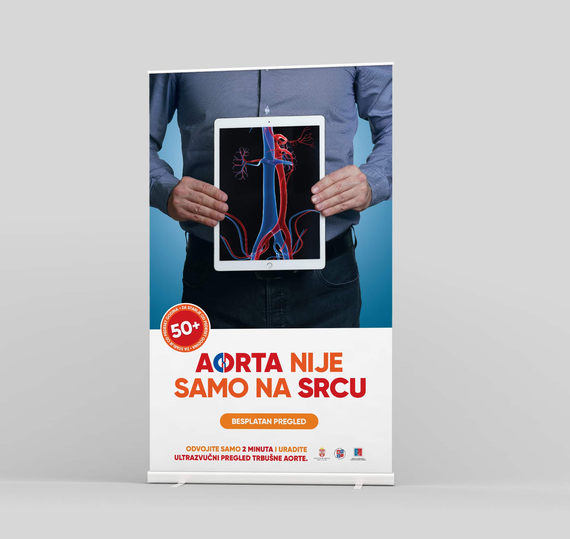
We created the campaign slogan in response to the belief of many that the aorta is closely connected with the heart, as well as insufficient knowledge of the fact that there is a stomach aorta that is a major cause of health diseases.
The results of this important campaign speak for themselves: in 12 days in seven cities of Vojvodina, southern and eastern Serbia, more than 4,000 citizens were examined and about 150 abdominal aortic aneurysms requiring surgical treatment were discovered.
Bearing in mind that bursting or rupture of an aneurysm is one of the leading causes of death in our country and in the world, with this campaign we wanted to raise awareness about this disease, its consequences, but also the importance of prevention in preserving individual and public health.
The screening project was initiated by our client, the Association of Cardiovascular Surgeons of Serbia, with the support of the Ministry of Health and the Clinic for Vascular and Endovascular Surgery UKCS.
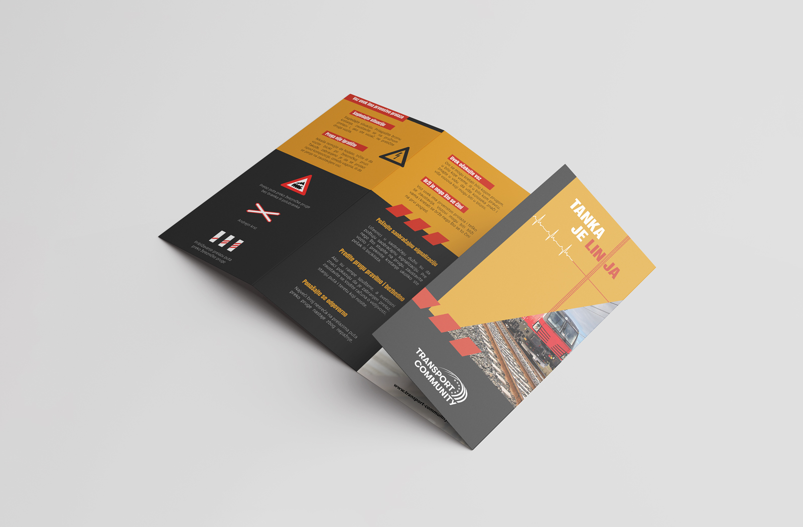
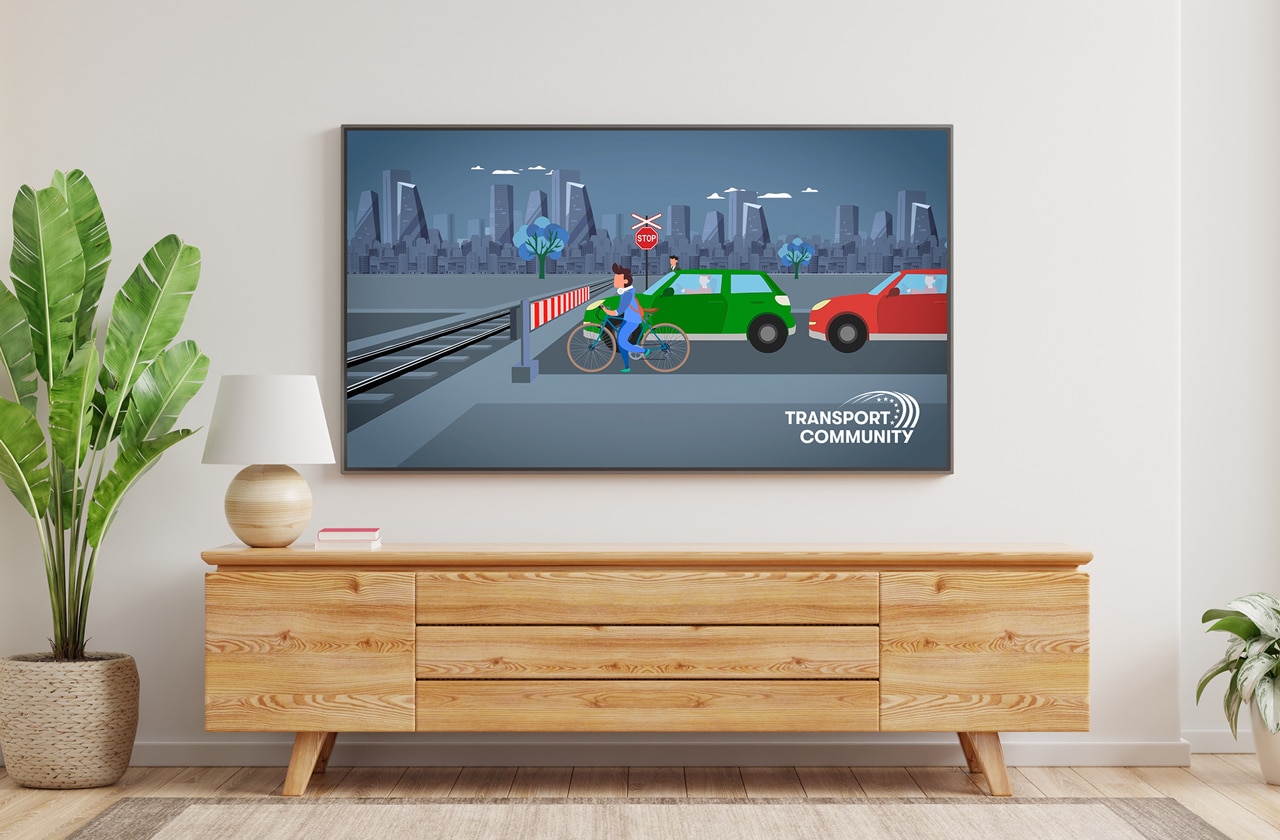
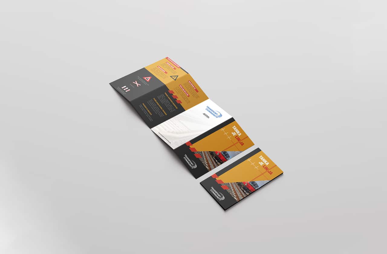
For Transport Community, we developed an educational campaign called “Public Awareness Raising Campaign – Safety of Level Crossings.”
The campaign’s goal was to raise public awareness about the (un)safe crossing of the railroad tracks, especially regarding different types of vehicles and pedestrians. This campaign targeted the widest audience, especially future drivers and students.
Services:
Design & Art Direction
Digital & Content Creation
Video & Photo Production
Industries:
Government, Business Associations and NGO
Level crossings present one of the biggest challenges in railway safety. And yet, despite numerous warnings, traffic road users still take risks and underestimate the dangers of level crossings.
Our idea was to use an impactful, emotional, yet creative approach to convey to traffic road users what can happen to each of us as a result of a moment of distraction when crossing railroads.
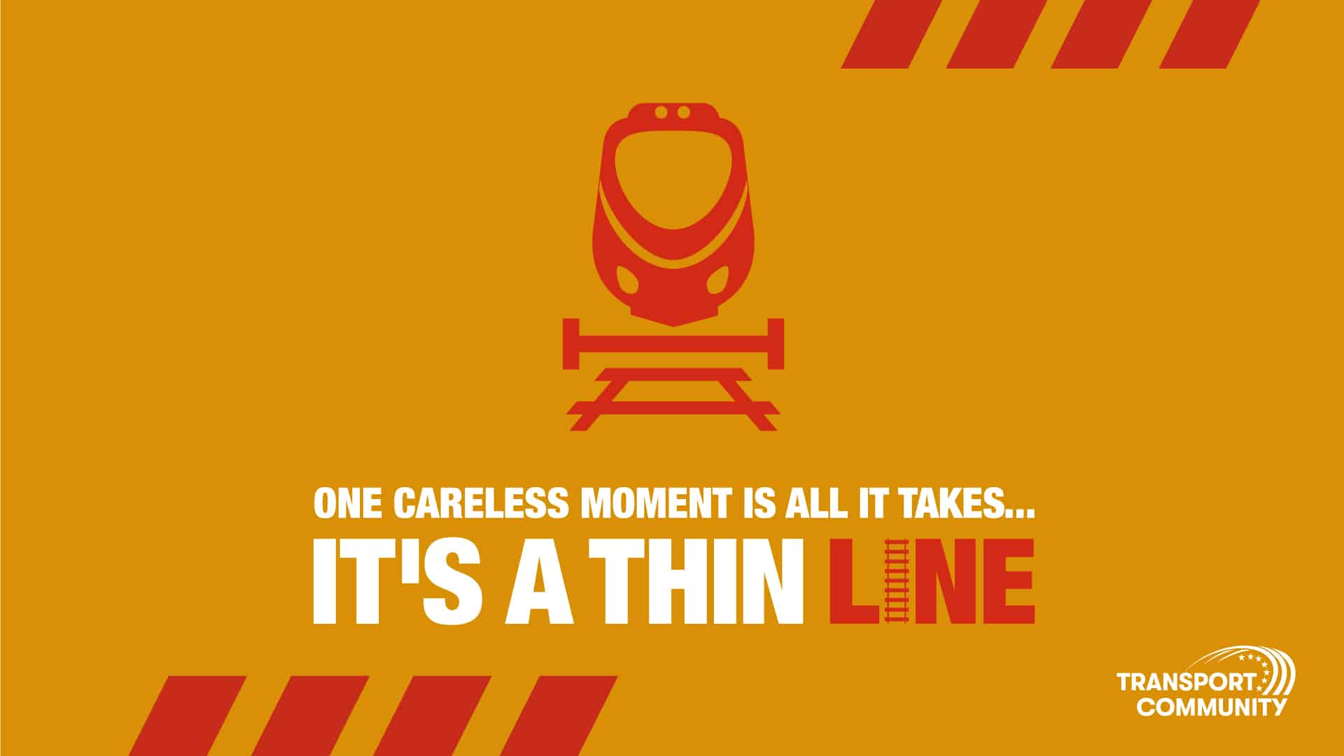
The campaign slogan is: “It’s a thin line…”, which can have several evident and symbolic meanings.
“It’s a thin line…” is not only the beginning of the people talking about the “thin line between life and death,” but the term “line” here can also be interpreted as a synonym for railways and roads, multi-directional communication, good and bad behavior of participants in the traffic, etc.
Also, one of the significant elements of the creative solution is the railway, i.e., the crossing of rails and roads, as well as the ECG line, which turns from a curvy “life-like” line into a straight line, which can also imply the tragic end of the life of a careless traffic road user.
Implementing the “It’s a thin line…” campaign included communication and marketing strategy, design and production of TVC, animated educational videos, and printed flyers.
The project is part of the global initiative “Global Plan for the Decade of Action for Road Safety 2021-2030”, which aims to reduce the number of fatal road accidents by 2030 by at least 50%.
“It’s a Thin Line” campaign was implemented in markets of the Western Balkan countries.

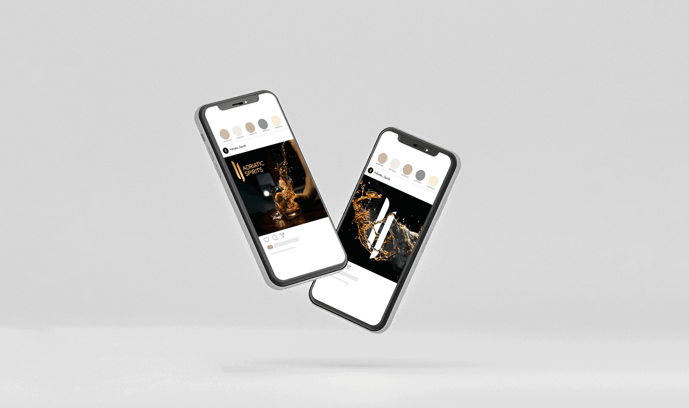
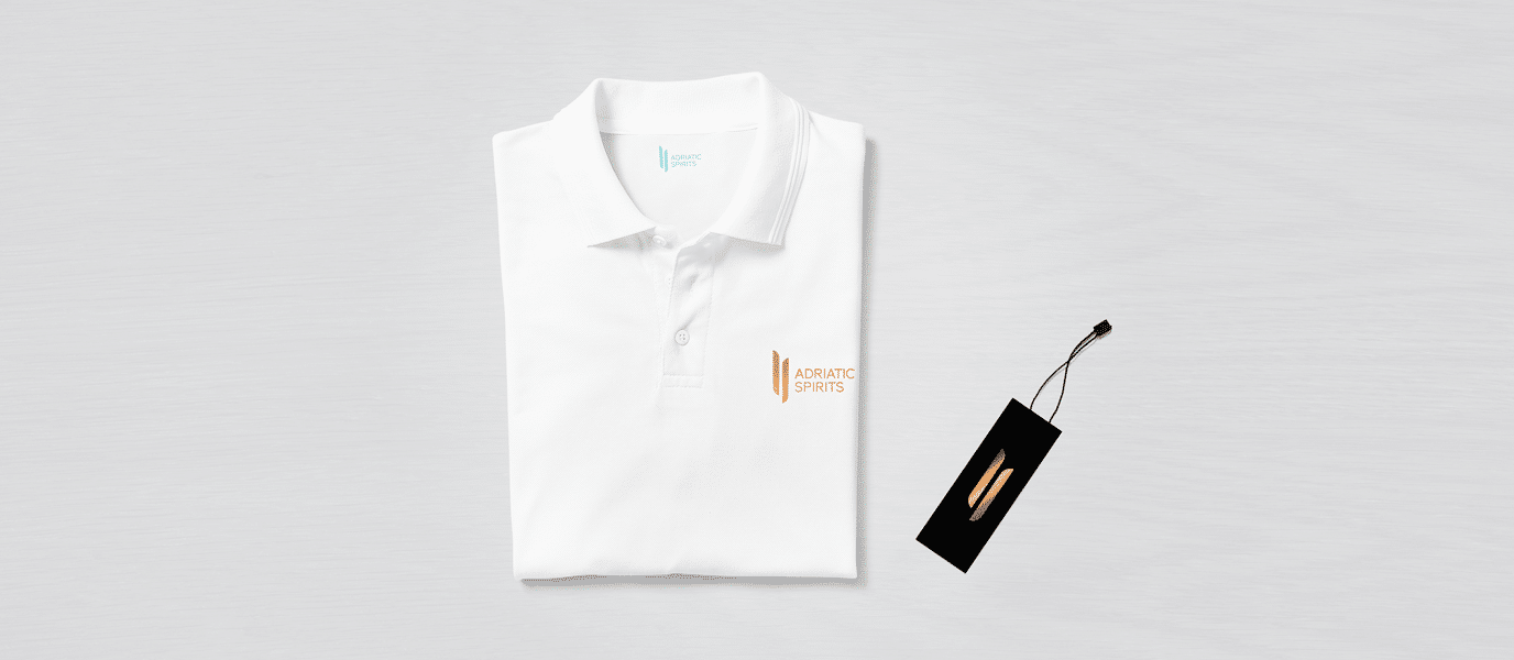
Adriatic Spirits is a company founded in 2021 which represents luxury alcoholic beverages of the highest quality in the Adriatic region. This company’s vision and long-term goal are to become a regional leader in the import and distribution of distilled spirits of the highest quality, thus providing consumers with an experience of complete enjoyment and a taste of satisfaction.
Services:
Brand Development
Design & Art Direction
Digital & Content Creation
Industries:
FMCG
Wine & Spirits

The visual identity of Adriatic Spirits is based on a minimalist, easily recognizable, and associative symbol of the road and two different directions. Figuratively representing the concept of exchange, i.e., distribution.
Fundamentally, the logo consists of maximally abstracted and stylized letters “A” and “C.”
With its upright “lines” and reduced form, the logo is associated with stability, luxury, hedonism, and elegance. The bronze reflection brings an open, airy impression that applies to any space and material.
The liquid during pouring creates a fascinating fluid and unique amorphous shapes that are abstracted into the logo’s negative space.
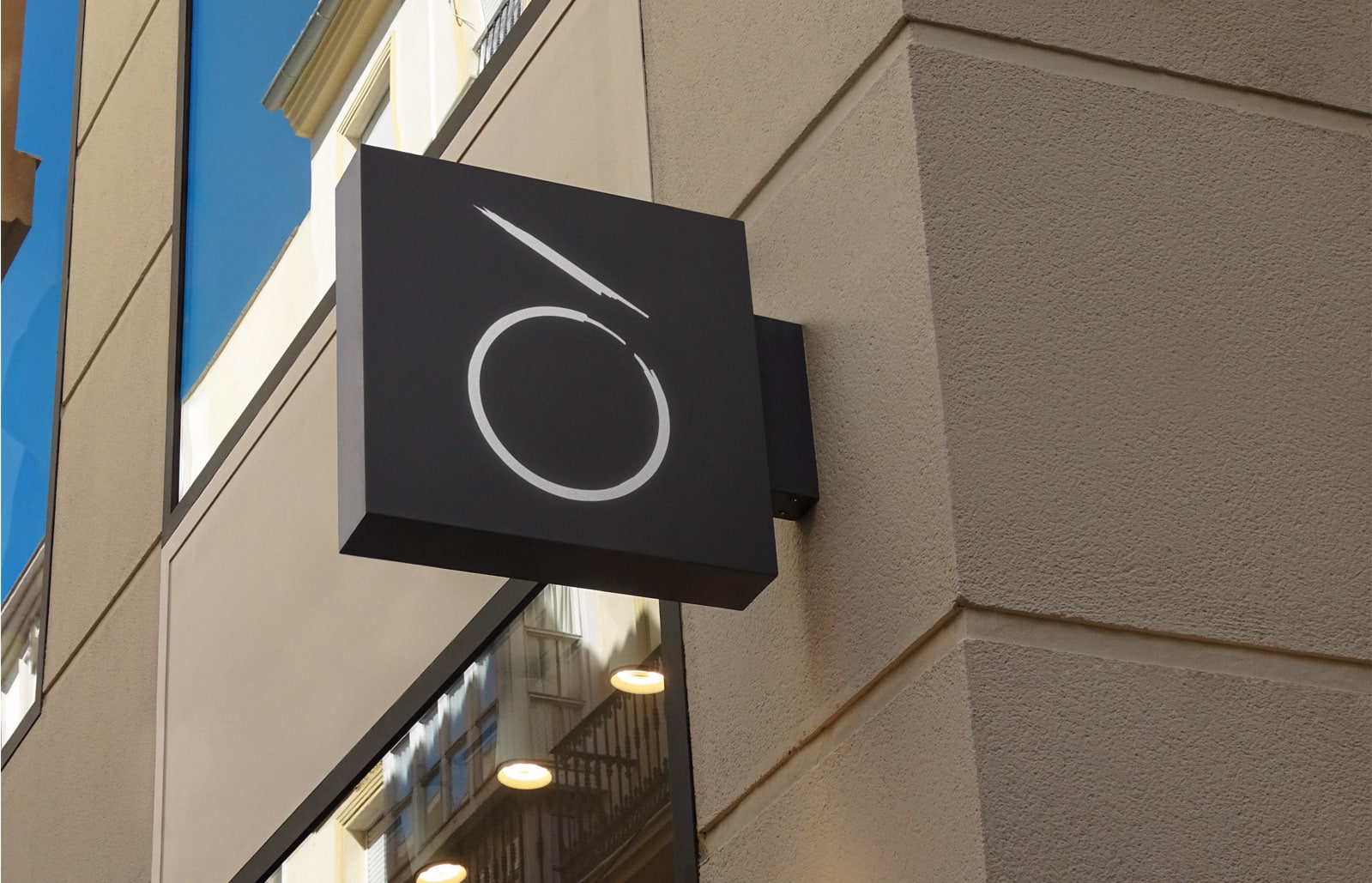
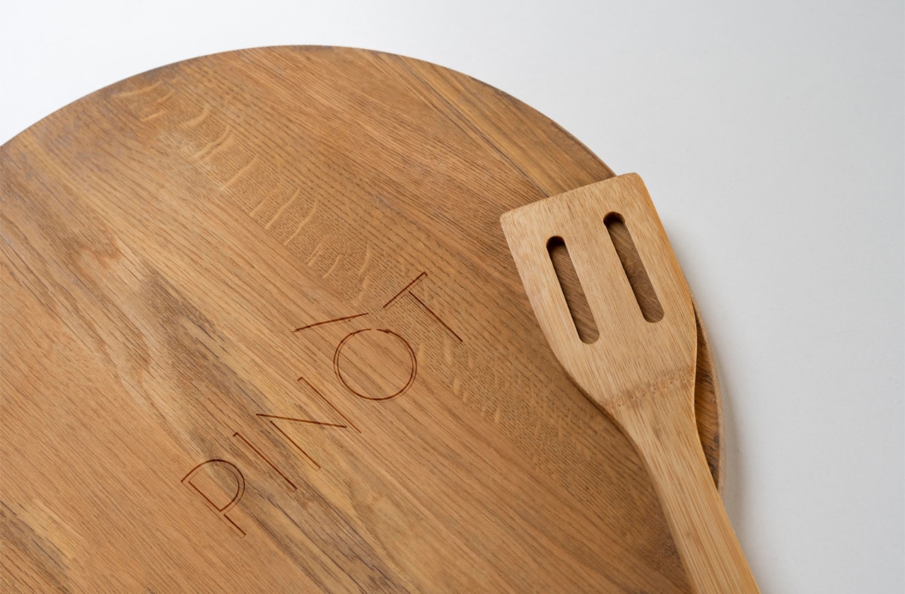
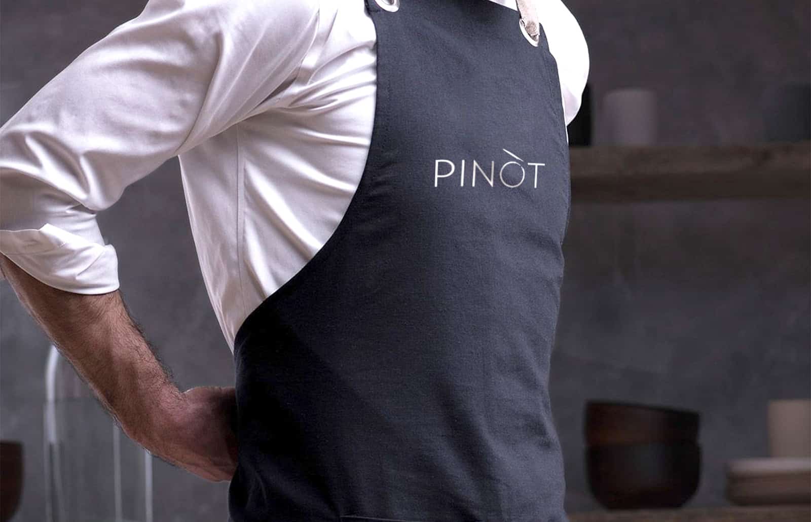
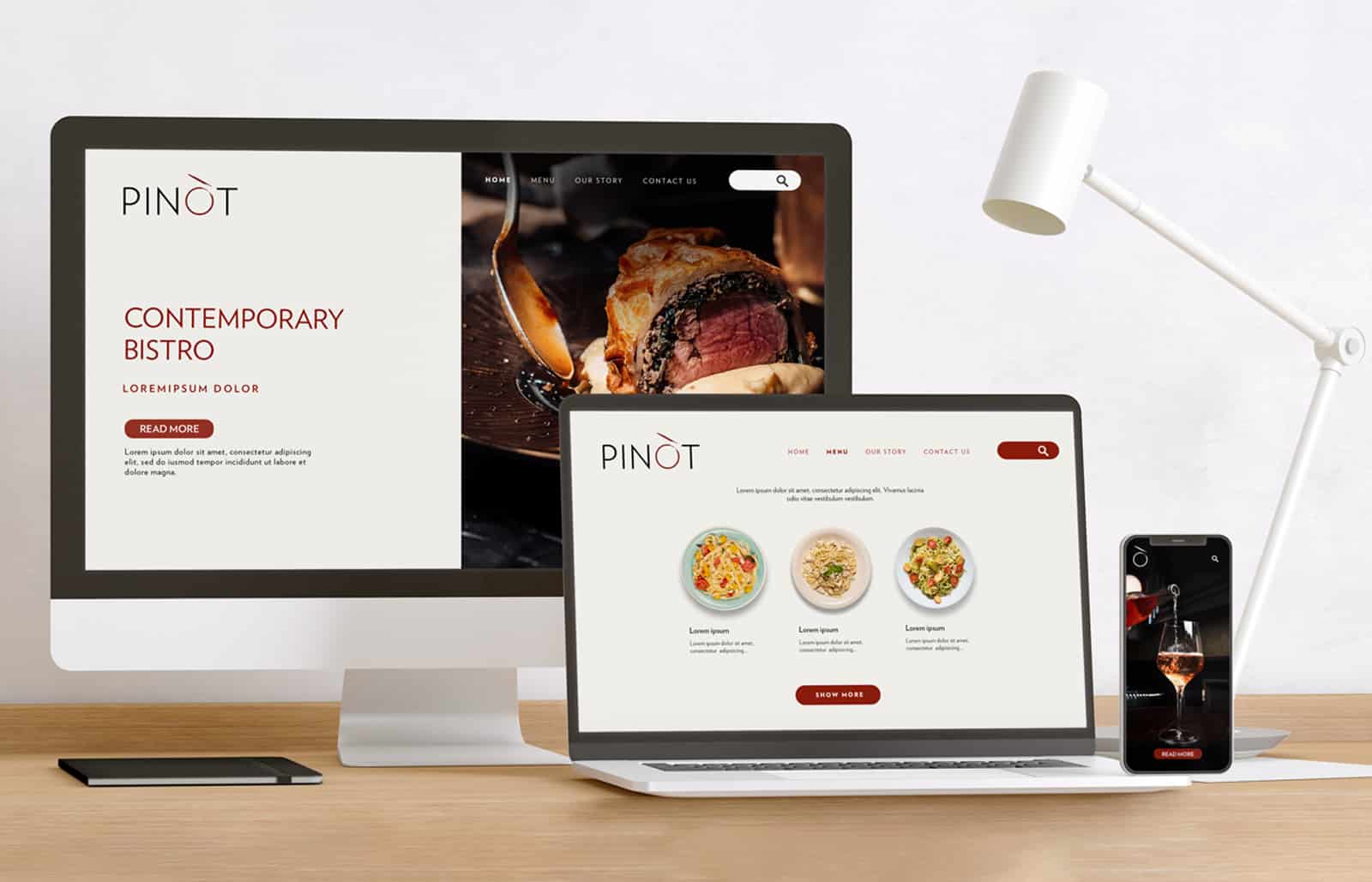
Pinòt – a modern bistro, opened in 2021 in the most exclusive part of New Belgrade’s West 65. With its attractive ambiance and diverse offer – adorned with a fusion of world and local gastronomy – Pinòt provides its guests with hedonistic pleasure with impeccable service and a friendly, tucked-in atmosphere.
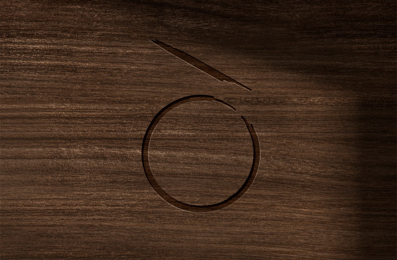
Enso is a sacred symbol in Buddhism, and some of its meanings refer to beauty in imperfection, the art of escaping from the expected to the circle of life and connection.
Services:
Design & Art Direction
Digital & Content Creation
Industries:
Hospitality & Travel
The name of the bistro comes from the eponymous Burgundy grape family, which consists of several famous varieties: Pinot Blanc, Pinot Gris, Pinot Noir, Pinot Meunier, Pinot Noir Precoce.
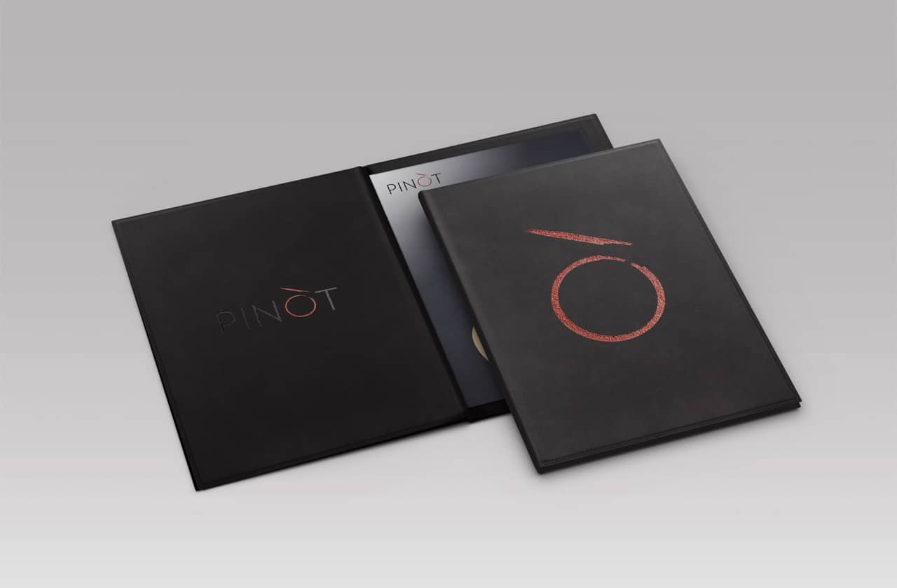
The basic element of the visual identity is the logo derived from the bistro’s name. Reduced forms, with an emphasis on the letter Ò, on which we intervened in the design, inspired by the inspiration we found in two elements – the grain of the gorge and the symbol of Enso.
Emphasis is on their symbiosis, similarity in form, sophistication, and context.
The grape seed is easily associated with an essential segment of the Pinòt bistro offer, a carefully selected selection of wines from Serbia, the region, the old and the new world, embodied in a wine list signed by the best sommelier in the Balkans, Vuk Vuletic.
The application of symbols is envisaged on various functional and decorative elements in the bistro (glasses, menus, napkins, uniforms, etc.)
Clean and powerful, the Verlag font visually supports the brand’s overall communication. The primary color of Kenyan copper, applied in the element Ò, is associated with the color of red wine, vitality, and life. In combination with it, the solid black color completes the initial strength and strikingness of the logo.
The reduced and sophisticated visual identity, adorned with a striking symbol, reflects the vision of a modern bistro that has become a new gathering place for those looking for their oasis in the city’s business center.
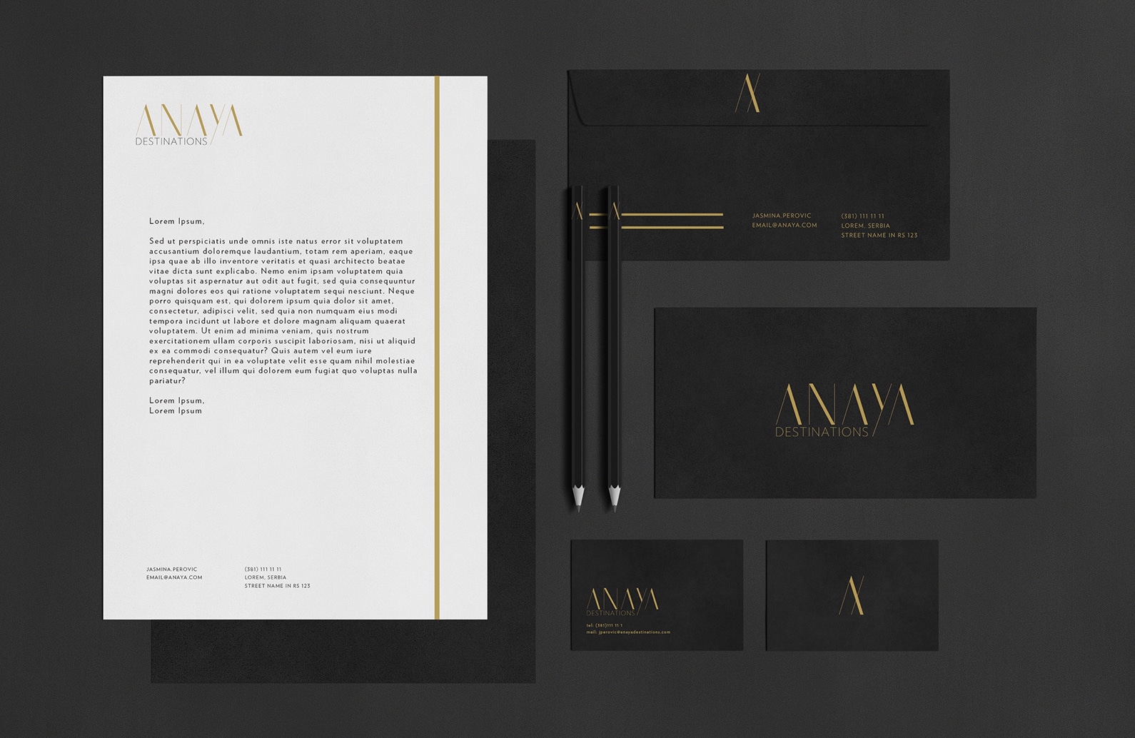
Anaya Destinations is a family agency for renting luxury apartments, founded in 2021 with the mission to provide interested clients with a completely new holiday experience.
Anaya Destinations apartments are in a unique ambiance, in which guests – in the embrace of untouched nature – feel comfortable and cozy, just like at home. In line with the new client’s vision, our creative team has devised a name and visual identity, developed a long-standing brand strategy, created a website, and a tactical plan for social media appearances and online content.
Services:
Design & Art Direction
Digital & Content Creation
Industries:
Hospitality & Travel
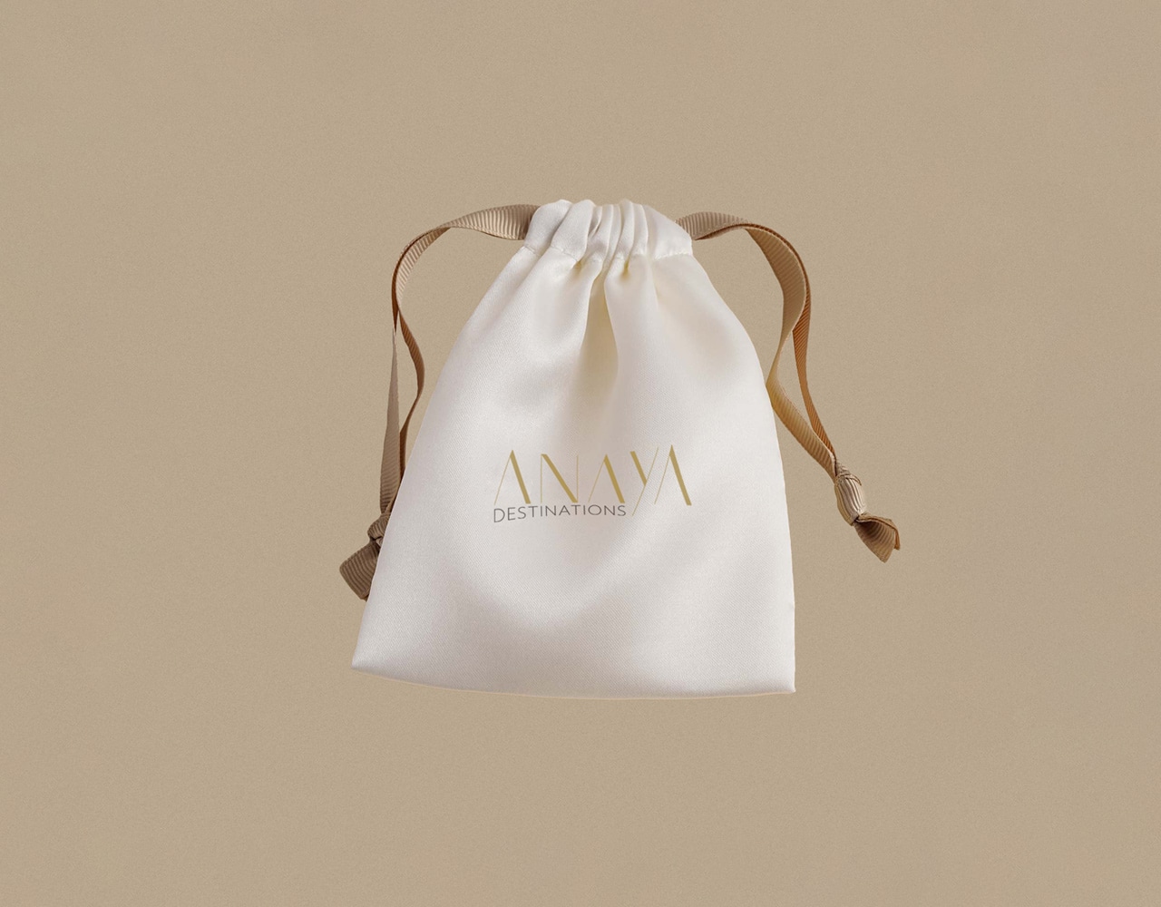
Although the inspiration for the name Anaya comes from an anagram composed of the initials of personal names, its original origin comes from an Arabic word that describes terms such as “care,” “guardian,” or “protector,” and these features properly symbolize the Anaya brand.
The visual identity consists of two keywords – Anaya – which is also the basic logo, as well as the word Destinations, which descriptively describes the purpose of the agency’s existence.
Old gold, as the Anaya brand’s primary color, is associated with a feeling of warmth and positive energy. Ivory black is a secondary shade in perfect contrast and, at the same time, colorful symbiosis with the logo’s primary color. We choose the Verlag font family for the “display” font, characterized by features such as simplicity, minimalism, and effectiveness.
The symbol in the form of the initial letter “A” is illustrated to represent an association with the apartments’ area.
The emblem is modular and can incorporate a pictogram of a mountain, sea, or other landscape. In this way, the illustrated symbol on the website, brochure, or other advertising and promotional materials will visually help to evoke the location where luxury Anaya apartments are rented out.
The logo differentiates unique typography, and the visual identity as a whole reflects “discrete luxury” and communicates about a company of a highly professional level.
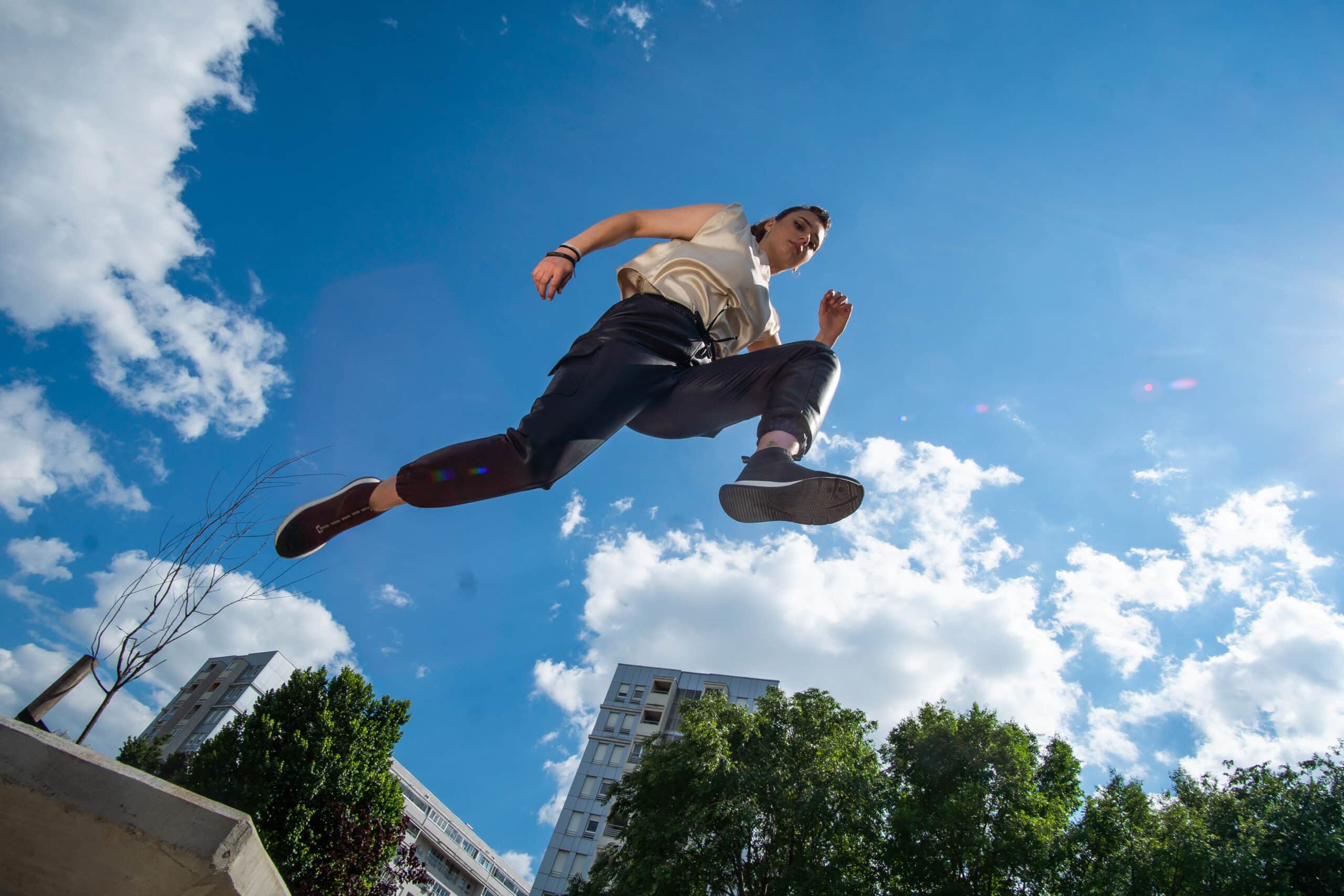
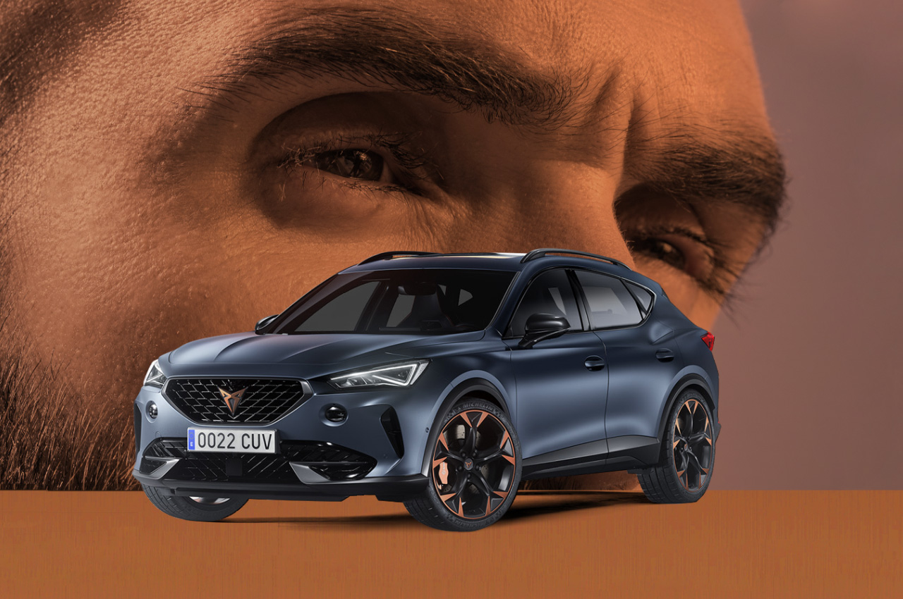
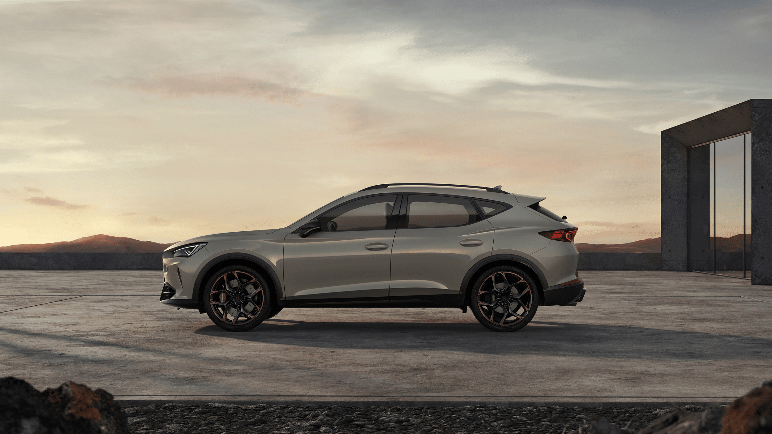
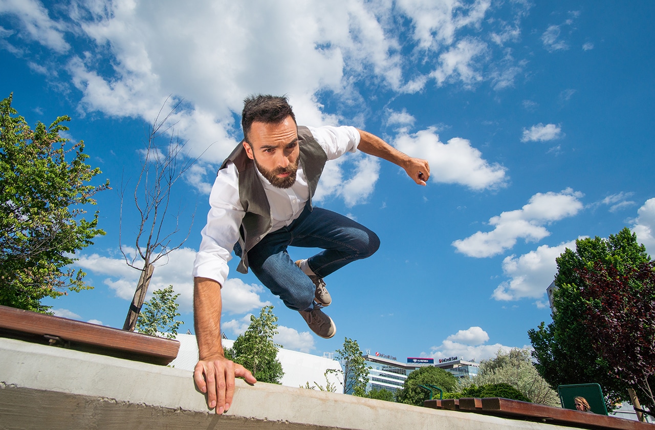
For the client Porsche SCG, we designed and implemented a digital campaign whose backbone is an interactive video called “CUPRA HERO”, based on the convergence of the gaming industry and video technology.
The key medium of the campaign was the micro site cuprahero.rs, whose basic content is an interactive video of a competitive nature.
Services:
Brand Development
Design & Art Direction
Digital & Content Creation
Top 10
Video & Photo Production
Industries:
Automotive Industry
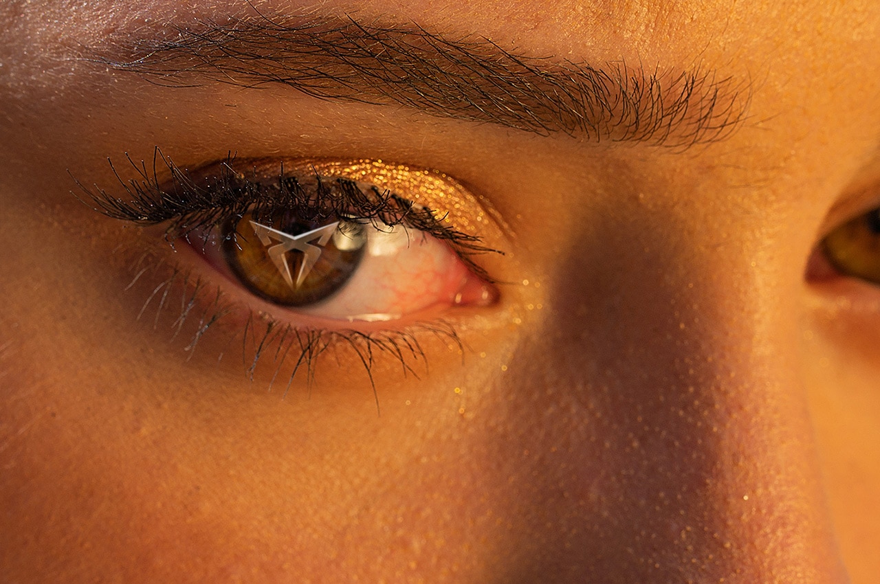
Everyone who embarked on this unique interactive experience had the opportunity to choose one of the three characters offered – that is, “their” hero to the parkourist – as well as, in the race against time, choose their path and reach the finish line in record time. This type of campaign is a new type of digital experience applied for advertising and promotion purposes.
With the slogan “For all the brave who choose a different path”, this interactive adventure aims to enable players in a fun and interesting way to choose the characteristics that feature a unique CUPRA DNA – be it speed, agility or strength.
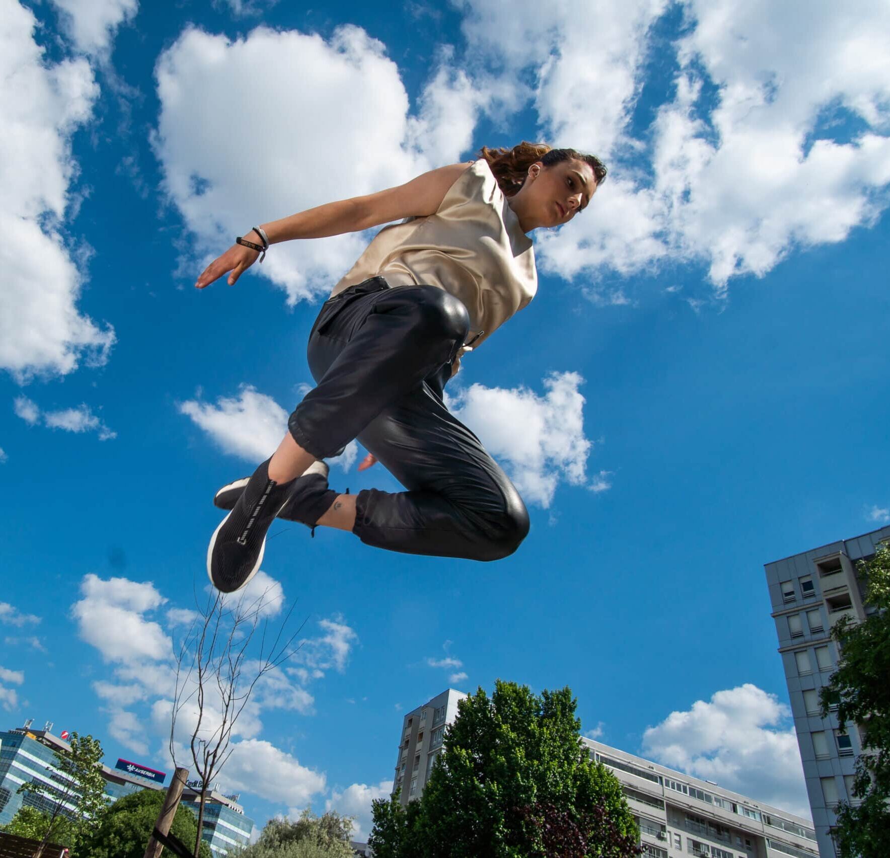
The story that accompanies the interactive video also points to certain values that each individual should promote in their life, regardless of the circumstances in which they find themselves. Sometimes the fastest way to the goal and using shortcuts is not the best way. That is why the CUPRA Hero story is intended for ordinary people, real heroes of everyday life, who behave in accordance with their own code and true values and know how to choose their path.
The CUPRA Hero campaign was realized in cooperation with the production company NEO – New Entertainment Office. System Studio was in charge of micro website design and technical support, while our agency, in accordance with the set strategy, created an immediate user experience.
The CUPRA HERO digital campaign was also supported by a number of influential domestic influencers, whose lifestyle coincides with the CUPRA brand and for whom the car industry is an important area of interest.
The success of the campaign is reflected in the results of raising awareness and drawing attention to the new model in our market. During the three weeks of the competition part of the campaign, over 36,000 unique visits to the micro-site cuprahero.rs were recorded, and the total number of those who played the interactive video and recorded the result was over 13,000 users.
“A brand like Cupra has brought a new style, approach and energy to the automotive industry. It has been a challenge for us to discover new, innovative forms of communication with the target group, as well as to provide inspiring incentives to consumers.”