


AVIATOR UNVEILED A NEW BRAND IDENTITY
AVIATOR
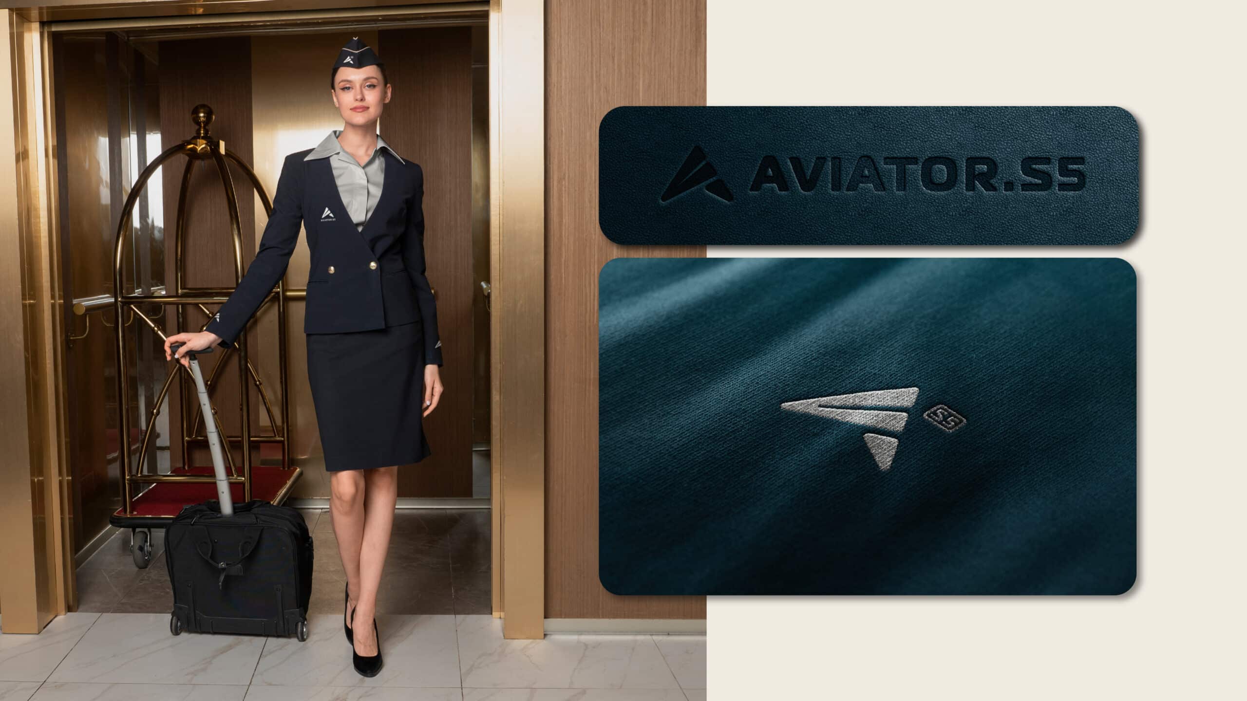
We created a modern and striking visual identity for Aviator – a premium brand from Slovenia, specialized in top-tier air transport services.
Services:
Art Direction
Brand & Strategy
Industries:
Aviation

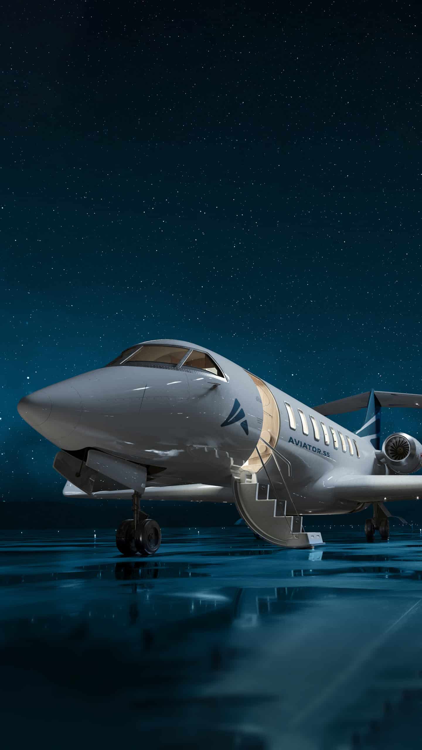
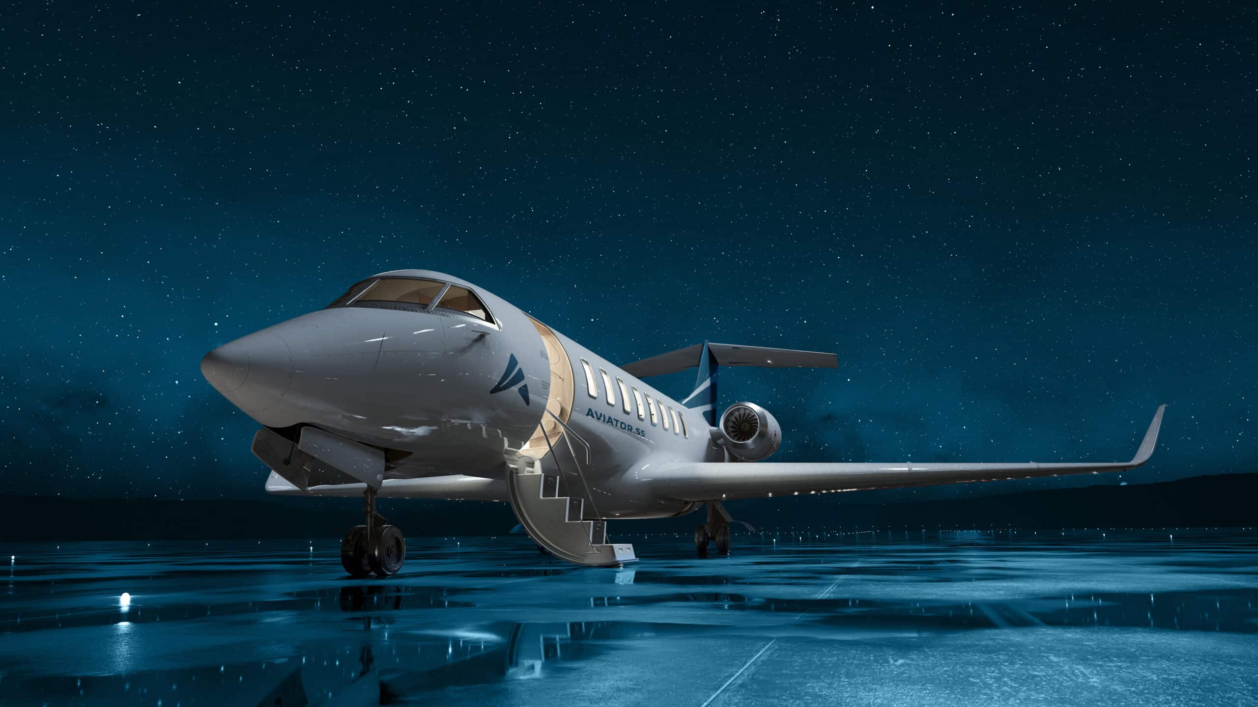
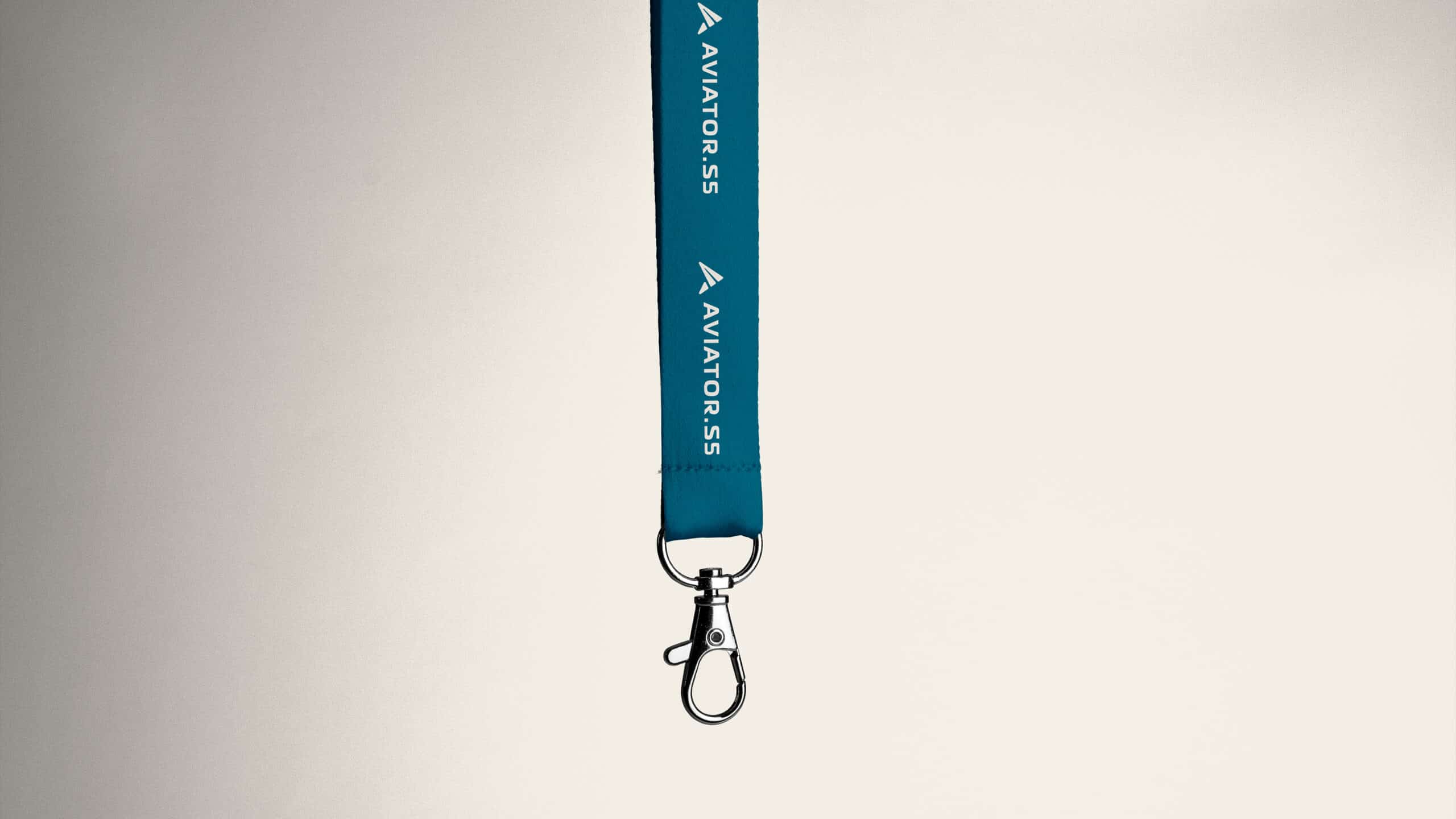
The inspiration for the logo design came from mountain peaks, one of the recognizable symbols of Slovenia, as well as from the aerodynamic and elegant form of an airplane. Our goal was to merge national identity with the dynamic spirit and vision of contemporary aviation.
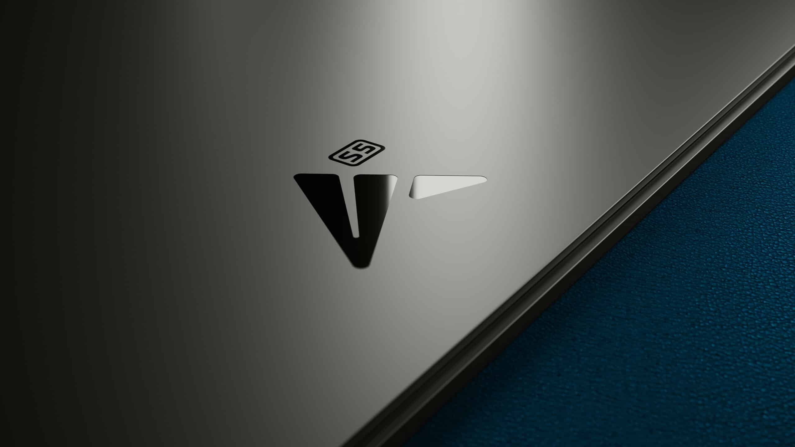
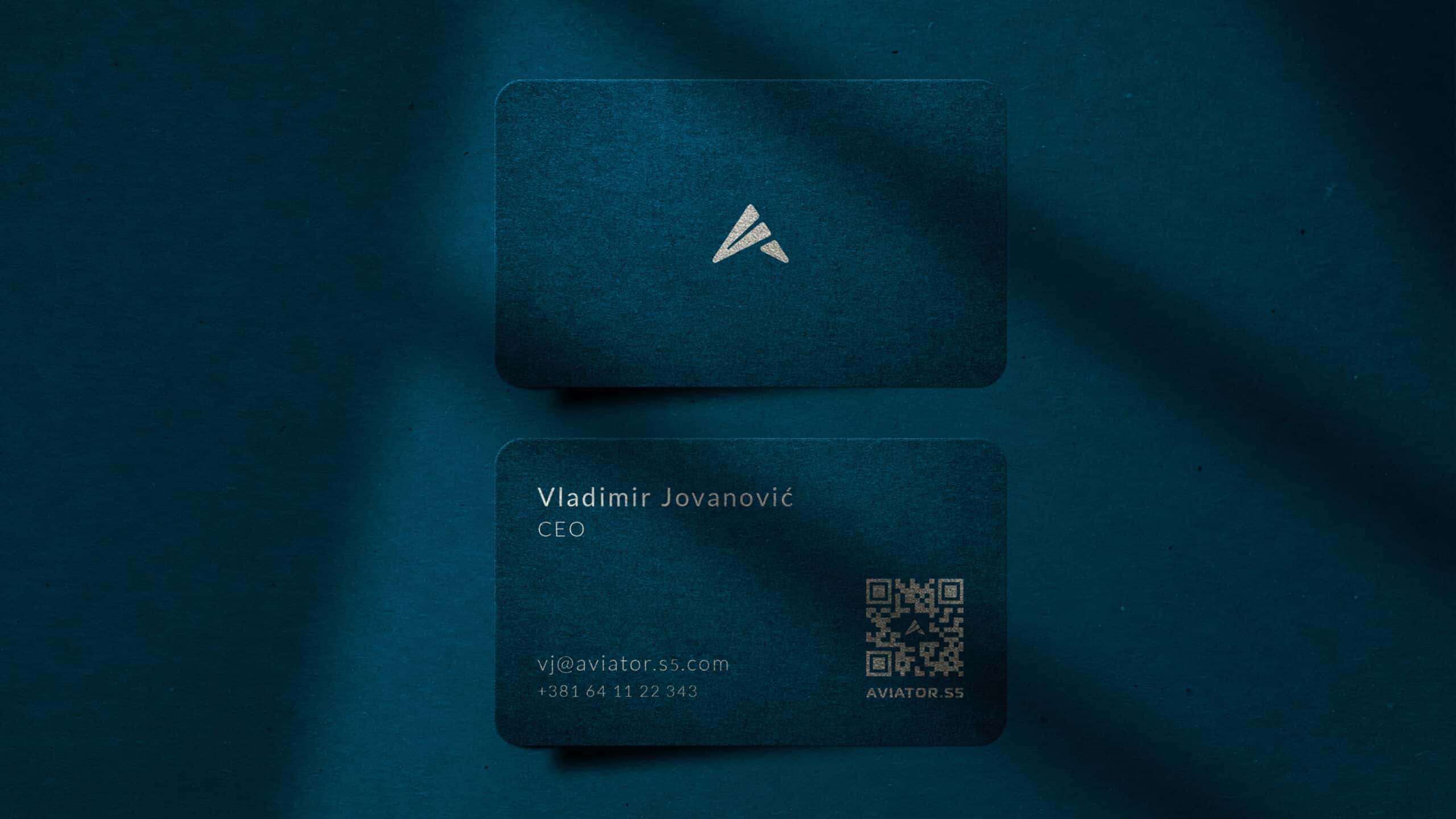
The logo combines various symbols and meanings into a unified whole. The paper plane represents beginnings, dreams, and ambitions, evoking the first steps toward reaching new heights. The upward-pointing arrow symbolizes clear direction, growth, and the pursuit of success.
The triangle, which forms the foundation of the mark, carries the symbolism of stability, intellectual and spiritual order, as well as ascension and enlightenment. It is inspired by airplane wings and the capital letter A – the first letter of the brand name – which together form the shape of an arrow pointing toward continuous progress.
The edges of the logo are rounded, further emphasizing the aerodynamic nature and sophistication of the form.
We believe that the new logo clearly and powerfully reflects the essence of the Aviator brand – reliability, ambition, and a vision aimed toward the future.


BRAND DESIGN: CHIAREZZA PADEL
CHIAREZZA PADEL
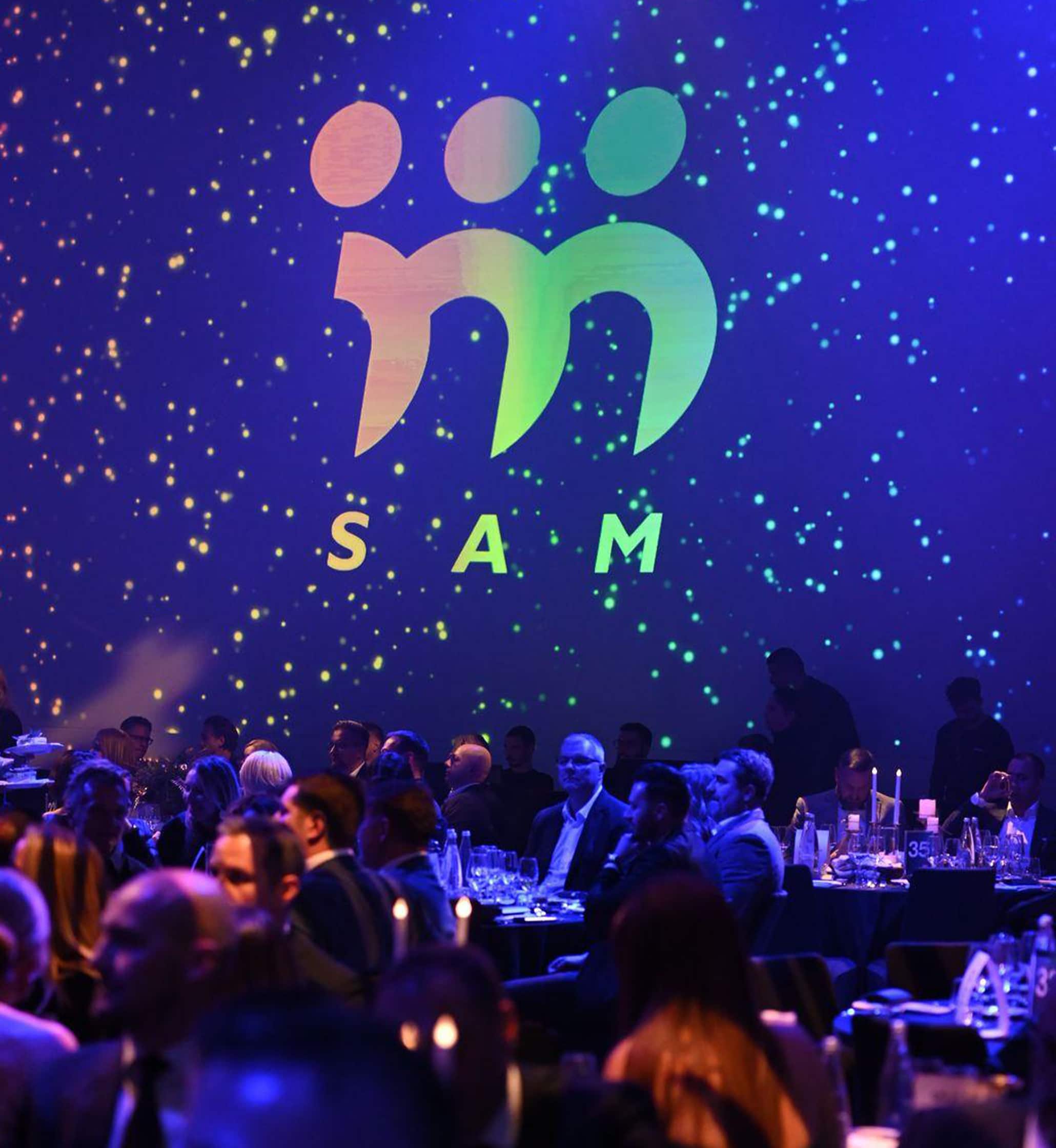
SAM GALA: CREATING UNBREAKABLE CONNECTIONS
SERBIAN ASSOCIATION OF MANAGERS
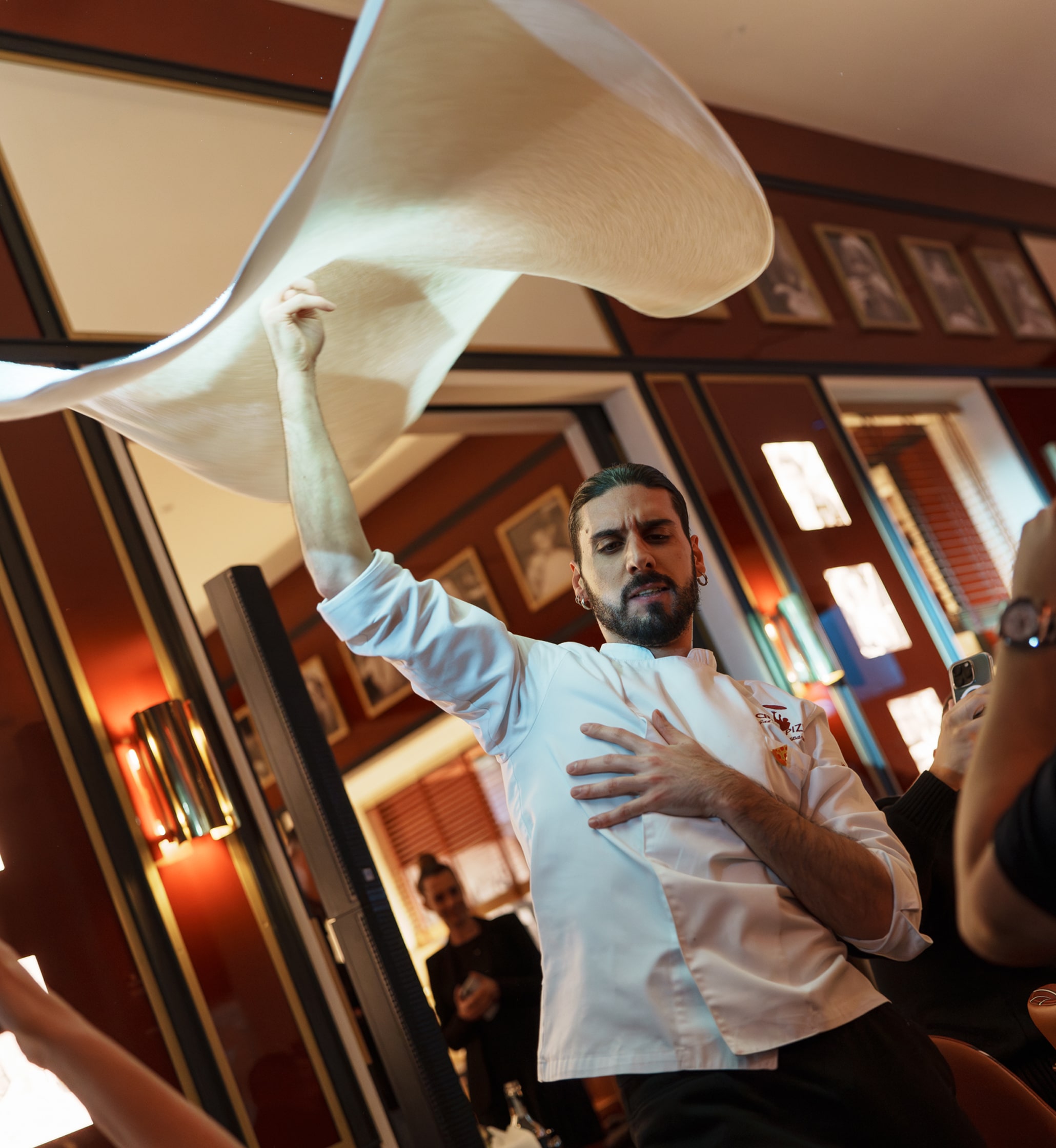
FOR CRAZY PIZZA, WE OPENED THE DOORS TO BELGRADE
CRAZY PIZZA