Exciting news is coming from the sports association “Aktivniji” – they have just unveiled their new logo that reflects energy, movement, and dedication to a healthy lifestyle!
This logo is not just a symbol, but a story. It was born as a combination of two key symbols: the initials “A” representing the brand “Aktivniji” and athletic running tracks. This combination of symbols not only emphasizes the goals of the association – which are organizing, planning, and programming recreational sports training – but also highlights the importance of an active and healthy lifestyle for individuals and communities.
Services:
Brand Development
Industries:
Art, Entertainment & Lifestyle
Sports

What makes this logo special is its dynamic and robust construction, which simultaneously represents stability and motion. The intertwining tracks within the logo are not random; they signify a path, direction, and progress. It’s as if the logo follows and supports the individual on the path to a more active lifestyle.
This logo is not just a symbol of the “More active” association, but also an invitation to every individual to join the association towards a healthier and more active lifestyle. With the support of the association, everyone can find their way to more successful participation in sports activities and achieving their goals.
Services:
Brand Development
Industries:
Art, Entertainment & Lifestyle
Sports

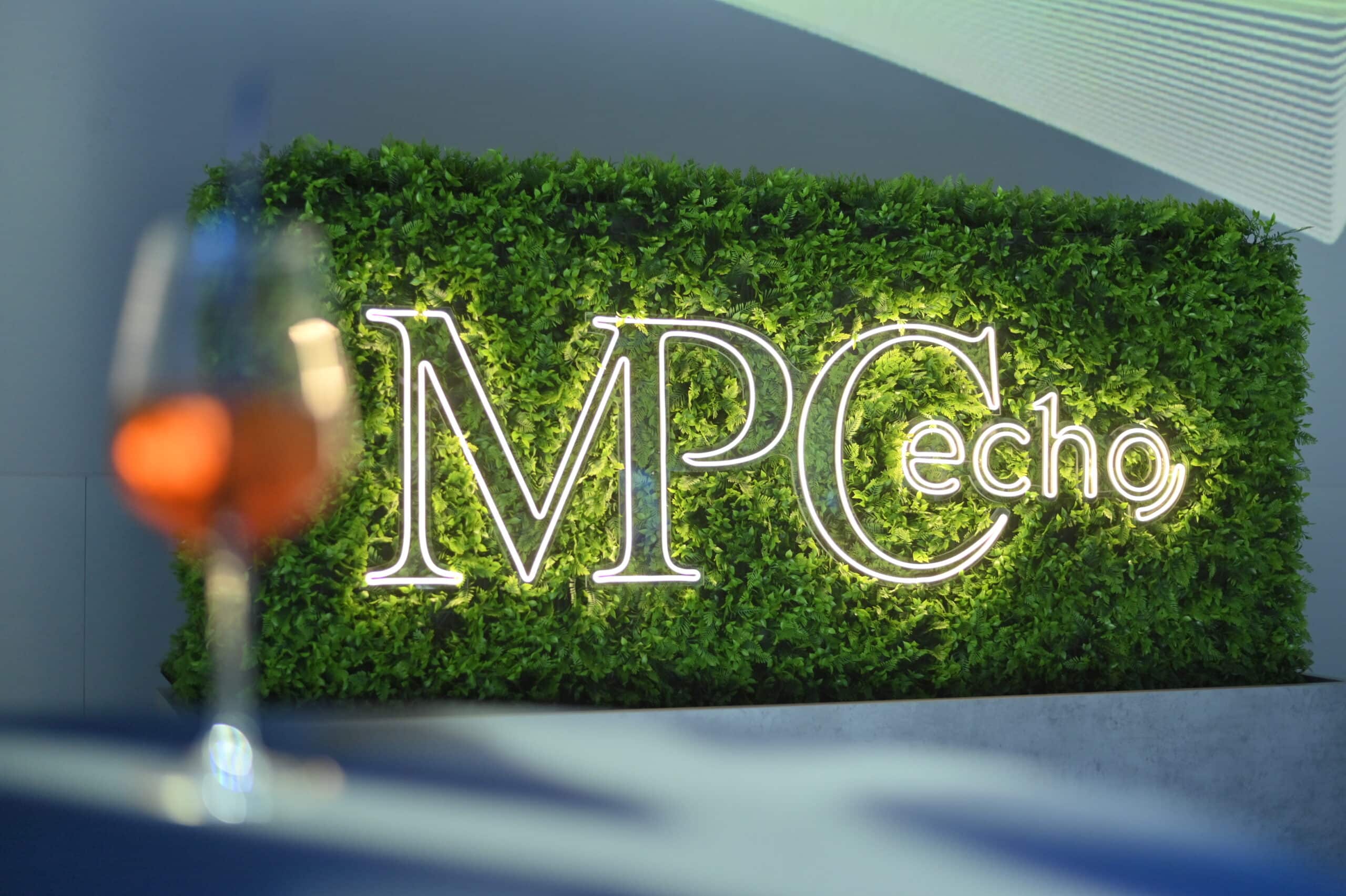
Belgrade witnessed a unique business echo on April 23rd – the MPC Echo Conference, organized by MPC Properties in the immersive atmosphere of the Sava Center. This event represented a fusion of business, innovation, and sustainability, with a special focus on the future of construction, retail, and real estate.
The M2C creative team was responsible for this visual and conceptual spectacle. We designed the conference’s visual identity, including the logo, graphic elements, and everything that visually defined the atmosphere of the event.
Services:
Brand Development
Experience Design & Event Production
Industries:
Real Estate & Construction

The M2C team was also responsible for the name and creative concept. The term “Echo” was chosen as a metaphor for the spread of good ideas and messages. We handled the organizational and technical realization, as well as the scenographic setup, which transformed the Sava Center space into a unique immersive experience.
Services:
Brand Development
Experience Design & Event Production
Industries:
Real Estate & Construction


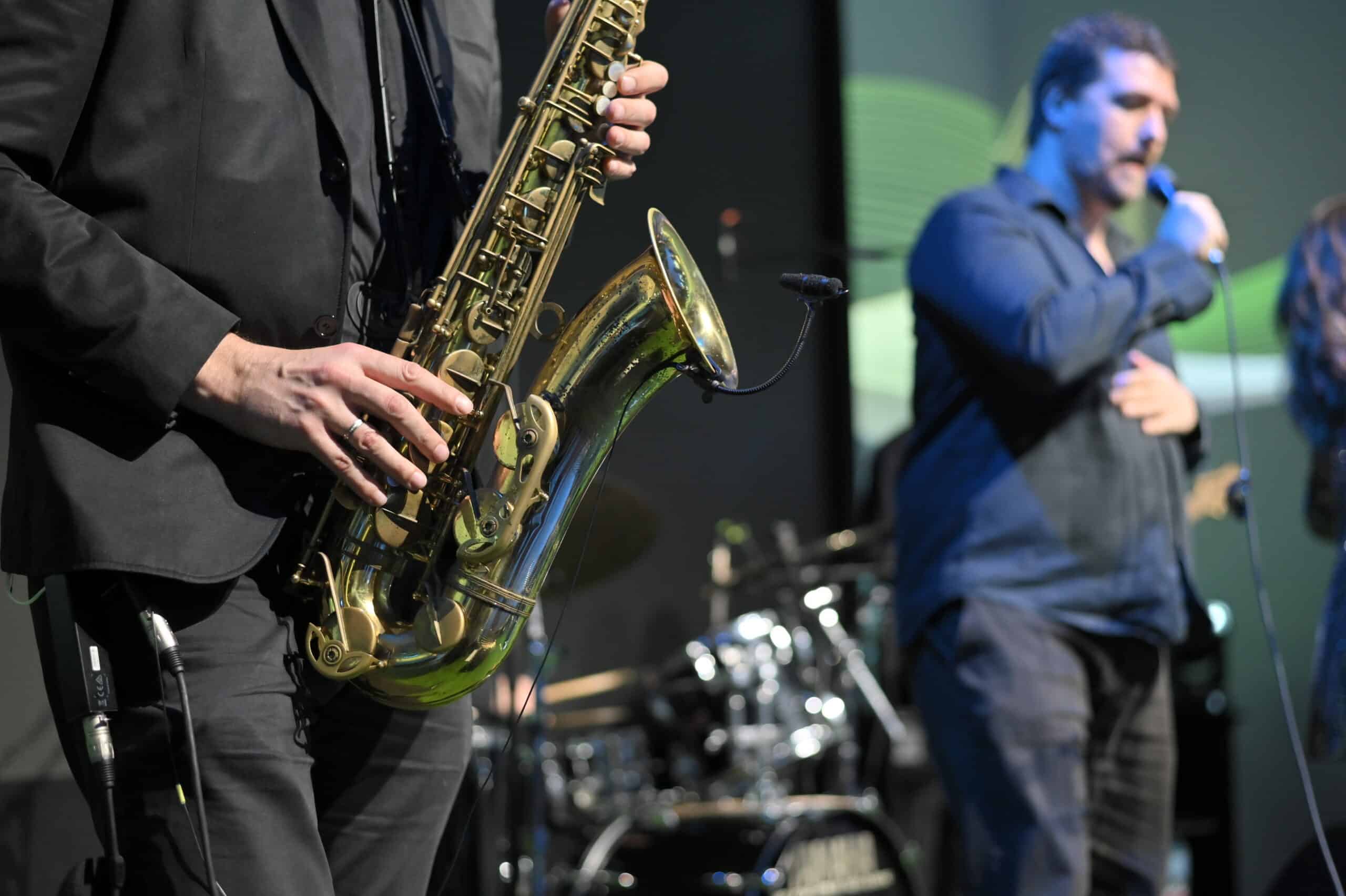
Every element of the conference was aligned with the values and vision of our client, MPC Properties. Their innovations, designed with a clear focus on positive environmental impact, strive for a healthier and more fulfilling life for individuals and the entire community.
This was the first conference of this type, with the ambition for MPC Echo to become an annual event, an important business platform for the exchange of knowledge and experience in the dynamic real estate industry.
Services:
Brand Development
Experience Design & Event Production
Industries:
Real Estate & Construction
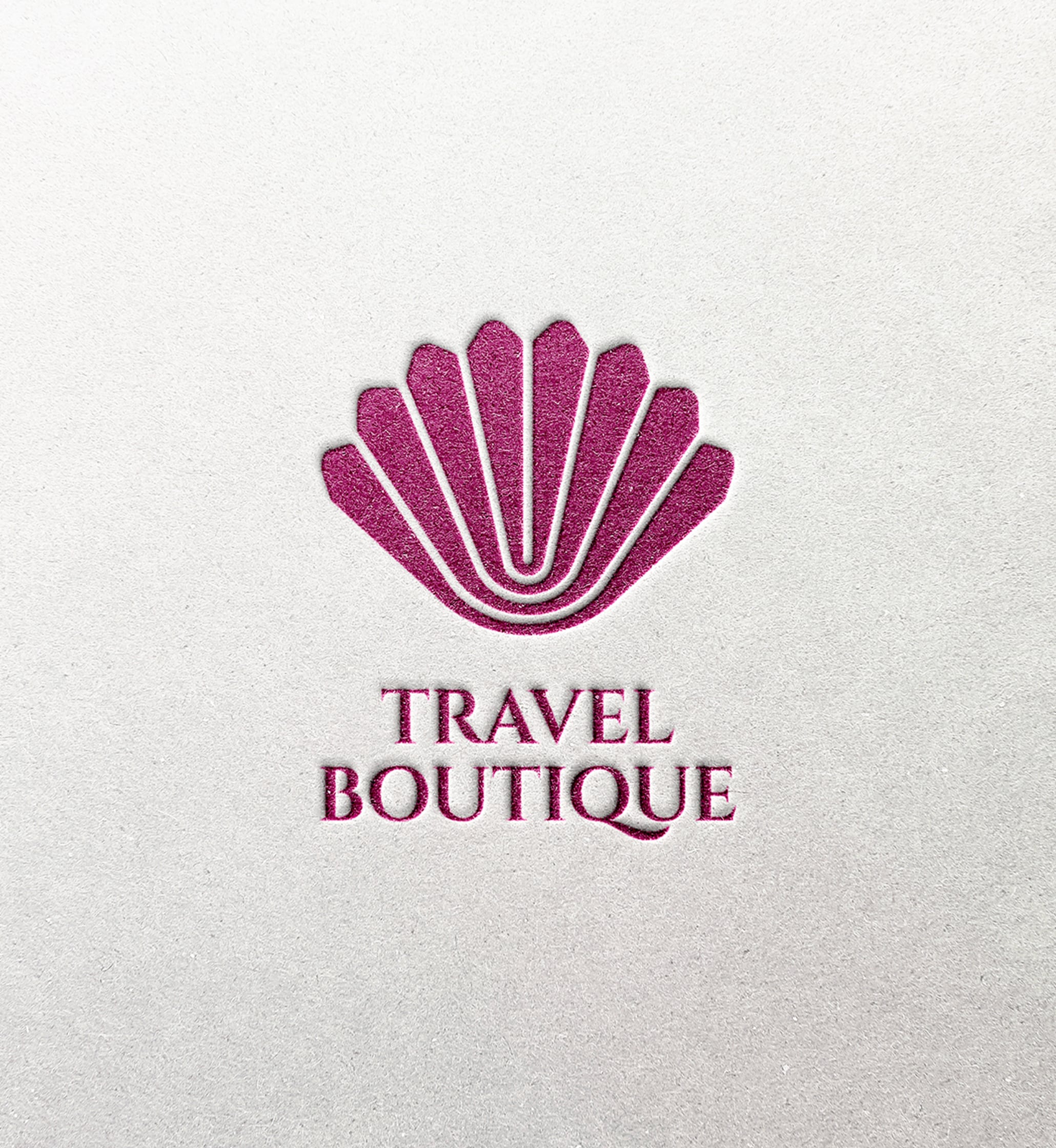
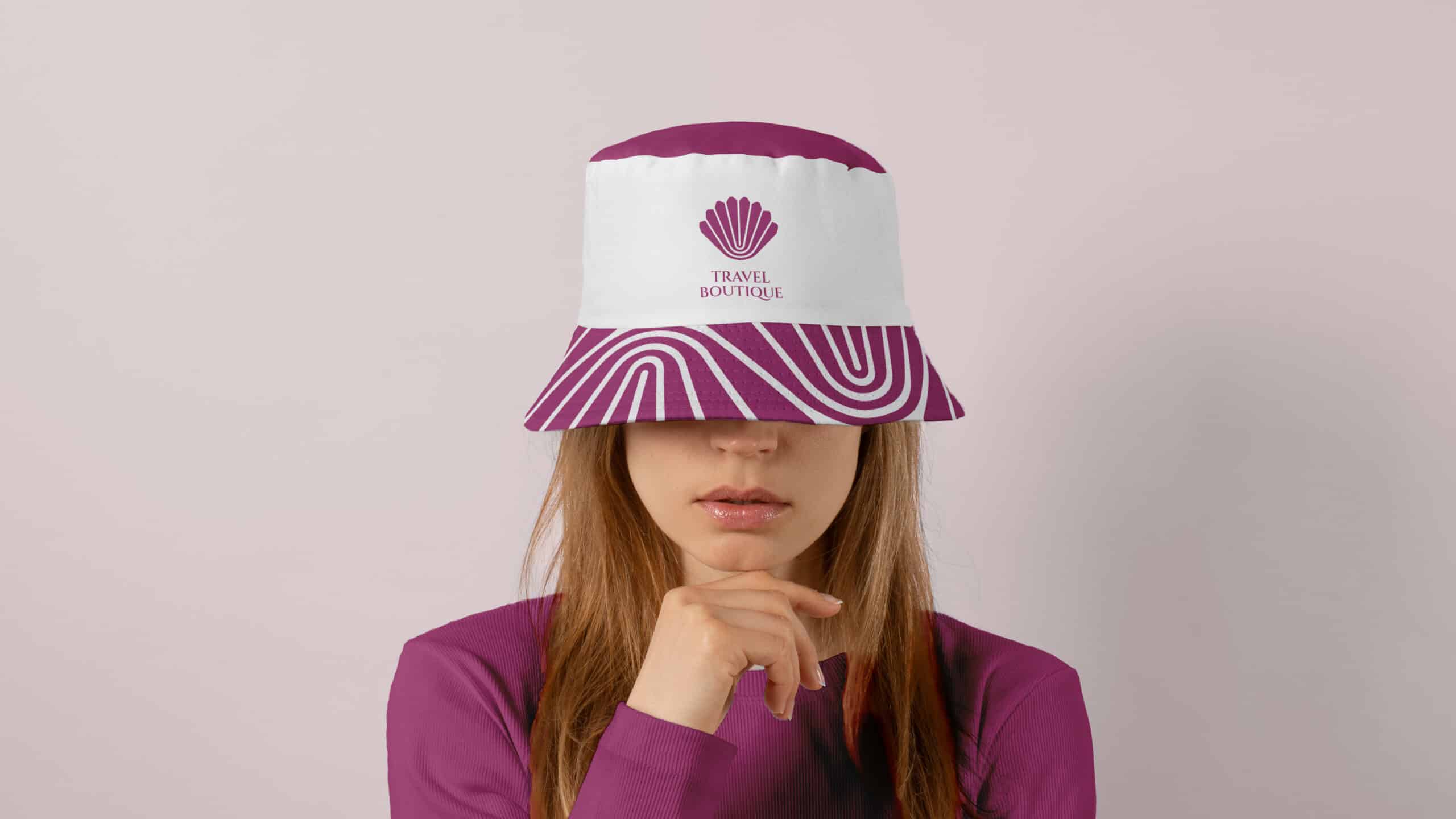
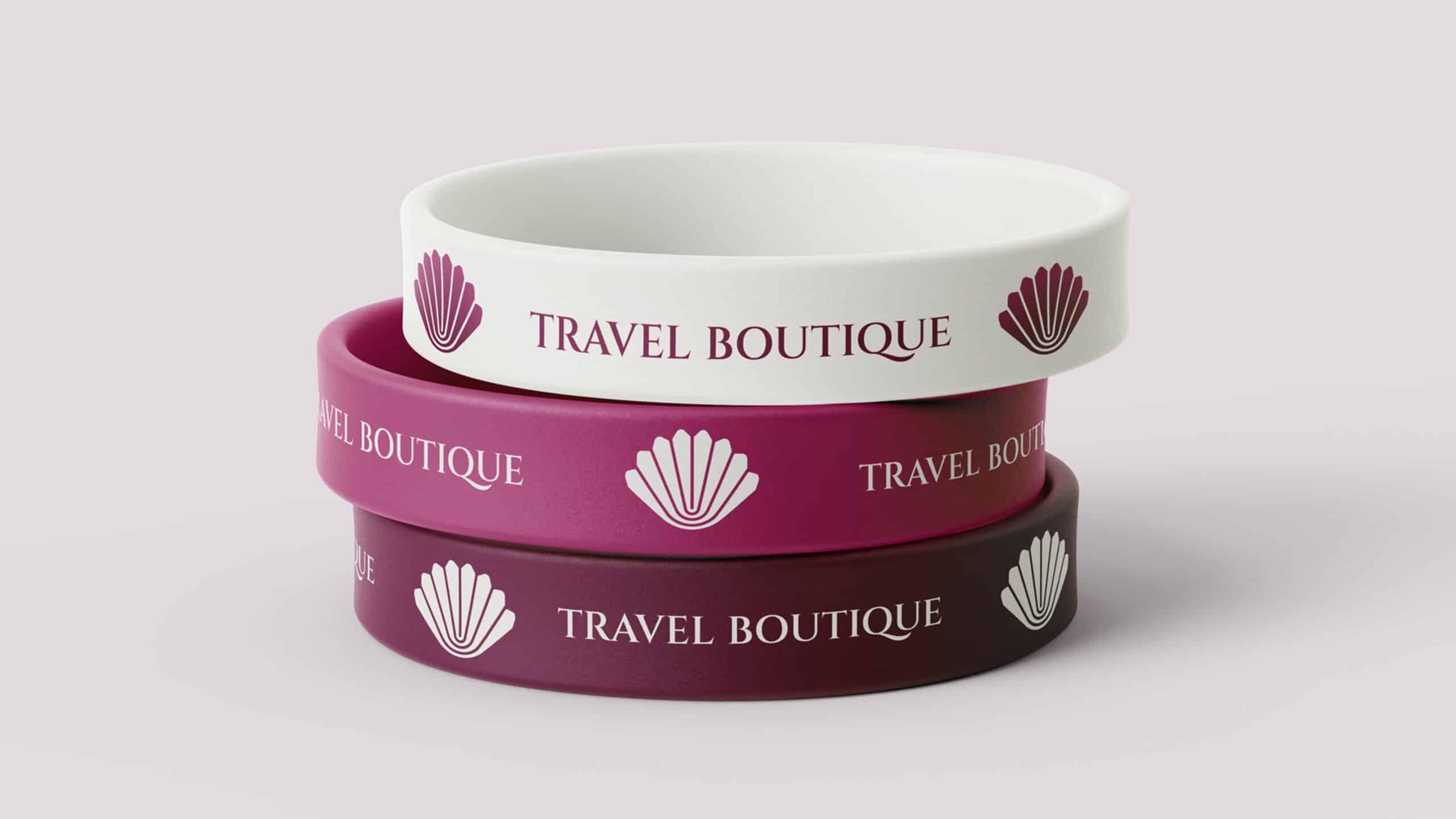
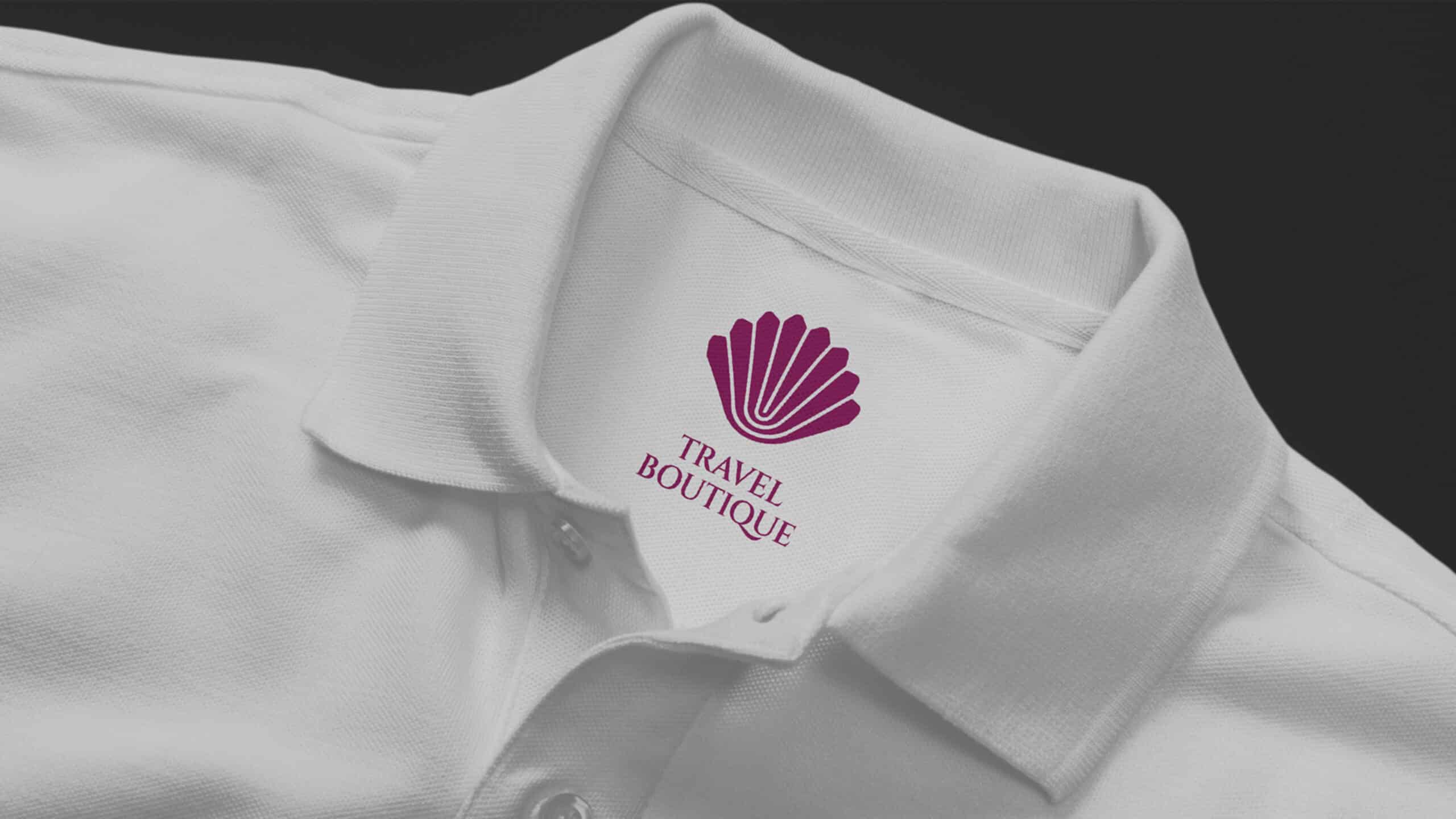
This is how a travel agency changes its look. But not just any agency— it’s Travel Boutique, a Belgrade-based agency known for organizing luxury travel.
Services:
Brand Development
Digital & Content Creation
Industries:
Hospitality & Travel
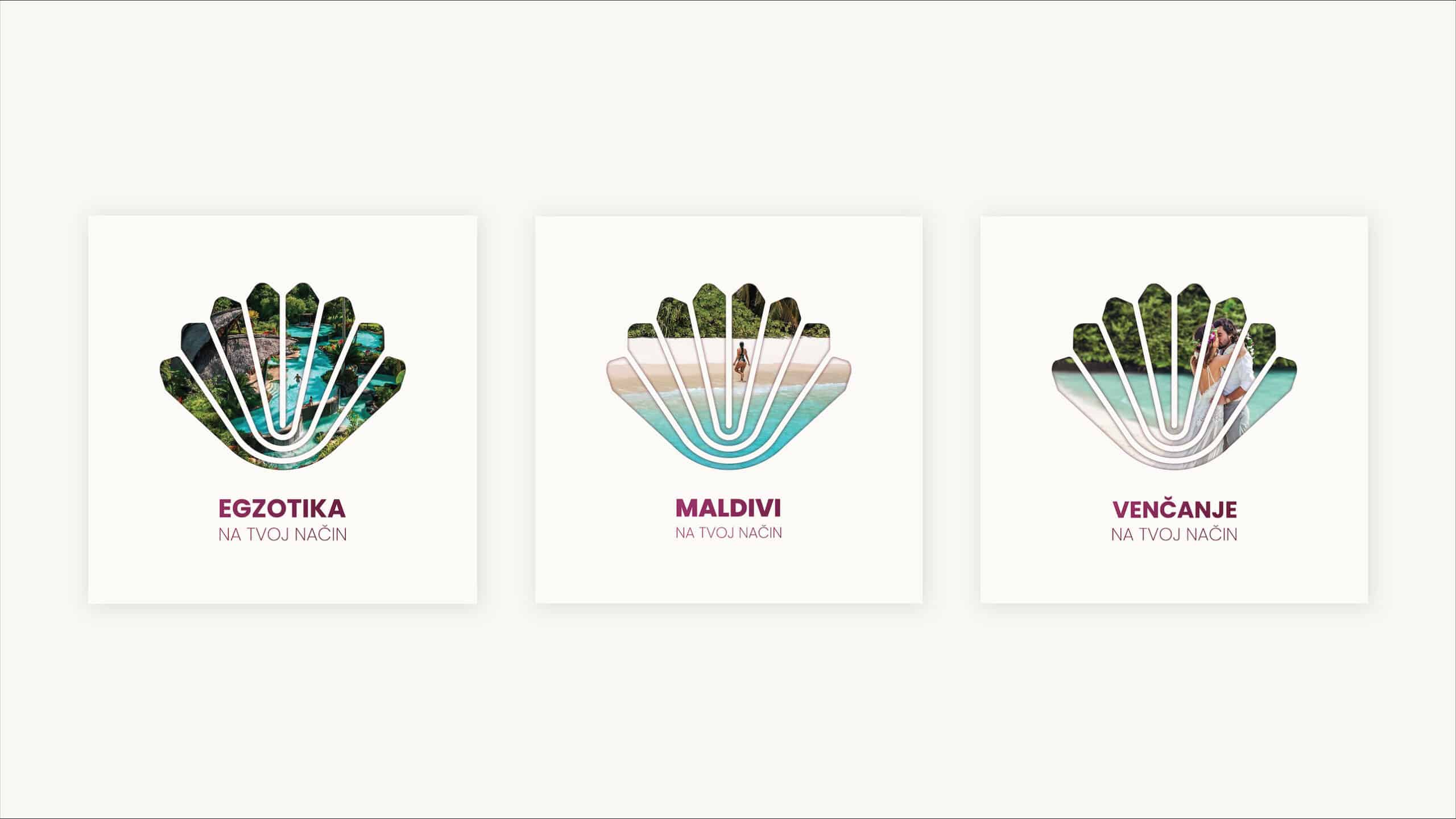
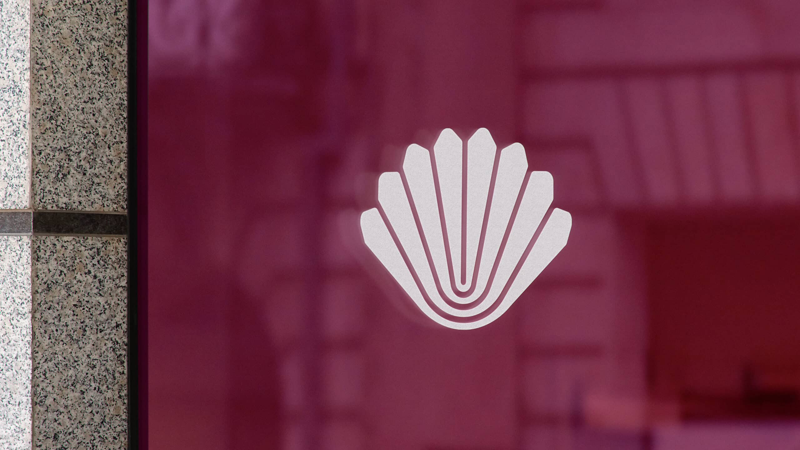
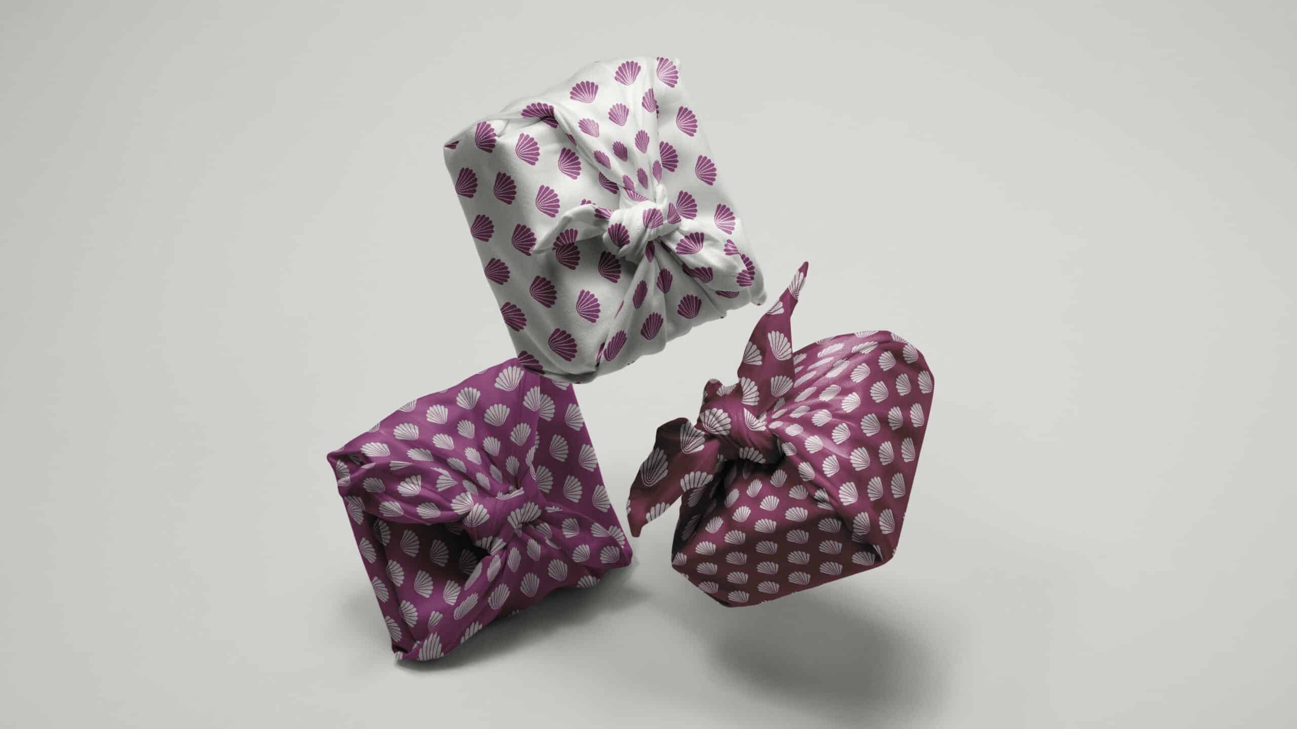
Our job was to showcase the most amazing, faraway, and hidden spots around the world. At the same time, we wanted to show how travelers can customize their trips with Travel Boutique. This means each traveler and destination is special, just like a precious pearl.
We thought about all of this and decided the shell symbol made perfect sense. We came up with this idea by thinking about everything the brand stands for. We looked for the right words, colors, and shapes to represent what the agency wanted to offer when they started.
The slogan we chose sums up what Travel Boutique is all about. We keep our communication simple and honest, without using big words or hiding anything. We want people to know exactly what to expect when they travel with the company, just like how Travel Boutique shows destinations on social media – just real pictures.
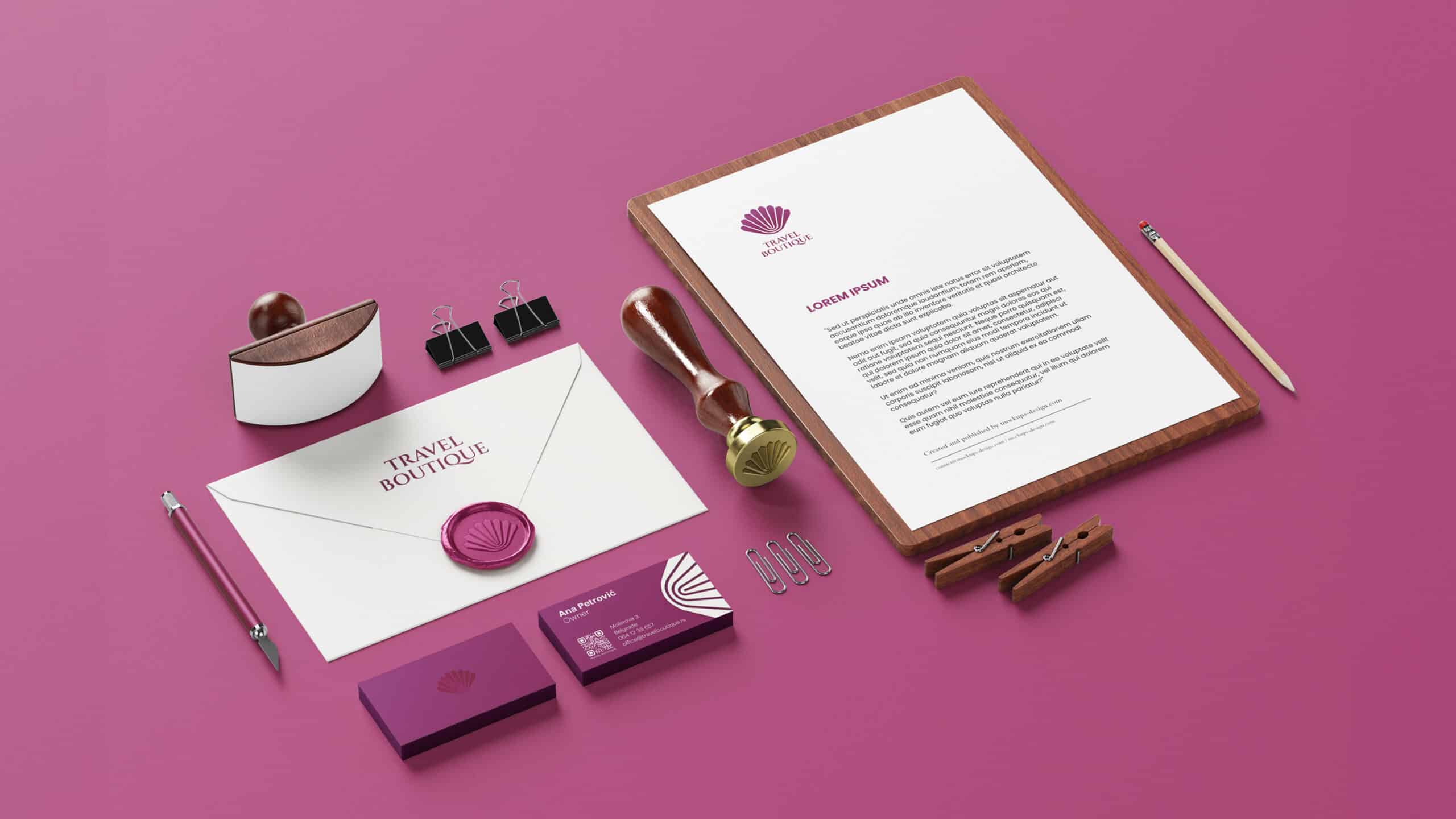
We updated the website, social media, and other materials to match the new look. We also made a series of social media posts, including a video about the logo change and what we’ve achieved in our 14 years in business.
Projects like this are exciting because we get to make an already great brand even better, both in how we talk about it and how it looks.
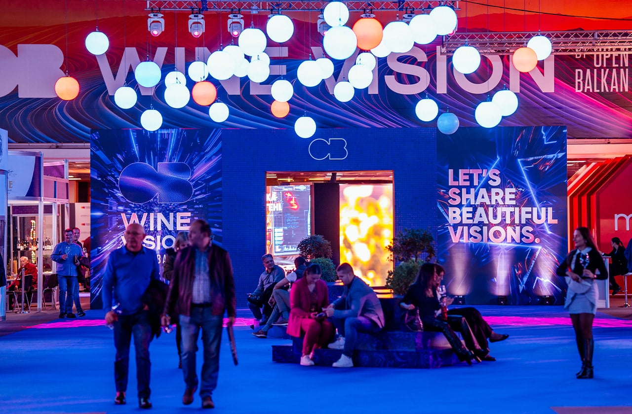
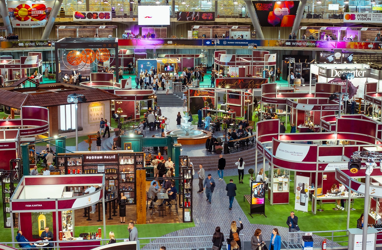
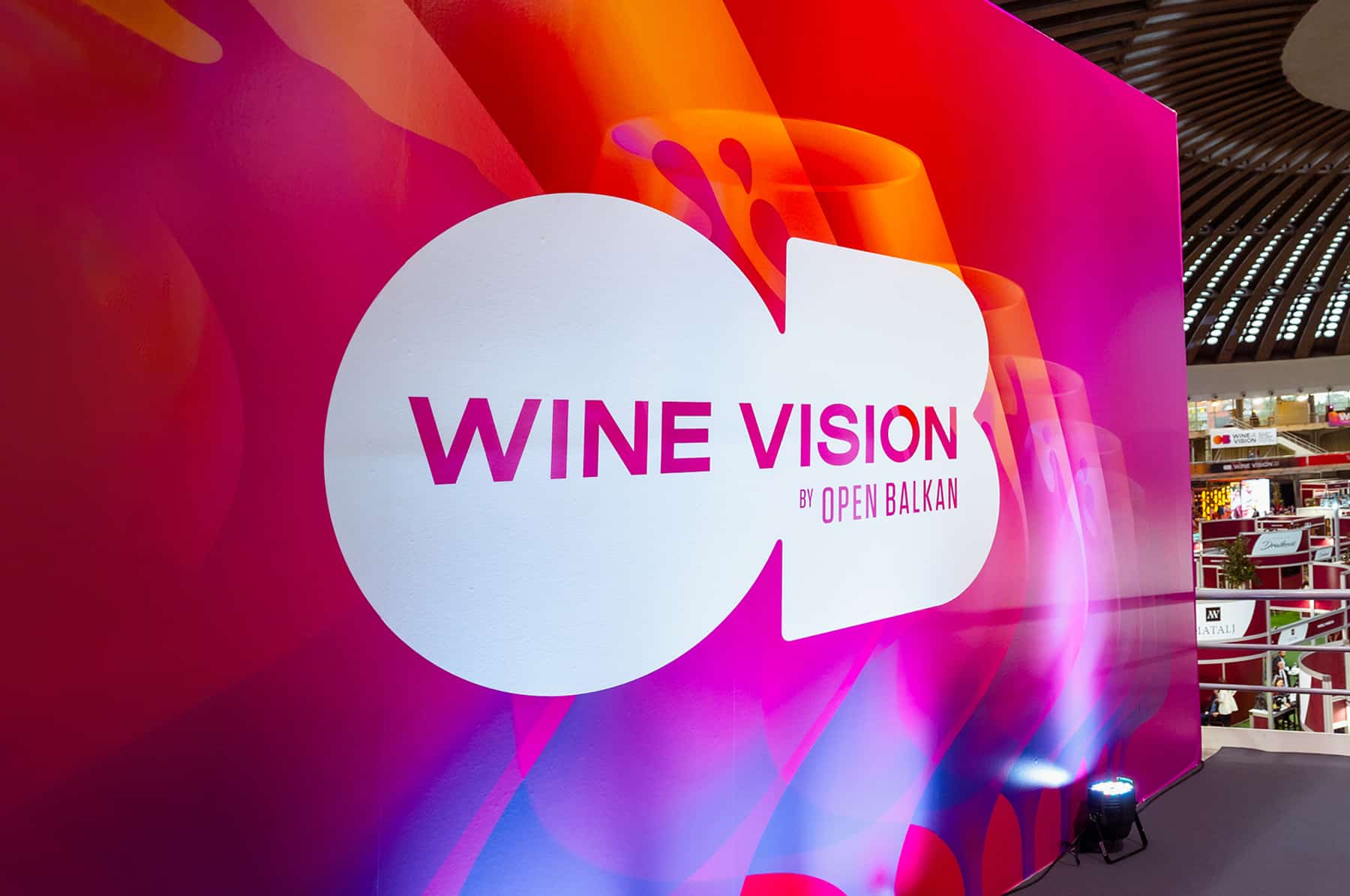
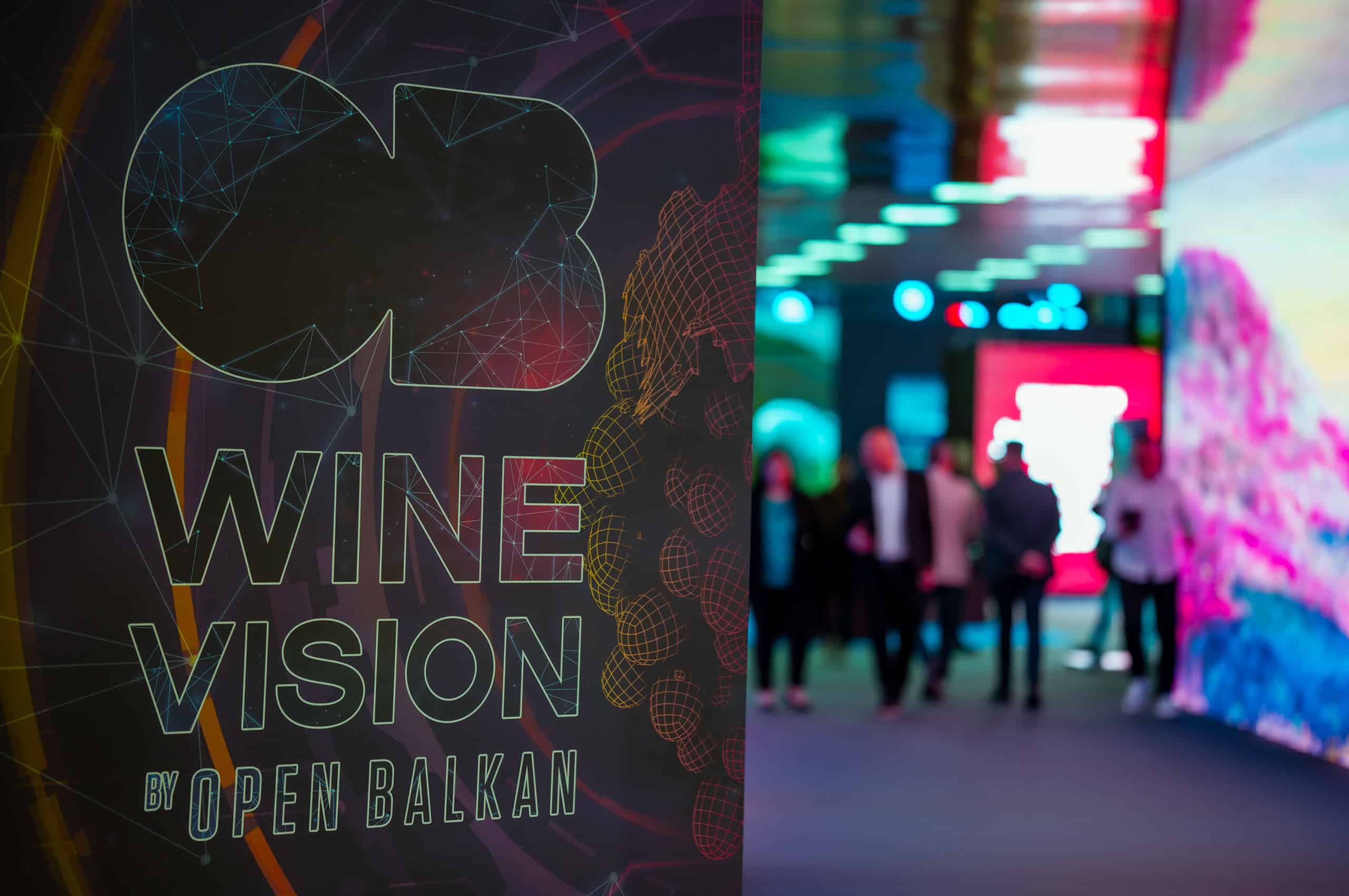
Another wine vision has been successfully completed! The second international wine fair “Wine Vision by Open Balkan”, held from November 16 to 19, proved once again that it is the largest and most recognizable wine festival in this part of Europe.
Services:
Brand Development
Digital & Content Creation
Experience Design & Event Production
Industries:
Government, Business Associations and NGO
Wine & Spirits
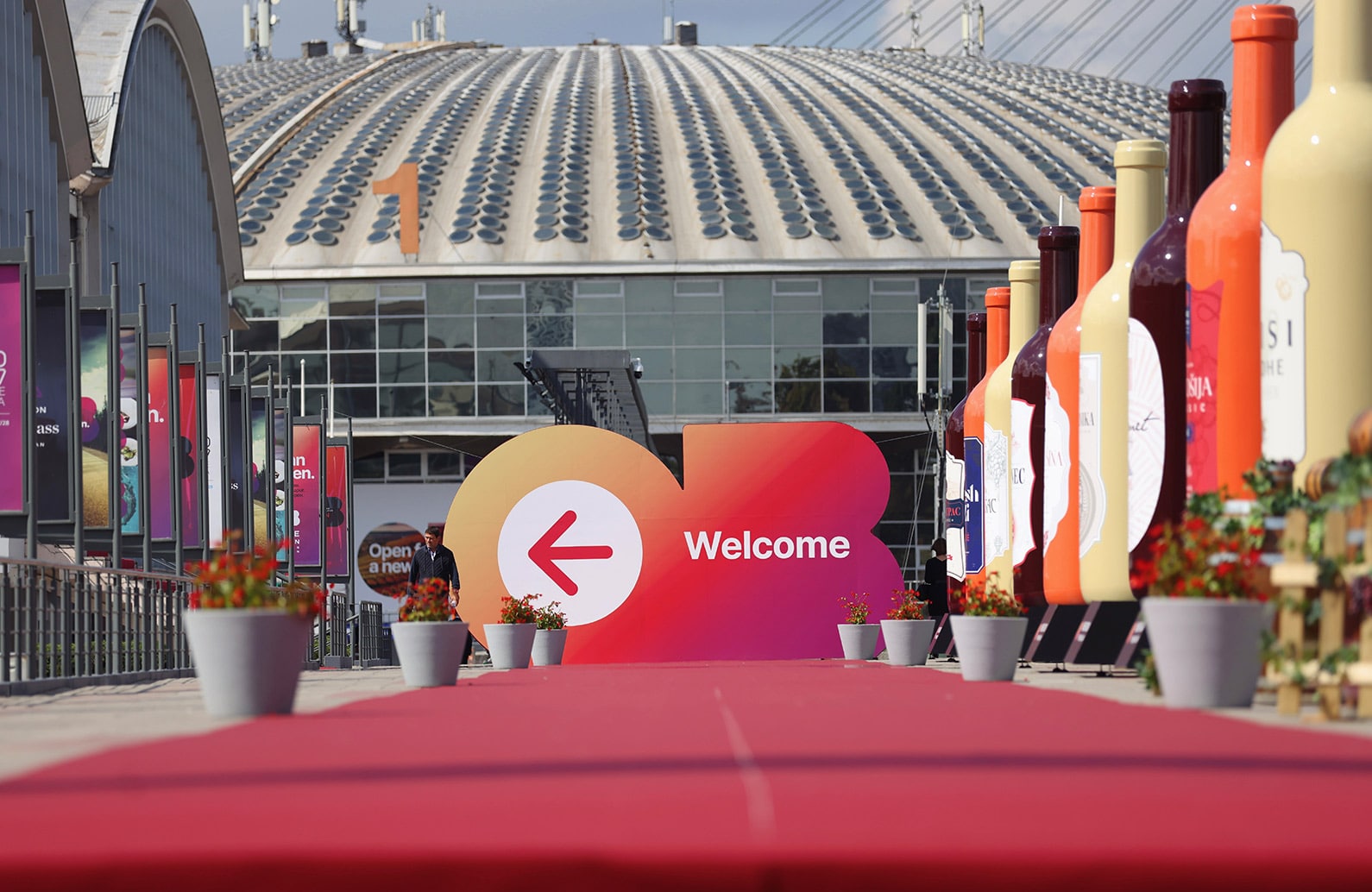

Another international festival of wine, food and tourism “Wine Vision by Open Balkan” was held under the auspices of the governments of Serbia, North Macedonia and Albania, and as part of the Open Balkans initiative.
Again, the executive production of this unique event was entrusted to the creative and production team of M2Communications, and the fair brought together the best wine producers from the region and the world in one place. More than 600 exhibitors from almost 30 countries participated in this unique event, which was visited by several tens of thousands of wine lovers over the course of four days.
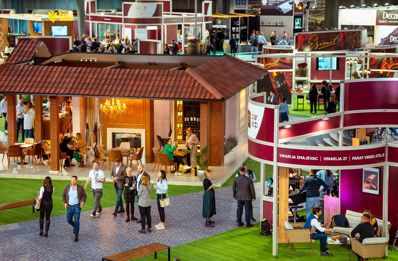
The creative concept called “Wine as a constant of civilization” was based on the idea that the cultivation of vines and the production of wine are inextricably linked with the history and progress of people (and all of humanity) in different time periods. Visitors and oenophiles had such a unique opportunity to travel through space and time while enjoying the quality wines of the region and the world.
The organization of an event of this magnitude was a complex and multidimensional project, which included numerous aspects of production and the realization of a series of accompanying programs and exhibitions, and visitors had the opportunity to visit thematically differently designed halls. The entire display of the Wine Vision by Open Balkan was realized in six halls of the Belgrade Fair and was divided into three units: The Roots of Wine Culture, The Wonderful World of Wine, and A View of the Future, which talked about the past, present, and perspectives of winemaking and the wine industry in our country and in the world.


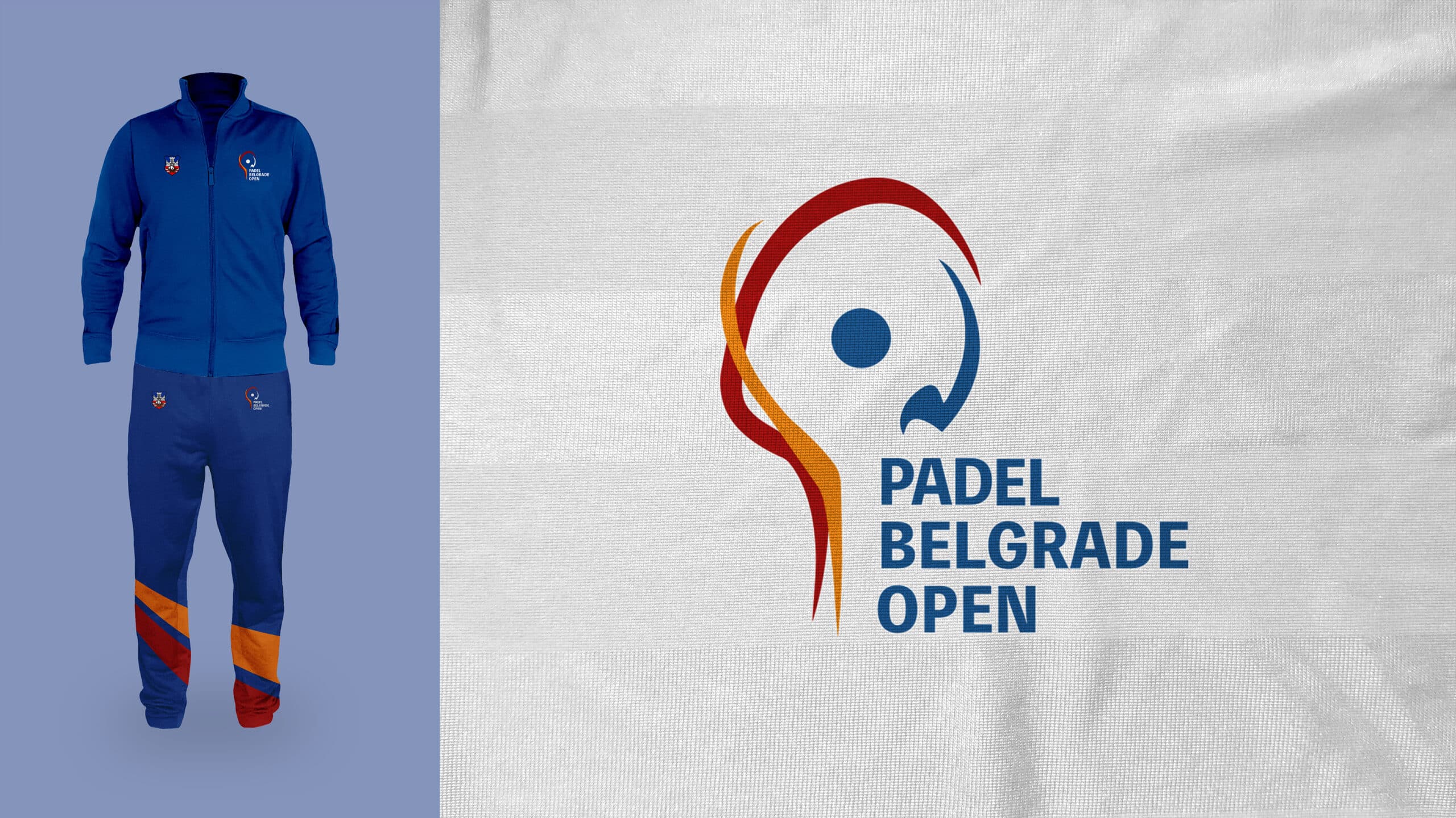
We are thrilled to present the new, dynamic logo for the Padel Belgrade Open! The logo is designed to capture the energy and passion of the growing and increasingly popular padel sport, a racket sport that combines elements of tennis and squash.
The creative concept behind the logo is based on several premises: By associating it with the Olympic ring, the logo embraces the spirit of free will, symbolizing the sporting unity that padel promotes. Equally important is the symbolism of the racket swing, as the logo’s abstract shapes are fluid and dynamic, reminiscent of the graceful swing of a padel racket.
Services:
Brand Development
Design & Art Direction
Industries:
Art, Entertainment & Lifestyle
Sports
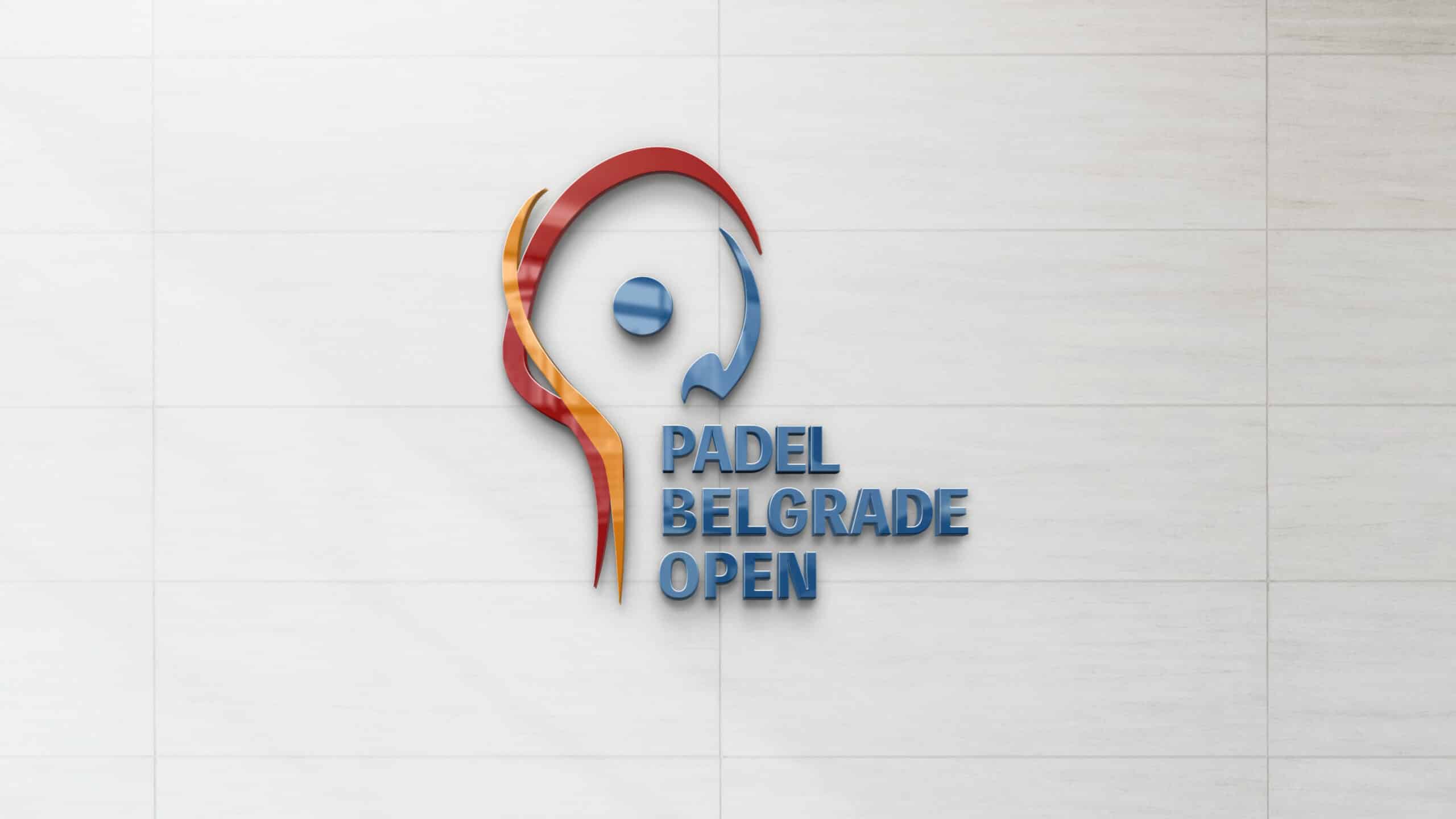
Upon closer inspection, the abstract shapes of the logo come together to form recognizable forms of a racket and a ball. The new logo of the Padel Belgrade Open also incorporates the colours of the Belgrade coat of arms, creating a strong connection between the tournament and the host city.
This logo is not static, but rather represents the movement and energy of the padel sport. It also symbolizes the spirit of Belgrade – a city that is vibrant, open, and ready for victory!
We believe this logo perfectly represents the Padel Belgrade Open tournament and Belgrade as a metropolis of sport and culture. We believe the new logo will inspire many to be part of the exciting padel tournament adventure!


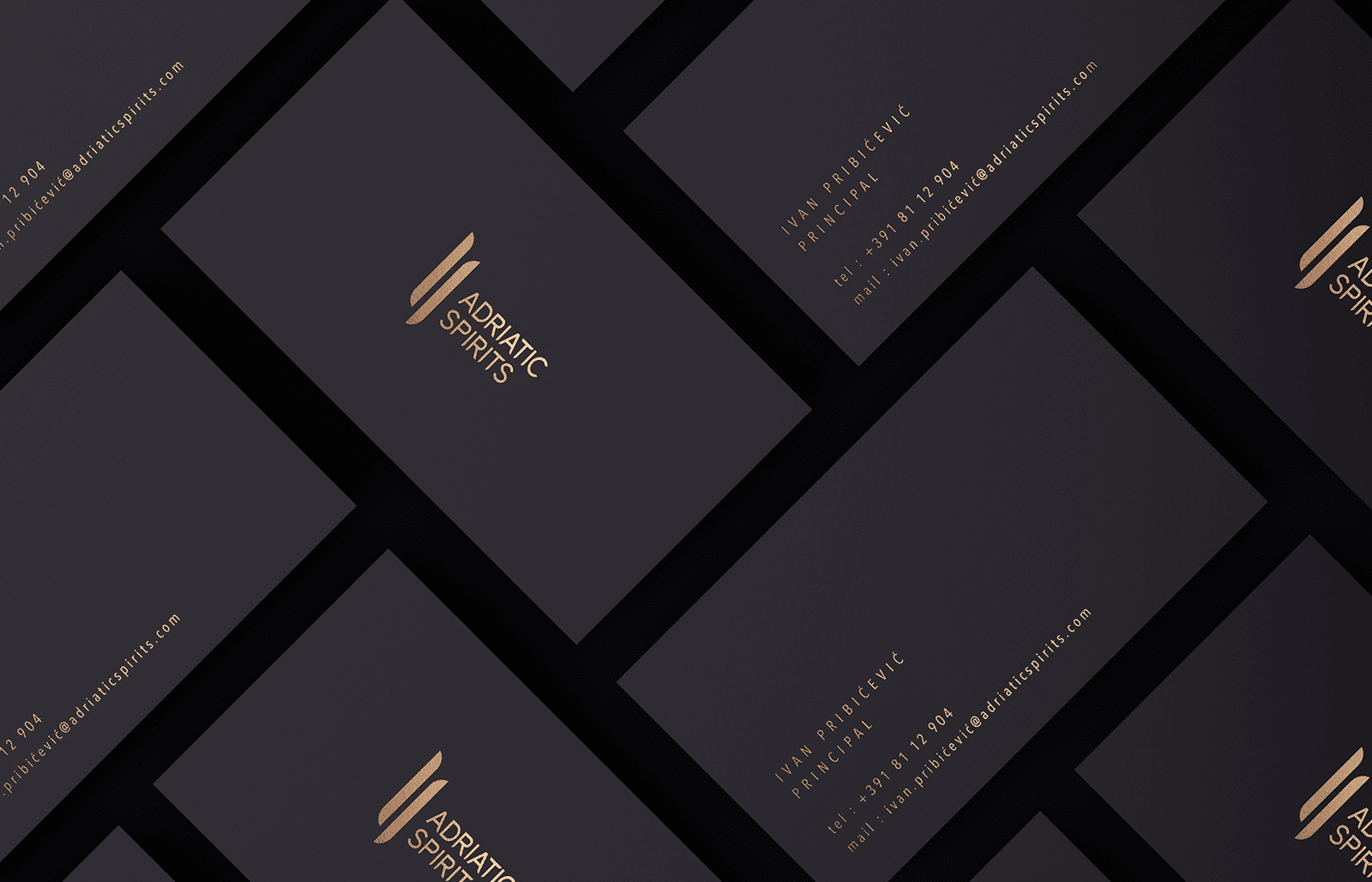
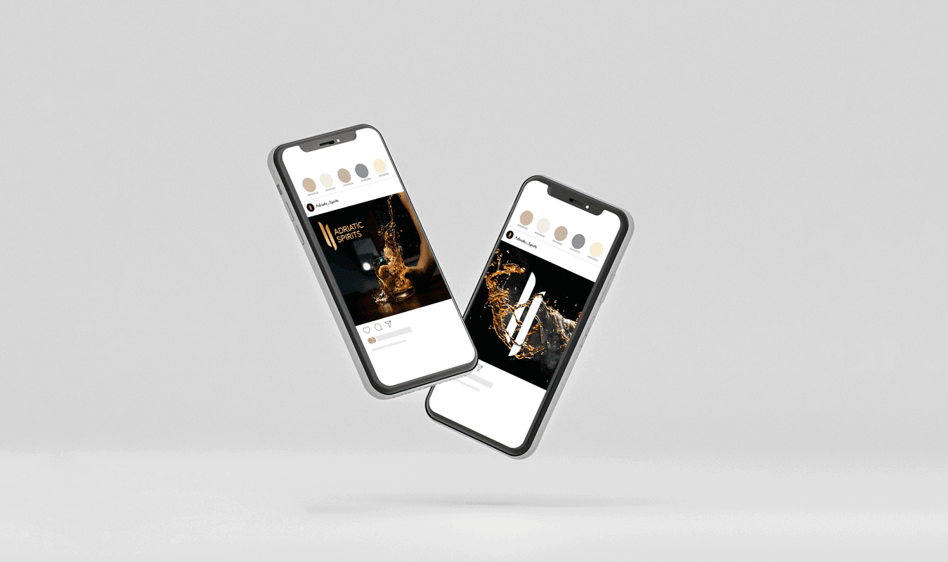
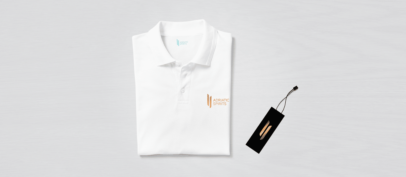
Adriatic Spirits is a company founded in 2021 which represents luxury alcoholic beverages of the highest quality in the Adriatic region. This company’s vision and long-term goal are to become a regional leader in the import and distribution of distilled spirits of the highest quality, thus providing consumers with an experience of complete enjoyment and a taste of satisfaction.
Services:
Brand Development
Design & Art Direction
Digital & Content Creation
Industries:
FMCG
Wine & Spirits

The visual identity of Adriatic Spirits is based on a minimalist, easily recognizable, and associative symbol of the road and two different directions. Figuratively representing the concept of exchange, i.e., distribution.
Fundamentally, the logo consists of maximally abstracted and stylized letters “A” and “C.”
With its upright “lines” and reduced form, the logo is associated with stability, luxury, hedonism, and elegance. The bronze reflection brings an open, airy impression that applies to any space and material.
The liquid during pouring creates a fascinating fluid and unique amorphous shapes that are abstracted into the logo’s negative space.
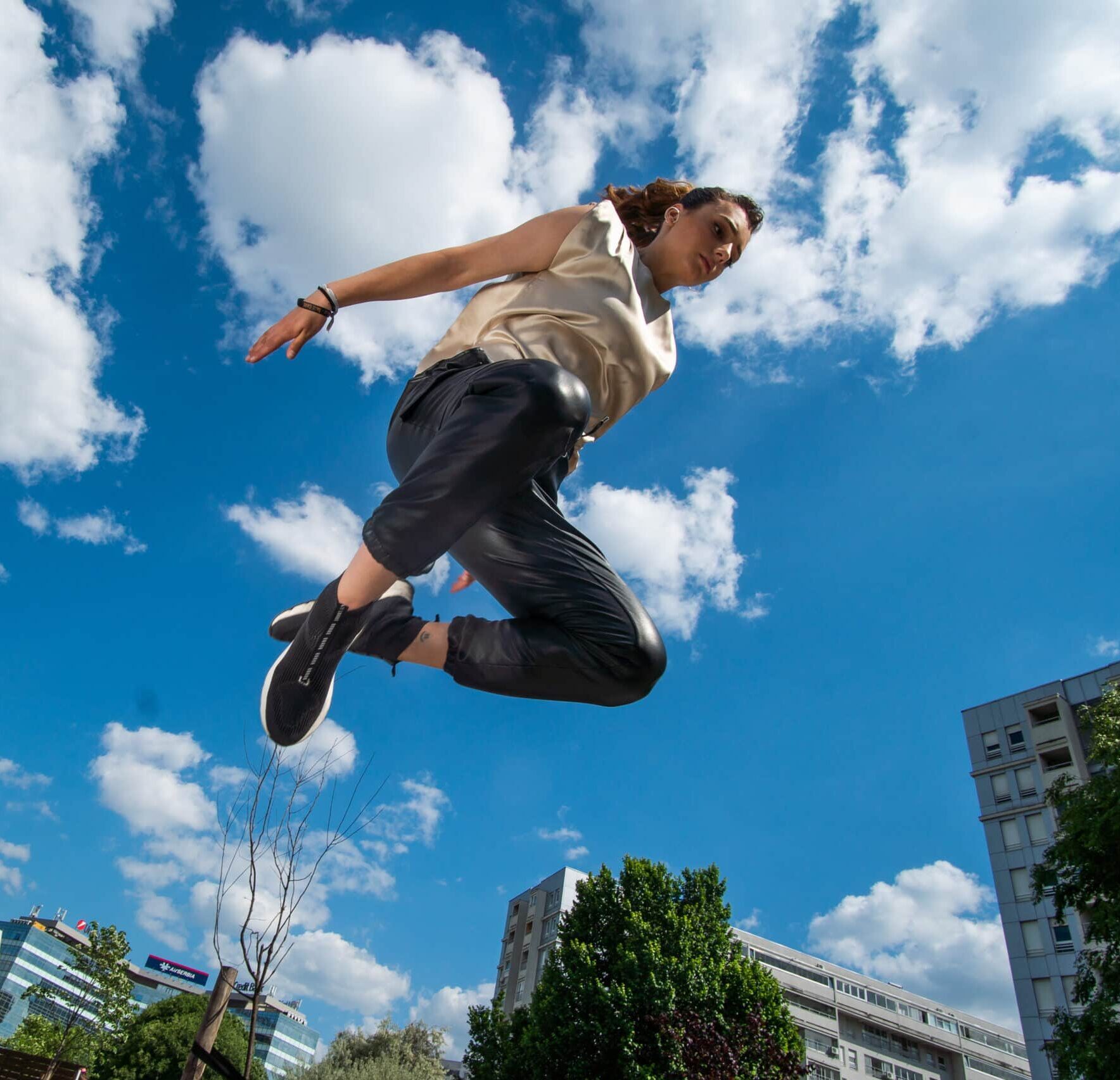
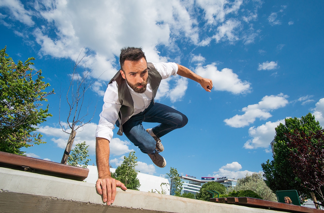
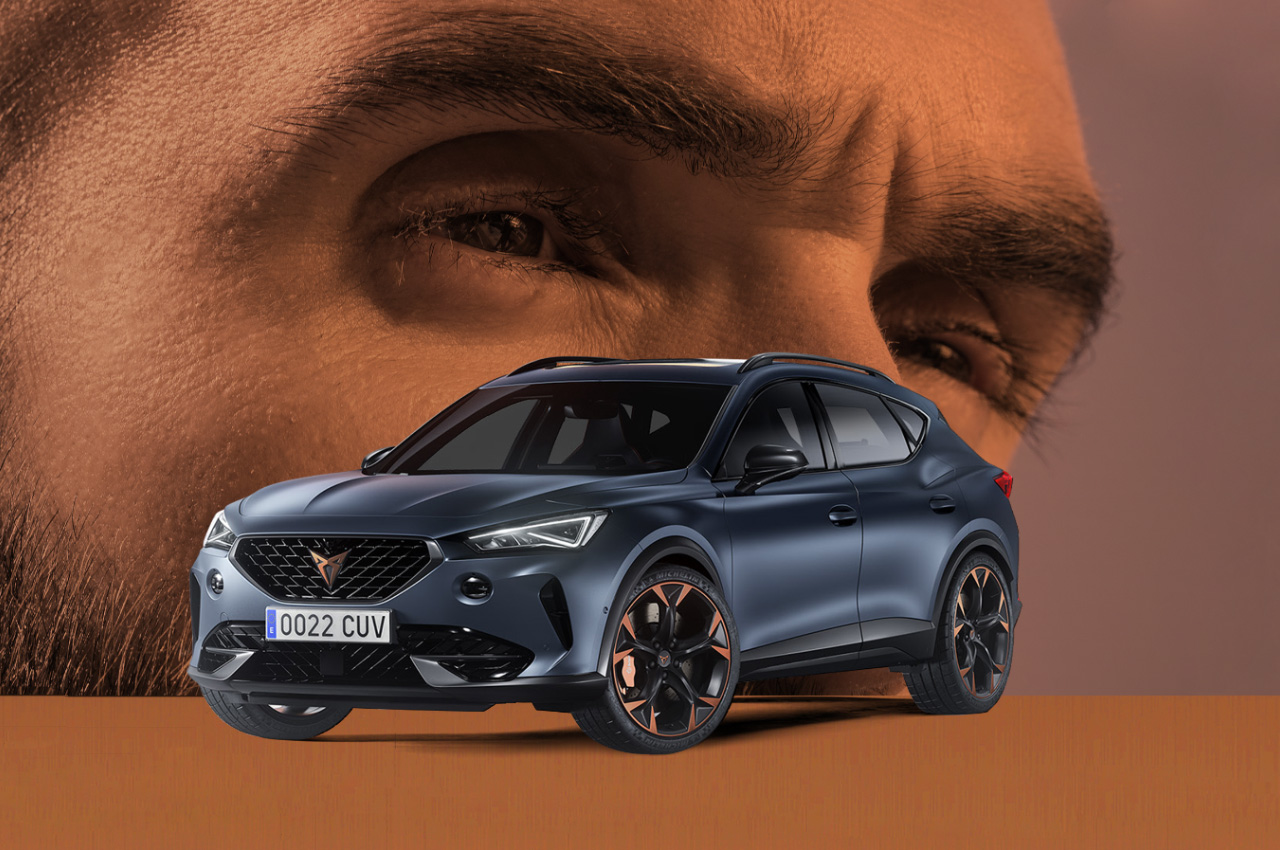
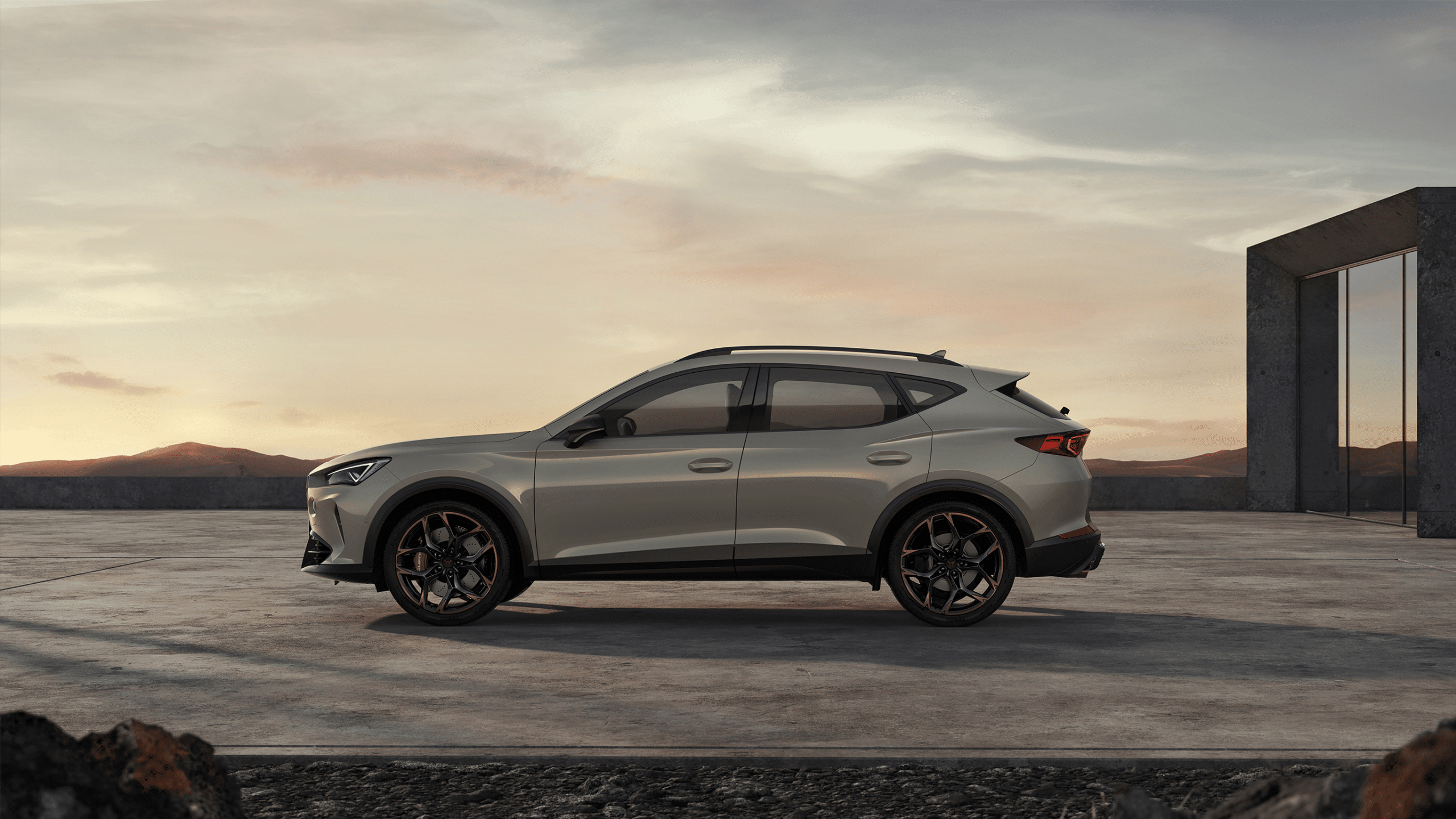
For the client Porsche SCG, we designed and implemented a digital campaign whose backbone is an interactive video called “CUPRA HERO”, based on the convergence of the gaming industry and video technology.
The key medium of the campaign was the micro site cuprahero.rs, whose basic content is an interactive video of a competitive nature.
Services:
Brand Development
Design & Art Direction
Digital & Content Creation
Top 10
Video & Photo Production
Industries:
Automotive Industry
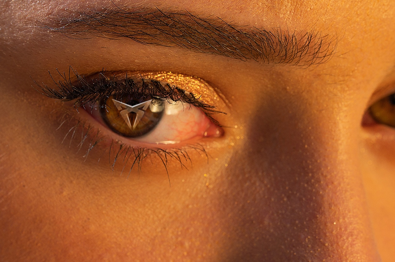
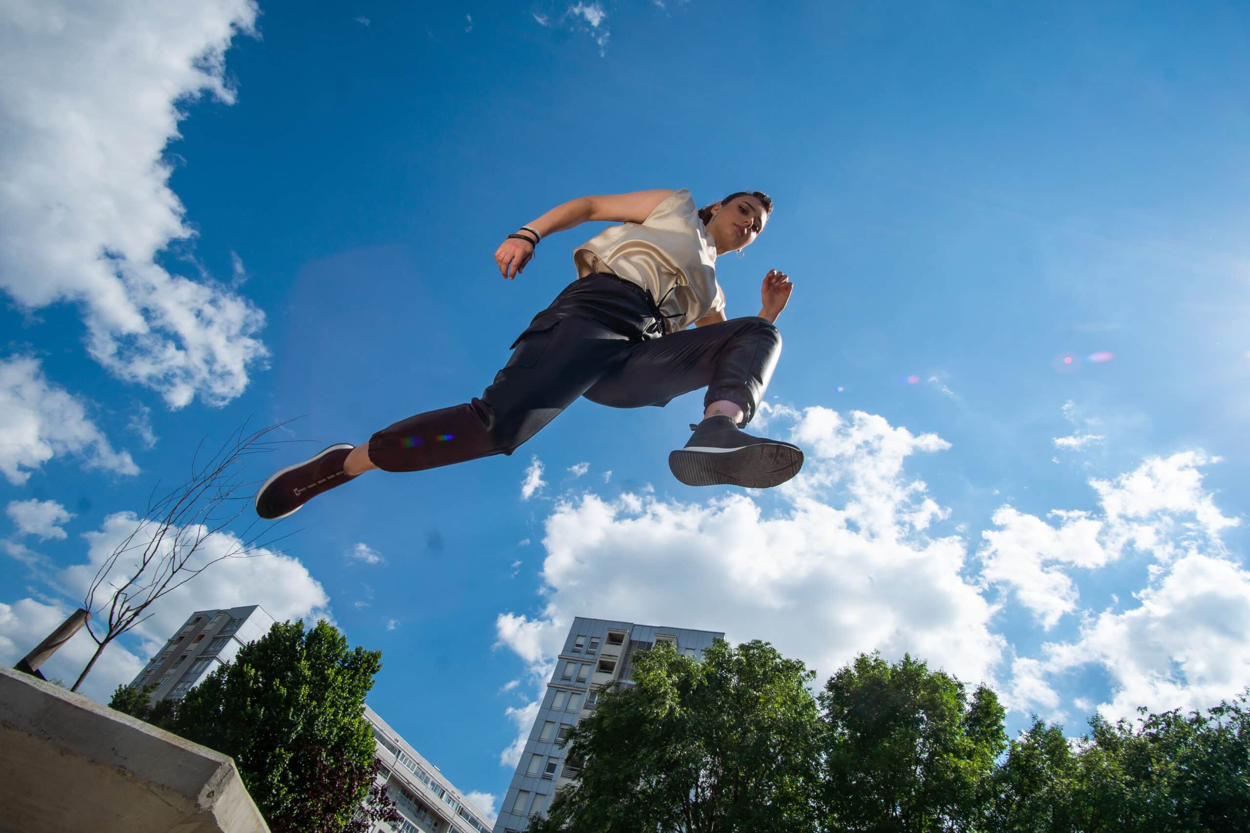
Everyone who embarked on this unique interactive experience had the opportunity to choose one of the three characters offered – that is, “their” hero to the parkourist – as well as, in the race against time, choose their path and reach the finish line in record time. This type of campaign is a new type of digital experience applied for advertising and promotion purposes.
With the slogan “For all the brave who choose a different path”, this interactive adventure aims to enable players in a fun and interesting way to choose the characteristics that feature a unique CUPRA DNA – be it speed, agility or strength.
The story that accompanies the interactive video also points to certain values that each individual should promote in their life, regardless of the circumstances in which they find themselves. Sometimes the fastest way to the goal and using shortcuts is not the best way. That is why the CUPRA Hero story is intended for ordinary people, real heroes of everyday life, who behave in accordance with their own code and true values and know how to choose their path.
The CUPRA Hero campaign was realized in cooperation with the production company NEO – New Entertainment Office. System Studio was in charge of micro website design and technical support, while our agency, in accordance with the set strategy, created an immediate user experience.
The CUPRA HERO digital campaign was also supported by a number of influential domestic influencers, whose lifestyle coincides with the CUPRA brand and for whom the car industry is an important area of interest.
The success of the campaign is reflected in the results of raising awareness and drawing attention to the new model in our market. During the three weeks of the competition part of the campaign, over 36,000 unique visits to the micro-site cuprahero.rs were recorded, and the total number of those who played the interactive video and recorded the result was over 13,000 users.
“A brand like Cupra has brought a new style, approach and energy to the automotive industry. It has been a challenge for us to discover new, innovative forms of communication with the target group, as well as to provide inspiring incentives to consumers.”

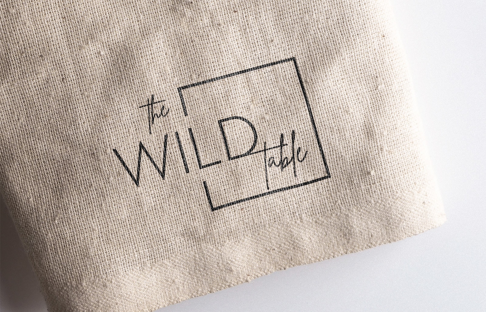
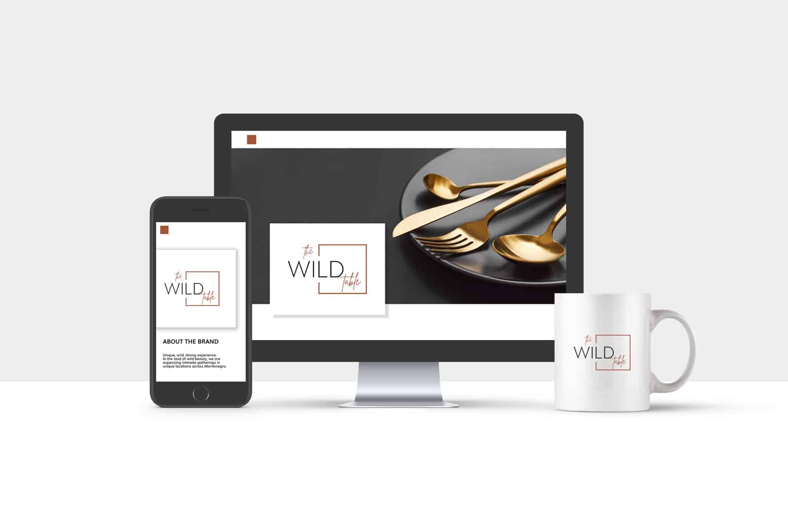
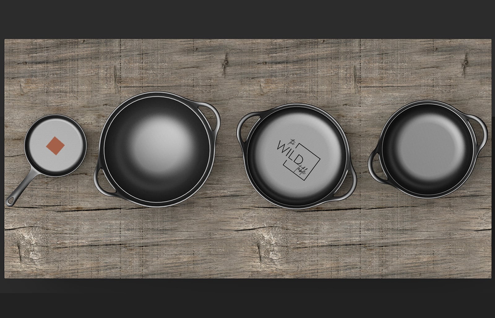
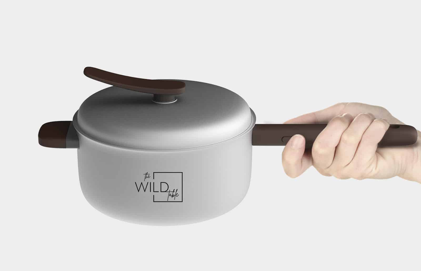
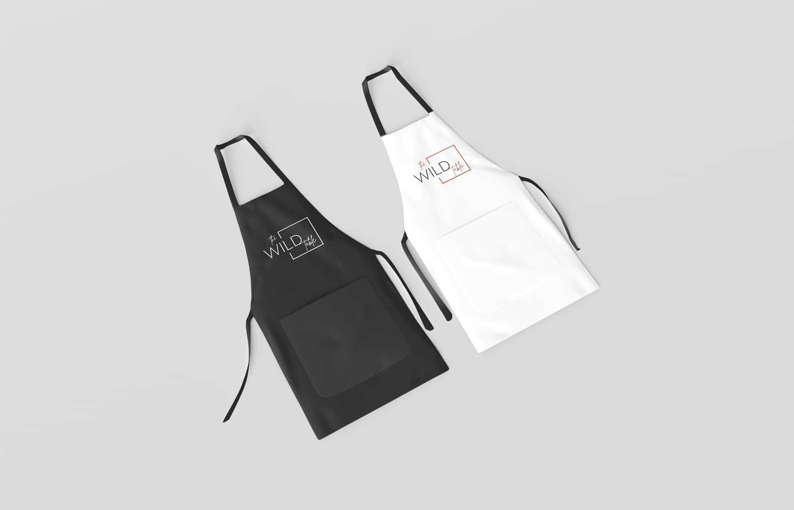
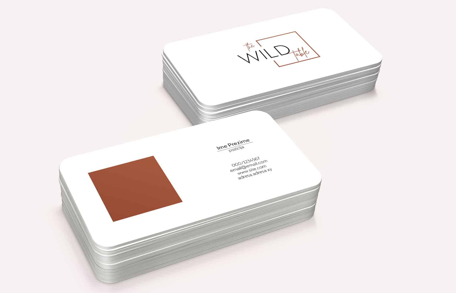
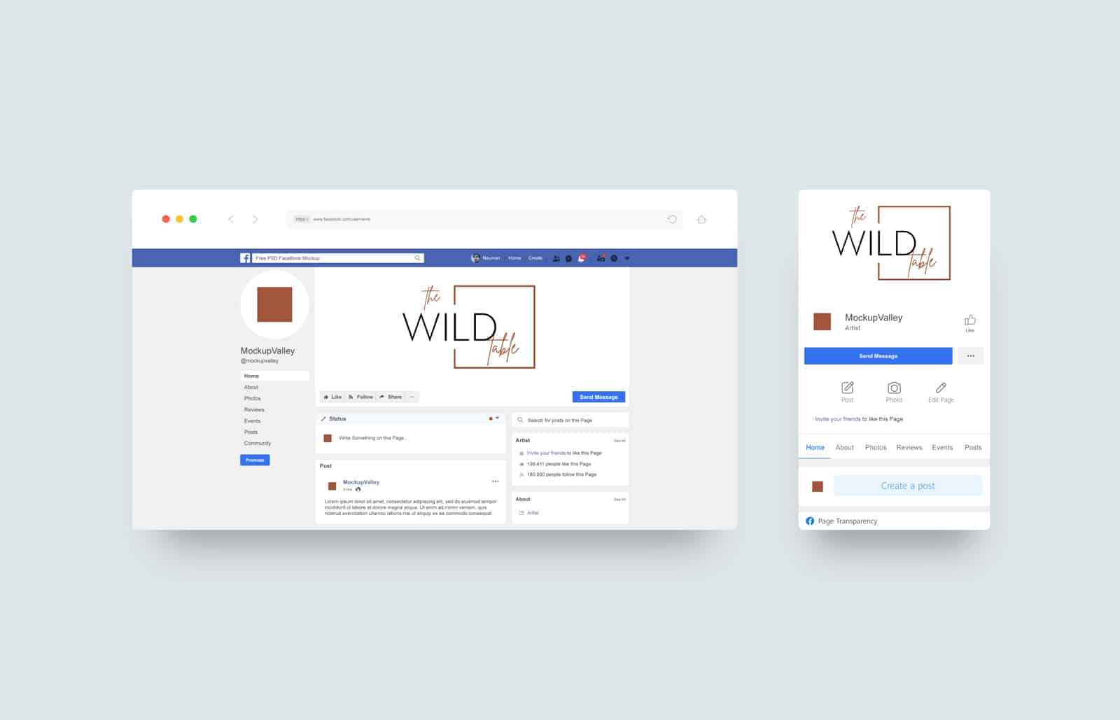
The Wild Table is a unique “food experience” concept that conveys the wild beauty of Montenegro to the dining table, through local food and a variety of bites.
Services:
Brand Development
Design & Art Direction
Industries:
Hospitality & Travel
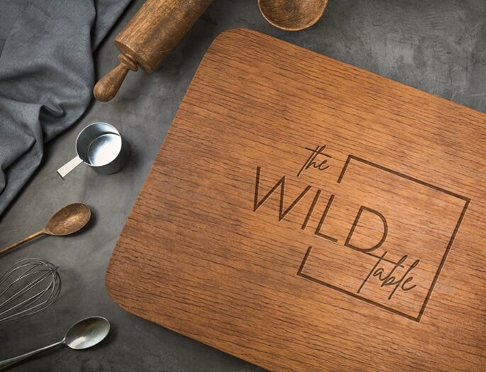
Our task was to create a logo for this concept that provides an authentic gastronomic experience.
We found the inspiration for making The Wild Table logo in the variety of flavors on the “wild” table.
The square in the logo represents a table from the aerial view, and the copper color represents fire. As a known, reliable form represents honesty, firmness and stability.
By combining the two fonts, handwritten, as a symbol of fine dining and Sans Serif, an optimal contrast is achieved.
Our food concept is local and wild. We celebrate and modify local cuisine in every dish we serve
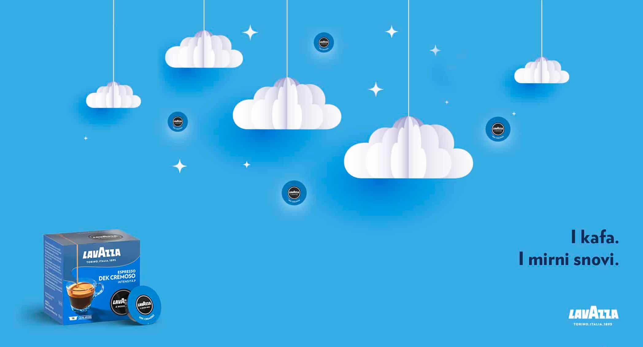
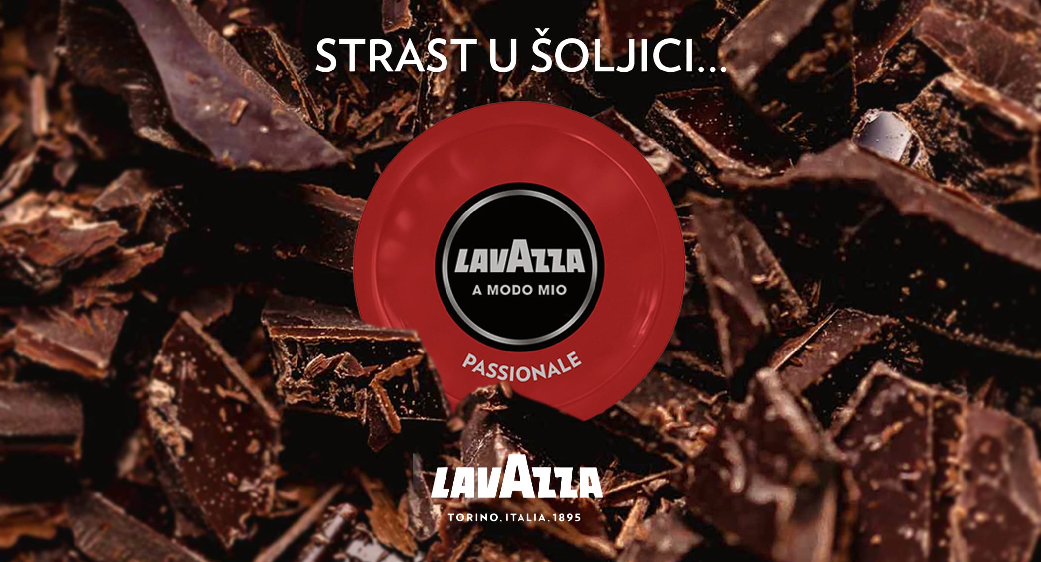
We provide the Lavazza Montenegro client a full service that includes: positioning and development of brand strategy, art directorate and market presence; creating integrated campaigns for each individual product in Lavazza offer; creating content for ATL and BTL activities; managing social networks and creating content for digital communication channels; design and implementation of promotional activities; expanding the base of potential customers and increasing online sales on the e-shop.
Services:
Brand Development
Design & Art Direction
Digital & Content Creation
Industries:
FMCG
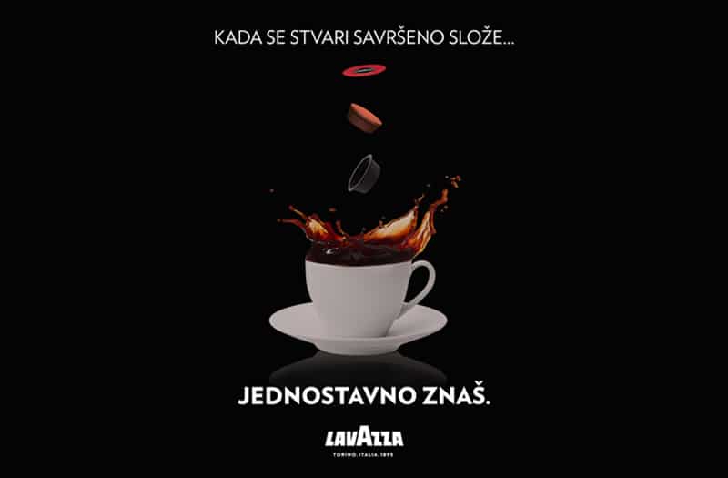
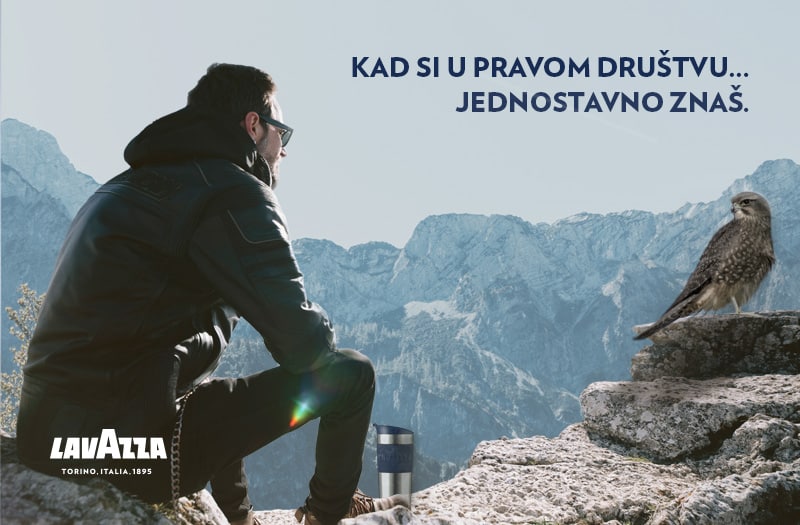
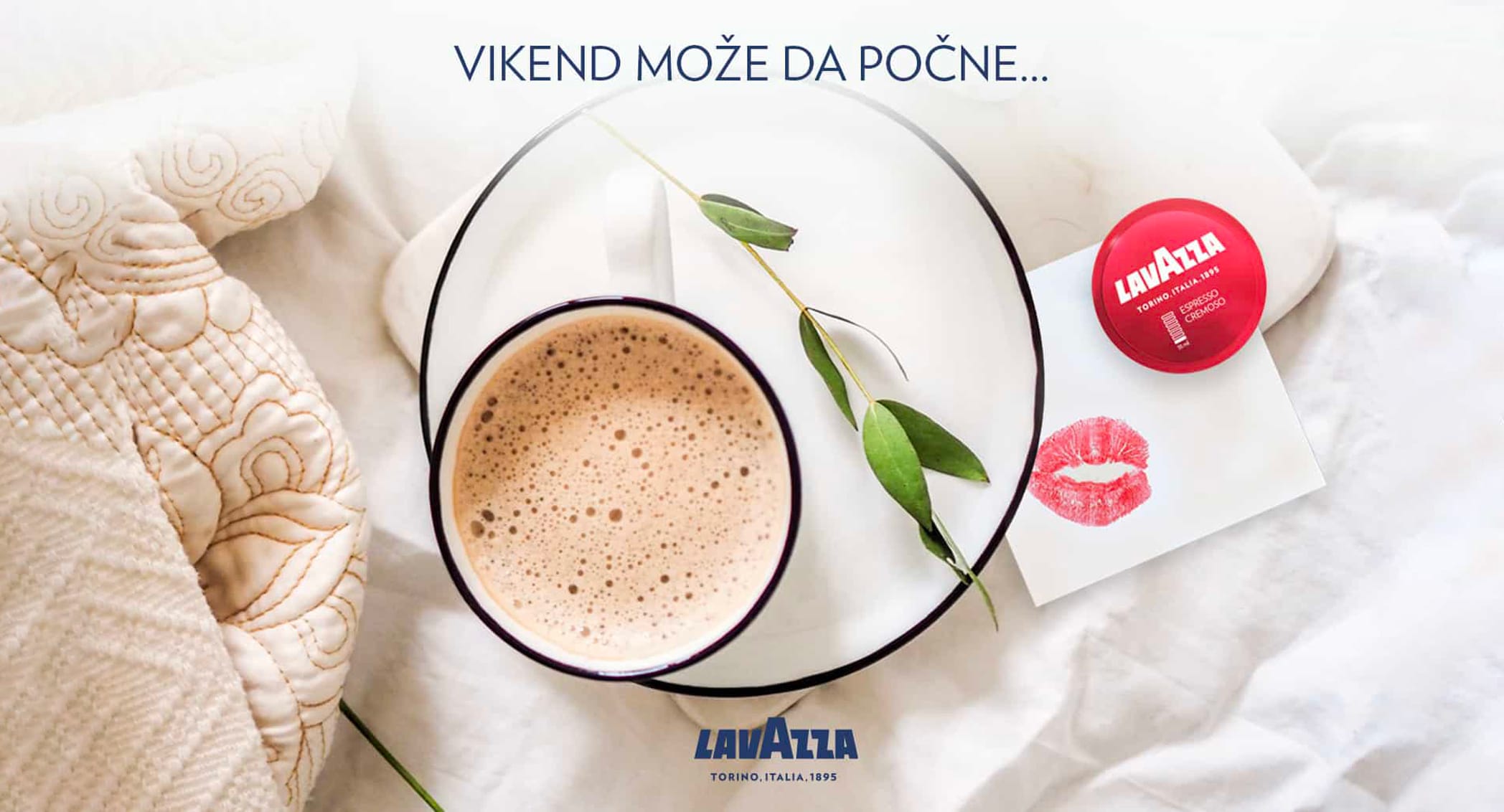
For Lavazza Montenegro, we conceptually created and developed the image campaign “Jednstavno znaš” (You simply know) with the aim of the message indicating that those who enjoy Lavazza coffee know that it is the right choice.
The visuals for the “Jednostavno znaš” campaign were created in three directions. Visuals with Montenegrin motifs are shown, then elegant visuals on a black background with espresso coffee in the foreground, as well as everyday life situations that we encounter and that a real escape from everyday life is a cup of real espresso.
The image campaign “Jednostavno znaš” (You simply know) attracted the attention of fans of this coffee in Montenegro with its art direction and message.